Fueling the fire- don't rule out dark ceilings
Now that my radar is set to showing you how dark ceilings can be a viable solution, I just remembered another example I collected eons ago.
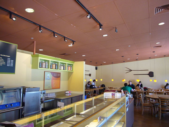
Whenever I went to visit my friend Amy in San Francisco (just a hop skip and a jump from me in Oakland), we inevitably ended up at this one little eatery below her apartment.


Students and their families living in the housing developments above could stroll down for a quick bite to eat before disappearing into their labs and office spaces.
 Peasant Pies is one of those eateries. (quite yummy, btw) The retail spaces are delivered to tenants in
“cold shell” condition, aka completely empty with concrete walls, ceiling and floor. So, it's up to each retailer to personalize their space.
 The first thing I noticed when entering this shop was the brown ceilings. Can you imagine what this space must have looked like before color was added? Just a big blank box, waiting for it's personality.
 Darker ceilings work especially well in industrial buildings like this, where you have high ceilings, often with exposed duct work and so forth. It creates a sense of intimacy where otherwise there would be a sterile over-sized space. The stained concrete floor is nice, too.
I'd like to go back and snap pictures of the other retail shops flanking Peasant Pies to see what they did with their ceilings...
Whenever I went to visit my friend Amy in San Francisco (just a hop skip and a jump from me in Oakland), we inevitably ended up at this one little eatery below her apartment.

image source
The brand new Mission Bay life sciences campus where she lived is all concrete and hard edges. While some see the minimalist architecture as beautiful and elegant, I found it all too sterile. 
image source
To be fair, the campus is still very much under construction, and softscaping is in the works. Anyways, I digress.Students and their families living in the housing developments above could stroll down for a quick bite to eat before disappearing into their labs and office spaces.
“cold shell” condition, aka completely empty with concrete walls, ceiling and floor. So, it's up to each retailer to personalize their space.

I'd like to go back and snap pictures of the other retail shops flanking Peasant Pies to see what they did with their ceilings...
Painting your ceiling dark-why it works
I have always felt that ceilings could be painted something other than white. Why is it that people are stuck around the idea that all ceilings should appear higher? When did cozy, intimate, or appropriately proportioned go out of style? My theory is that the mad rush towards up-sizing has resulted in McMansions with massive grand foyers, enormous vaulted ceiling family rooms, and oversized everything. Why is bigger better?
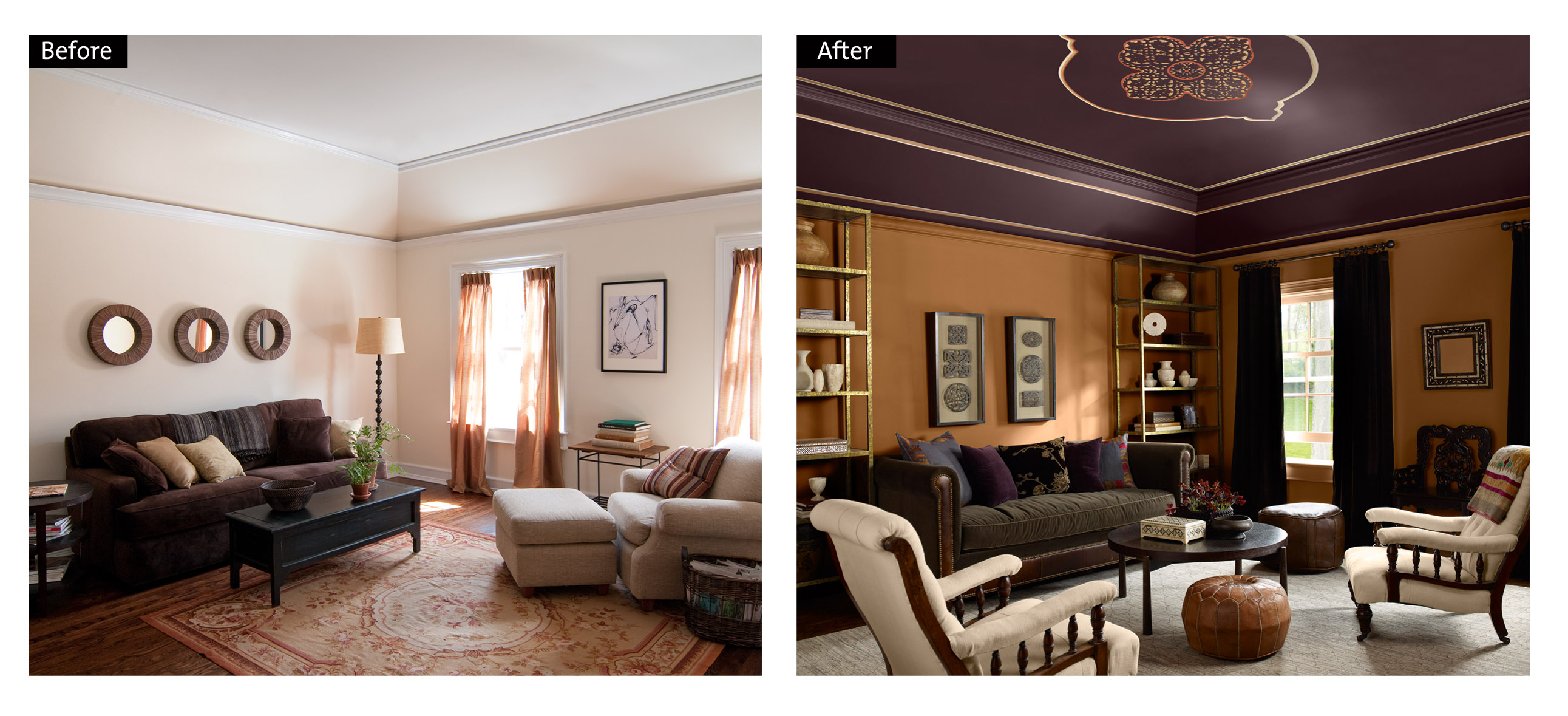
image source
So, when faced with an oversized room that just feels cold and huge, try your hand at bringing the ceiling -down- instead of up! Thank you, deep, rich colors! (and snazzy cool painted medallion)
Throwing away color 'crutches'
Fantastically-silly interview on the Colbert Report with painting superstar Chuck Close.
Imagine having the opportunity to interview someone of that level of fame? Colbert is rather dorky trying to converse with this amazingly talented artist, but you still manage to learn some interesting tid bits about the man.

When Chuck was painting in the 60's and 70's, portraiture was out. Especially representational painting. 'Cool' was splashes of paint, or messy screen prints. So he didn't have much competition with his large-scale, photo-realist portraits. When asked why he painted so huge, he jokes that he used to say, "the bigger they are, the longer they take to walk by, and therefore the harder they are to ignore."(source) I love that.
I wanted to find out more about the artist, so I did a little more research online to fill in the gaps.

Interesting take, right? As though he was aware of falling into habits by using color recipes. Hm, kinda like what I tend to preach here: color design as subject/site/use specific, and refusing cookie cutter color formulas.

While Close's technique for paint application has evolved over the years, the perceptual mixing of value and color has not changed. One variation on this theme was his 3 color process paintings made from 3, 1 color paintings using only cyan, magenta, and yellow layered ontop of each other. (pre-computer generation, mind you!) Chuck explains, " It is just a relative proportion, more red than blue, more blue than yellow that determines the generic color and then the relative density."(source)
Always challenging himself, he continues, "See, just the red nose, you add the blue and you have the purple nose, add the yellow and you get full color. So I learned an awful lot about color by mixing it on the canvas, and I was able to make pictures again without using the pallet, where everything was mixed in context, in relation to pieces that had already been completed and in anticipation of things I'm going to do next." (source)

His donut paintings (my expression) are the coolest. Hundreds of "cells" filled with colored elliptical and ovoid shapes comprise the painting. Like a pointillist painting with blobs of color placed next to one another so that when you stand back far enough, colors mix, and images form.

The color-challenge this presents him is fascinating. Here, he describes in more detail:


via source
Imagine having the opportunity to interview someone of that level of fame? Colbert is rather dorky trying to converse with this amazingly talented artist, but you still manage to learn some interesting tid bits about the man.

When Chuck was painting in the 60's and 70's, portraiture was out. Especially representational painting. 'Cool' was splashes of paint, or messy screen prints. So he didn't have much competition with his large-scale, photo-realist portraits. When asked why he painted so huge, he jokes that he used to say, "the bigger they are, the longer they take to walk by, and therefore the harder they are to ignore."(source) I love that.
I wanted to find out more about the artist, so I did a little more research online to fill in the gaps.

image source
By working from photographs, he 'purges' himself of perceived crutches, he's been quoted as saying. "The first thing I did was I wanted to purge my work of everything I had done as a graduate student. I threw away all the materials I had, all the brushes. I was told I had a good sense of color which meant I’d learned that certain color combinations looked more like “art” than other color combinations." (source)Interesting take, right? As though he was aware of falling into habits by using color recipes. Hm, kinda like what I tend to preach here: color design as subject/site/use specific, and refusing cookie cutter color formulas.

While Close's technique for paint application has evolved over the years, the perceptual mixing of value and color has not changed. One variation on this theme was his 3 color process paintings made from 3, 1 color paintings using only cyan, magenta, and yellow layered ontop of each other. (pre-computer generation, mind you!) Chuck explains, " It is just a relative proportion, more red than blue, more blue than yellow that determines the generic color and then the relative density."(source)
Always challenging himself, he continues, "See, just the red nose, you add the blue and you have the purple nose, add the yellow and you get full color. So I learned an awful lot about color by mixing it on the canvas, and I was able to make pictures again without using the pallet, where everything was mixed in context, in relation to pieces that had already been completed and in anticipation of things I'm going to do next." (source)

image source

image source
Here's an example revealing Close's process. From the tape down reveals the "first pass" at a self-portrait, using "rather arbitrarily picked colors so that [he will] have to do something different ontop of it [the initial color choices]."The color-challenge this presents him is fascinating. Here, he describes in more detail:
I have to move the colors from what's on there to what I want, which is, you know, a series of 4, 5 or 6 corrections - correcting moves. It's sort of the color equivalent of a musical chord. If you think about the way a composer would go in a room and score, let's say, the oboe's gonna play this note, the bassoon's gonna play that note, the french horn will play that note, the resultant sound, the combination of those notes makes kind of a chord, and I'm doing the same thing with color. The 4, 5, or 6 colors when seen together will make kind of a color chord, in a sense...

image source
They're wrong on purpose. One time there will be blue underneath and the next one will have pink underneath and the next one will have orange underneath or green underneath. That's so that the correction moves will be different. I'll have to move from green to what I want, the next time from pink to what I want. I respond to what's already there, and all the decisions are made in context in the rectangle instead of being made solely on the palette. (source)

image source
"Besides being a face, it's colored dirt on a flat surface," Close demur's. via source
Lounging in Luxury
Some eye candy for you from the Maison Moschino Hotel in Milan, Italy...of course.


What happens when you step into a dream? Each room answers this question with themed spaces, inspired by the unconventional side of fairy tales.

"The ordinary world, painted with a surrealist brush".
I love that!
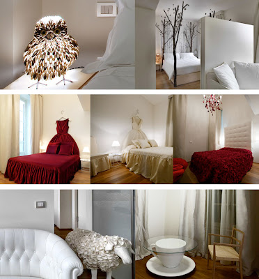


This is a branded hotel, part of the Moschino empire, "where four stars meet a few clouds– and the occasional teacup table, forest bedpost, and rose petal-covered bedspread". I wonder where the idea of cross-marketing a fashion brand with a hotel first started? I always thought cross-marketed cars were so silly, like the LLBean Subaru, etc. Would you be tempted to go here, just based on your love of a fashion brand?

Very mysterious and dark, not light and fluffy like some iterations of children's tales. The promo video for this hotel reads like a mystery novel.
 With gold stilettos and animated bugs of course.


Its all about fashion- seeing, and being seen.
 In a world where hoteliers are like movie stars, this snazzy place is all about the Experience.
 Got your catsuit ready?
Via source

image source
What, you mean by the fashion brand, Moschino? Yup, the very same. 
image source
Who would think within these stately walls, reality would be turned on it's head? 
What happens when you step into a dream? Each room answers this question with themed spaces, inspired by the unconventional side of fairy tales.

"The ordinary world, painted with a surrealist brush".
I love that!

image source
To me, the rooms' success lies in the dramatic lighting and elegant, simple palette. So theatrical, it really sets a mood, don't you think?
6 fanciful settings each different that give name to the 65 rooms of the hotel and that are surrealistic visions obtained by adapting the typical language of fashion to the interior design. The common thread connecting the guestrooms is a fairy tale theme inside a dreamlike environment which tell an optimistic story about a fantasy world and come to three-dimensional life. “Alice’s Room”, “The Petal Room”, “Red Riding Hood”, “Forest”, and “Gold” transform sleep into a dreamy experience, continuously weaving between a fairytale dream and upbeat, optimistic reality. (source)

This is a branded hotel, part of the Moschino empire, "where four stars meet a few clouds– and the occasional teacup table, forest bedpost, and rose petal-covered bedspread". I wonder where the idea of cross-marketing a fashion brand with a hotel first started? I always thought cross-marketed cars were so silly, like the LLBean Subaru, etc. Would you be tempted to go here, just based on your love of a fashion brand?

Very mysterious and dark, not light and fluffy like some iterations of children's tales. The promo video for this hotel reads like a mystery novel.


image source
Even the hotel restaurant serves up branded plates.
Its all about fashion- seeing, and being seen.


Via source
Subscribe to:
Posts (Atom)