Just wanted to say to everyone,

I hope 2008 is an amazing year for all of you...
 I need that fantastic hat! What on earth is it made out of?
 For those unfamiliar with Cirque, they are a circus performance company that encompasses everything that is magical and amazing about acrobatics, theater, lighting, music, choreography, costume, and of course, Color! Anytime a show comes into town, I am first in line to buy tickets, and have even traveled to Las Vegas specifically for their permanent show at the Bellagio, "O". If I ever relocate to Montreal, Canada where they are based, I would love, love, love to work for them.
 I used to create edible paintings for high-end cakes. Lots of celebrity events. Once, we did personal cakes decorated with faux dollar bills for some government function. They flew a chartered, private jet out to pick up the cakes. This one was an enormous pagoda for a wedding
 I can eat an entire pan of brownies in one sitting, if necessary.
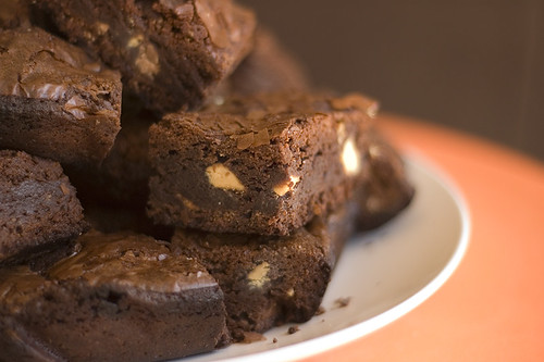 image source
 I am a chicken nacho connoisseur, always on the hunt for the perfect recipe.
 Every birthday, my husband and I design and create birthday "crowns" for each other. They seem to get more and more elaborate every year. This carousel actually spun around.
 Screen stills of Starbucks commercial
 Caribou storefront and coffee packaging
 Caribou has the leaping deer/reindeer, and Starbucks has the siren. Caribou has aqua, Starbucks has forest green. In essence, we could easily swap out Starbucks logo for Caribou's in their commercials, and the product would translate perfectly for their competition. So, am I missing something here?
 Starbucks storefront and coffee packaging
 One blog that never lets me down is Design Meltdown, by Patrick McNeil. Essentially a web designer critiquing and categorizing websites. Fascinating stuff.
Some colors appeal to certain demographics; some have universal appeal; some are trendy; others are boring; but pink is the one color that when used well just makes me a jealous designer. Somehow this color can just ooze with style and elevate a site to an aesthetic other wise not possible. I love how this presumably feminine color can cut across the sex barrier and appeal to men and women alike.
One example of such a terrific site is SheUnlimited. This pink and black site is just beautiful. Looking at this site I can't help but wish I had come up with it. It is so refined, elegant, and just plane tasty. One great lesson to learn from this site is how much a wrapper for content can influence your expected response to the content. Without so much as reading a sentence I presume the content to be inelegant and well thought out; I don't expect flippant sloppy articles. The ability to shape expectations is tremendous and can ultimately lend to the success of a site. (source)
 Consumers will have the power to select the flavor, color, name, logo, label, and tagline for the next Mountain Dew.
 This online experience includes a story-based game that features a live-action short film, and an animated story presenting various challenges that will give consumers the tools to develop every aspect of the new drink. The core idea is this: players have to complete the challenges in order to develop the new flavor of Mountain Dew, with the twist being that next year, people will vote on the best ideas, and the winner will actually be produced.
 The firm in charge of this campaign, Protagonist, is targeting the the 18-29 age bracket, nicknamed "Millennial" consumers. They're also going after other Dew drinkers, and online gamers.
"To the best of our knowledge, a brand has never given consumers this much control," says a company representative. "We felt that the best way to fully engage consumers would be to give them the power to create a new product." (source)
Pepsi will hype the game mostly through online sources--although the company has prepared a 30-second television spot and outdoor executions to promote "DEWmocracy," according to a company representative.
 I can understand wanting to involve your brand loyalists to help drum up some excitement about a new product, but to leave a product's complete development in the hands of the general public? What do you guys think of this approach?
myColor myIdea lets people learn about the colors that inspire some of today’s celebrity personalities in the graphics, fashion, beauty, architecture and interior design industries. Not necessarily trends, just personal preferences.
So, I was curious to see whom Pantone had nabbed for color quotes...
 Patricia Field caught my eye, as she is the fabulous fashion stylist who did "Sex in the City". Turns out, her favorite color is that teeth-gritting ripe green you see above. And what did she have to say about it?
In this color I feel most balanced. It makes me feel calm. It makes me feel natural. It makes me comfortable. It makes me feel oxygen. It makes me feel life.- Patricia Field
Now, correct me if you all feel differently, but hello, calming? Not the word I would have used to describe that color. 
I love PANTONE 65-1-2 C because it reminds me of a beautiful hydrangea, my son's favorite flower. -Kelly Wearstler, Interior DesignerI'm not exactly sure what we are supposed to be getting out of this...

Tim Gunn, co-host of the reality series "Project Runway", chose beige as his inspirational color for interiors. Beige? He says,
There is a unique quality, resonance, richness and aura to this color that soothes and calms me. It’s restorative...It heals, it repairs, and it’s always part of me.-Tim Gunn
I think Pantone might be stretching things a bit, in their attempt to promote a new system of color specification products for graphic designers. To avoid confusion, the Pantone Goe System is different than the Pantone Matching System. I'd try to clarify how this new system differs, but honesty, I found it rather confusing! Those of you who are designers and own any of Pantone's crazy expensive fan decks are probably groaning right now. "Another fan deck to purchase?!"
What do you all think of this new site?
Without content, there is no form. Without form, there is no content. A work of art is realized when form and content are indistinguishable. -Paul Rand
 So simple, but so true. Here are the essential elements to consider in any design, be it interiors, products, logos, art...if it's visual, it's design. (click for bigger stills)
 (Click on image for bigger view)
The colour of a product, its packaging or the material used to promote it is often a crucial way of distinguishing the goods and services of one trader from those of another. The use of colour in a product or its packaging is widely recognised as being crucial to building a brand image and marketing and advertising agencies agonise long and hard when deciding which colour, or shade accurately reflect the brand values. (source)
 Deutsche Telekom, the mother company of T-Mobile, owns the European trademark on a specific color of magenta, to be used within the tele-communications sector.
 Owens-Corning has a trademark on the use of pink for insulation, and Tiffany & Co. has a trademark on its signature robin's-egg blue for their jewelry brand. Just think, if a construction company started using tiffany blue on their building materials, this would not affect Tiffany's brand.
 I love this description:
Ad agencies, publishing houses, operating rooms, office cubicles: dull, duller and dullest.Then along came "Ugly Betty," set in the sleek, chic offices of a high-fashion magazine, and before you could say "Oscar de la Renta," that changed.
Betty Suarez (America Ferrera) and her co-workers spend their days in an environment where steel-gray file cabinets and dust-colored carpeting would be ashamed to show themselves. -source
 Here's what set decorator Archie D'Amico had to say about color's role in the show's set design:
 In the meanwhile, if any of you were considering swapping out your custom header, I would suggest holding off 'til this is fixed.
 For me, it's all about twinkly, colorful light displays. After all, this is the season of lights.
 Check it out, vote for your favorite, or submit some of your own!


