Making an industrial building pretty? Seriously.

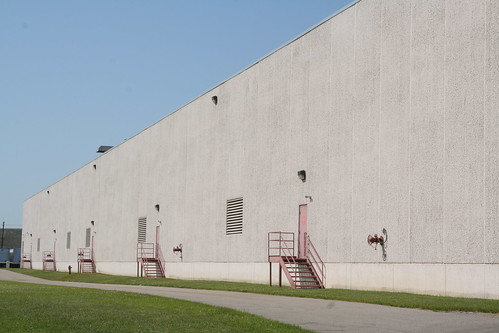
You're driving down the highway, and pass by huge, plain factories or industrial buildings, clad in boring grey concrete facades. Maybe something like this:
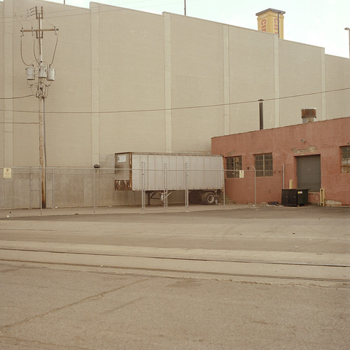
image source

Or this:
image source

or this:
image source

Then, out of no where, this beautiful building appears on the horizon. What a change of pace. It's color!
and it's even interesting up close, too!
images source
This building is located in Germany, and designed using facade tiles by the Creaton Color Studio These are designs by the European architectual color designer, Friedrich Ernst von Garnier. Friedrich is world renown for his work on humanizing industrial facilities and incorporating them more into their environment. You mean that all huge industrial plants don't have to be eyesores? That's the cause he has been championing for years.

Imagine taking colors from nature, and using them in a building's steel shell instead of stark, unharmonious white or grey.
image source

Here's another cool industrial buiding, a shipbuilding shed at Stralsund shipyard, also in Germany.
image source

Friedrich won the European Steel Building Prize in 1999 for this design. The Schwelgern plant was designed in various shades of green, with parts in blue and yellow. It more harmoniously into its environment – e.g. the landscape on the opposite side of the river, in a way that has generally not been the case in industrial buildings this humongous. (source) I think Europeans are much more willing to embrace color than we Americans.

I don't know about you, but when have you seen such a friendly "inviting" factory before?
image source

Have you seen any buildings in your area that integrate into the environment, or are enjoyable to look at, color-wise?

Going crazy for orange

If you love orange, and didn't get enough eye-candy from my latest article on decor8, head back over for more. Holly has taken this color and run with it, in one amazing example after another.
orange
more orange
even more orange
need even more orange?
crash course on color theory, featuring, orange!

Hospital design that makes a difference

Have you ever noticed how most hospitals are imposing, overwhelming places? When I have to go to a hospital, I am always amazed by a.) how easy it is to get lost, and b.) how cold and sterile it is. It's as though there is some unwritten code that hospitals should be intimidating and threatening. Not exactly the kind of place that gives you the warm fuzzies, is it?
image source

With children's hospitals, there is at least some semblance of acknowledgment to try and make a patient more comfortable. During my color consulting training, we spent an entire seminar dedicated to how to use color appropriately, and usefully, in hospitals. It's a huge specialty, so I'm just going to skim the surface for you with some visuals.

There's a new children's hospital being built in Texas,Dell Children's Medical Center of Central Texas, and it is a great example of how you can fully-utilize color. I recently read an article by News 8 in Austin, talking about the project.
Color is interspersed throughout the hospital, adding cheer with bright pops of vibrant color in active spaces like information desks or lobbies, and promoting calmness in spaces where patients are examined or recuperating.Colors within the hospital not only provide visual interest, but they also lead you to specific color-coded departments, like the emergency room or the nurses station. Imagine how your experience in a confusing environment could be assisted by color-aids such as these.

Even the 1,100 hospital staff members will wear color coordinated uniforms so parents will know who's who in the hospital.

Rooms are painted with soft, muted colors which are soothing to anxious children (and their parents!) But not right above the head of the bed, because color casts from the wall could make it difficult for a doctor to diagnose things like jaundice (which turns the skin a yellowish color).

Think about how color is used to promote activity in some instances, and encourage relaxation in others. How can you utilize these enhancing qualities of color in your own spaces?

all images source

Orange, color of the month at decor8

My latest guest article on Orange is up at decor8
Hope you like it!

Color in Graphic Design

I interviewed Christy Ann Coppola, of Coppola Designs, for this article at Creative Latitude, entitled "An Insider's View on Color for Graphic Design". Click here to read it.
hope you enjoy it, and let me know your thoughts!

This is really cool:

Paint Jam Dan Dunn
Watch video

The right color pill helps the medicine go down

I just read an interesting article about colored pills in the pharmaceutical biz.

Think Nexium, the acid reflux disease drug, otherwise known as "the purple pill"
or Pfizer's Viagra, a male impotency pill, with it's distinctly blue hue.

One company that creates colored coatings for medicine, has developed a library of more than 200 pill colors — including "cheesecake" beige, "wasabi" green and "bubble gum" pink.

The coatings, which come in powdered form, are edible and regulated by the federal Food and Drug Administration. They are made primarily of cellulose, a plant-based material derived from either wood pulp or cotton.
image source

Here's another pill-coating company's description of its color-services:
Color Coatings

Color is a critical branding element used in solid dose, pharmaceutical product design. It serves to distinguish a product while influencing the physical and emotional perceptions with physicians, pharmacists and patients. Emotional preferences affect brand preferences, resulting in greater market share gain.
image source
For example, color can be used to visually distinguish different dosage strengths of a drug, in addition to providing an easy method for recognizing a specific medication. Chronically ill patients and older individuals may be taking six or more different tablets daily. In these situations, easy distinctions between drugs can be critical.
image source
Color is important in:

• differentiating pharmaceutical product dosages

• reducing medication administration errors

• enhancing patient compliance

• strengthening brand identity

• establishing trademarks
image source
A number of different studies link color with perceived therapeutic efficacy, site of action and drug strength. Color impacts perceptions of efficacy and relates to the potency of the dose. For example: darker to lighter colors = stronger to weaker dosages.
Interesting! I always knew that the psychology of color came into play in developing products for the market place, but this gives you a better idea of how important color's role really is.


article via Asbury Park Press

Martha Stewart, step aside!

While I was visiting my pal in Pittsburgh, we threw together a craft project for her baby's nursery. We originally saw the project on a Martha Stewart website, but decided to jazz it up more for our "vision" with gradated colors.


We tried pulling in colors from the curtains to keep a unified look, but were rather limited by the tissue paper selection.

Super easy, they were really fun to make. Instructions here. Perhaps for a fiesta party, hanging from trees or an arbor, or above a table?

What were they thinking?

There is a huge debate going on about the new 2012 London Olympics logo. Some people hate it, others defend it passionately. Over the past weeks, all the branding blogs that I read have been abuzz with debate.

In the "love it" camp, you have arguments like:
"2012 is not a logo in the conventional sense. It is a conduit for a larger experience....The 2012 brandmark introduces context via itself which is why we need different tools to asses its value. It does not present itself as the sole content for contemplation, it is a channel for content as well as content itself. You miss half the plot if you assess it as a thing in itself."-Andrew, London

And in the "hate it" camp, you have critiques that discuss the dated appearance and colors (1980's anyone?), the child-like attempt at graffiti, and the approach to reaching a younger audience, and people's general distaste for the design on the whole. Personally, I don't care for it, either. To me, the colors don't scream "athletic achievement", "world-renown tournament", "prestige", or any of the Olympics messages.


I'd love to get your take on the design. What do you think of it? Is it successful?

Stock up on yellow

If you love yellow, this is the season for you. Yellow is quite the rage, and now is the perfect time to get all those items you like, in a color you love!


Neiman Marcus

more delicious yellow treats:

style files

Swoon!

I am visiting my friend in Pittsburgh, PA, and we went to see a short performance called Swoon, by a group of Australian performers called the Swaypoles. Not quite Cirque du Soleil, but I loved the brightly colored costumes.

Climbing the pole
Swayin'
More swayin'
Yup, that's pretty much what they did...sway.
But don't you just love the orange and pink? Juxtaposed against the cold, hard glass and steel of the skyscrapers behind them, I think it mades a lovely composition.

Cool Branding Blog

Okay, so this is vaguely off-topic, but I had to share with you a fabulous new blog.

A little background first:
Part of the color work that I do involves consulting companies in the selection of appropriate colors to represent their brand image. Think of how successful UPS and brown has been, or Tiffany's and its trademarked blue. Not that I personally had anything to do with those particular successes... I wish!
Anyways, I am constantly gobbling up anything I can learn about branding, marketing, the psychology of color as it applies to products and services, etc. I recently found this new venture, and thought, if any of you are entrepreneurially-minded (is that even a word?), you might get a kick out of this, too.

BrandingWire is a collaboration of marketing experts from branding, marketing, PR and design. The "pundits" of BrandingWire not only maintain individual blogs, but also have banded together to collaboratively offer perspectives and commentary on a variety of branding themes. Each month, they focus on a particular branding challenge or topic, and collectively give their perspectives on how they’d apply best branding practices. Talk about behind the scenes scoop!

Their first test case is a fictional scenario, but really fascinating stuff.

It involves a small coffee company. They have a few retail stores and have been in business for 8 years. They roast their own beans on-site (and boy, does it smell wonderful!), their retail sites are wide-open, relaxed, and kind-of country-funky. There is very strong local attachment to the company, but little recognition outside of the geographical area (it’s a family operation but the owner is committed to doing whatever it takes to create a thriving business). Their brand name is OK but certainly not anything special. They have a lame tagline (Great coffee at great prices!) and no distinctive identity pieces. The logo looks like it came out of a branding bargain bin.

They want to grow, though they’re not entirely sure what is the most profitable path…more retail? Franchising? Mail-order? Corporate coffee service? Something new and unique?


Intrigued by what the marketers dreamed up? Read on...