Covering the spectrum-decorating for artists

Flipping through my latest ID magazine, I happened upon a spread about a benefit charity dinner for the American Patrons of Tate. Talk about eye candy!
David Stark, the event designer, needed to find a hook to amuse and entertain an eclectic mix of movers and shakers, including some rather high and mighty artist types. He created tall steel frames that undulated above the rows of dinner tables. 15,000 paint strips were strung together to form curtains which hung from the armature. The color scheme is based on the Tate Museum's signature colors, while the underlying theme pays homage to painting in general.

Here are some other shots of the party design- I thought everything was so pretty. I just love this color combination, it's so fresh and lively. What a great synthesis of marketing and interior design for color.

Orange paint strips drew attention to the main stage area
images source

via ID Magazine

Reader Dilemma-"notice me!" buttons

This week's dilemma has a marketing/branding slant. Our reader dilemma comes from Maryam in Marrakesh, Morocco.
My blog name is My Marrakesh and the blog is about Morocco as well as travel elsewhere. It's a travel and lifestyle blog with stories about our building a house and guest house in Marrakesh. I am trying to decide between these two [blog link] buttons. The feather is a reference to my love of peacocks (there are 9 in my garden) and the guest house we are building is Peacock Pavilions.
For some reason lately, I have been very drawn to hot pinks and rosy pinks. I feel like the color is just super charged, playful and downright fun. But I needed a little Marrakesh red in there, too. I think the pink one is more eye catching and might get noticed more in a sea of blog buttons.
The cream and red button is more in keeping with the colors of my current blog - red and golden sand colors are the colors I think of for Marrakesh. [It's] more elegant. I think it is more classic and restful, but not sure it will get noticed. Also worried it might look a little staid. Please help!

To give you a better feel for Maryam's blog, here is her header:
and her blog color scheme:
Both buttons, designed by Jan at Poppy, are fantastic-great job! Here's my two cents:
I think the cream and red button is certainly more in keeping with the branded look. But I find it hard to read, as the text and the feather are the same value. If you squint at it, they look the same. Another way to check the contrast on a design is to get rid of the color altogether. See what I mean?
So, while I agree that the pink button is definitely more eye-catching, it doesn't match with the rest of the blog, and would seem out of place if it were to be placed in the actual site it's linking to. I would take elements of the pink button, like the great contrast, and apply what you like about that button to the cream/red button. Maybe reverse out the type on a red background?

I don't think it needs to be crowded by the entire URL beneath. I saw a beautiful greeting card on Pigtown*Design's blog, and thought of this button project. I like all the breathing room allotted. I know blog buttons are tiny, and you have to fit a really long blog title into an itsy square, but I'd like to see more negative space.
image source

So, that would be my advice. I tried not to be so long-winded this time, as I'd really like to hear what you all think. Which button do you think works better? How would you handle the "notice me" factor?

Buttons designed by Jan at Poppy

Suggestions?

I have the opportunity to create several webcasts for a colleague's wonderful site, Sensational Color.
The question is, what would people be interested in watching/learning about? For those of you unfamiliar with webcast, they are online presentations that can consist of various elements: video, power-point screens, tracking movements on the computer or web, etc.
The premise for these webcasts is to increase the educational content on color on her site.

So, what do you think I should do a webcast about, within the topic of color? The sky is the limit, but I want to hear what -you- would like to watch!

Reader Dilemma-drowning in beige

This week, our color dilemma comes from a reader in Holland, who wants to add some color inspiration into her home. Let's see if we can help her out!
I have a limited budget, two small children and a very small apartment. In the beginning I started with a very neutral palette because I didn't want to overwhelm my space. Now, however, the neutral has overwhelmed me and I'm drowning in beige! Please help! I need guidance to make a restful, yet exciting and stimulating place to be, without making my apartment seem smaller than it really is.

I'd love to take elements from all three of these photos and mix them to create a palette that was really me.

I'm a little afraid of colour, to be honest. I find it overwhelming. There are so many choices, so many nuances. I find it difficult to choose one and then go with it, which is probably why my apartment is neutral, neutral and neutral some more.
Ashleigh provided us with some photos that inspire her, each paired with a useful break-down of the image's color palette.

So, here we have some greens and blues, balanced by neutrals
Cool, refreshing blues with a teensy bit of brown and a dash of claret...
and bright, cheerful pinks and violets, tempered by sage and olive greens.
Inspired by Ashleigh's color reduction process, I decided to take it one step further, and with my trusty Photoshop, boiled each image down to its bare essential palette, which will make color selection much easier, I would hope.
So, from these condensed palettes, it appears we have a nice soft periwinkle blue, a soothing palette of greens, and a robust rich eggplant with a more muted mauve. Would this palette encompass the entire house, or were they intended for one specific space? Either way, these three palettes work quite nicely together, don't you think?

I would suggest, for the "color cautious", that you ease into color use. If you don't want to commit to painting walls, I would bring color into your spaces through accent pieces-colorful throw pillows, a cheerful area rug, tapestries or art on the wall, etc. Here is a consolidated palette from which you can pull accent colors, or wall colors.


For small spaces, the important thing is to not break up the space too much, because you end up drawing attention to the size. This doesn't mean that each room can't have its own color, though. I would use a light to middle tone on the wall and the same color or a lighter tint on the ceiling. Balance a room painted in warm colors with a cool accent color, and vice versa for cool-colored rooms, making sure to bring in some warmth.

Some room palettes, based on the inspiration photos

Mood-wise, you want "restful, yet exciting and stimulating". I would closely analyze each individual room, as you will probably find that each space will have its own feeling or mood. Perhaps you want your children's rooms to be restful, calming spaces where they sleep and study, whereas the family room might be a space you'd like to encourage conversation and play-time.

How would you rescue Ashleigh from drowning in beige? Let's help bring some color into her world!

Just for fun

image source
A cool tid bit- it's not computer animation. Filmed in my fair hometown city of San Francisco.
Intrigued? See the whole video here.

This is so cool

I just discovered a website (still in beta testing) called pics2color that dissects your photos into color palettes.
For example, here is a break-down of the colors in my July blog banner:

and a few other images from my "inspiration" files:
original image source

original image source
This is too much fun. Talk about time-suckage.

Here, you give it a try! (it will pop up in a new window)
 launch

Psychology of color via Sherwin Williams

In the latest newsletter article from Sherwin Williams, they propose the idea that color and emotions are linked, as proven by psychological and physiological studies. As though this is revolutionary? (Says she, humorously)
I have to chuckle to myself, as I guess it just hasn't occurred to the general public. Even more surprising to me is my increasing discovery that many design professionals lack any understanding about the correlation between color and psychology. I have talked to interior designers who just never really considered the notion.

I have noticed a surge of "color recipes" infiltrating the industry. "Blue in the kitchen decreases your appetite" or "Yellow nurseries cause babies to cry more". These overly-generalized, inaccurate statements can be quite harmful to the intricacies of understanding color. It's like saying, if you have a stomach ache, the one solution is Pepto Bismol.

There are some article links at the bottom of the Sherwin Williams article that delve deeper into the psychology of color. In one, the Aspects of Color, I appreciated this statement:
The study of color is complex, and made difficult by its variety of systems, which include the aesthetic, psychological, physiological, associative, and symbolic.
So true.
Do you ever think about the emotional meaning behind a color when you use it? Decorating a room? Purchasing a product? Looking at a logo or signage?

Reader dilemma: brown and gray together?

This week, our reader question is all about color combinations-what works, and what clashes.
After years of hating the color gray I am finally coming around to it for tile flooring. I am looking at two possibilities. A concrete grayish color and a very dark gray-black color. My dilemma is that the floor will flow into an area I will be using a rug. The rug I want is chocolate brown with teal accents. Can a brown rug go on a gray floor? Since I have bought neither item yet I am concerned that I may not see it correctly in my head.
-Ann
Here's the proposed rug:
Teal damask rug

and the dark or light gray tile floor
steel and silver floor

My two cents: For the purpose of flow and a cohesive color palette, I would allow some of the gray tile to frame the rug. It's also important to consider contrast. Make sure your rug has a different value than the floor. In other words, when you squint at the two colors, side-by-side, they should not blend one into the other. If you chose the darker steel floor, the rug should be lighter; vice versa, if you chose the silver floor, the rug should be darker. With the neutral palette of grays and browns, punctuated by touches of cool-based teal, I think you are good to go.

Since we are such visual-people, here are some examples of brown-based rugs on gray flooring.
Mathew Smyth
(okay, so this may actually be a dark brown floor, but let's pretend for now)

The Rug Company

And if you are still not convinced, here is the oh so popular Kelly Wearstler's Hard Rock Cafe, in blacks, grays, and browns.
Kelly Wearstler
So, my most artistic, astute readers, what do you think Ann should do? What are your feelings on mixing brown and gray?

Logo and storefront redesign-what do you think?

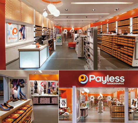
One of my favorite branding blog, Brand New, just posted an article about Payless Shoesource and the redesign of their logo and storefronts.
Without repeating the insights made by Armin, the author, and the comments by his cadre of dedicated design readers, I'd like to talk about the color use. I'm not thrilled with the logo redesign on the whole, but like the improvements that have been made in the storefronts.

image source

What strikes me the most is how so many businesses these days have embraced orange into their corporate branding image. I read a while ago that Home Depot initially chose orange for their logo to communicate that they were a discount brand. But now that Home Depot also owns Design Expo, decidedly not a discount brand, how does that effect the publics perception of their services and products?
image source and source

So, readers, what do you think about this influx of orange into company brand images? Do you think the Payless redesign works? How do you perceive orange? Are we in for orange overkill, ala 1970's?

Reader dilemma Part III-embracing natural "inconveniences"

A "p.s." from our first reader submission caught my eye:
BTW, I would never decorate using the colours in my entry since it wouldn't be practical in Israel. There is an incredible amount of dust in the air and things tend to get dirty very quickly. Those light colours, though very soothing, would mean running around trying to keep everything clean - not for me!
Instead of fighting against the dust in the air, and blocking the incorporation of your color scheme into the entry way, try to think about how to embrace it. Example: think about UPS trucks-the brown color was originally chosen as a practical way to hide road dirt.
image source

There is a German architectural colourist, Friedrich von Garnier, who created these amazing surfaces on the exterior of buildings that incorporate the inevitable "aging" that any structure will eventually go through. This way, no cosmetic retouching was needed. I wrote about some of his other projects here. I looked and looked, but couldn't find any pictures to show you examples of this specific treatment.

But think about this: what about painting in a variety of natural tones that are similar to the color of the dust itself? To take it one step further, consider a decorative finish, like a color-wash or venetian plaster, that varies the surface color and gives it textural interest and amazing hiding power.
Venetian Plaster
Color Wash
decorative finishes by Coloratura, Inc.

Now, your foyer becomes the dramatic, centerpiece entry into your home!
Does anyone else have any suggestions for Ruth on how to incorporate color into a space that gets really dusty?

Reader Design Dilemma Part II

We continue with our first reader's letter, and talk about brown accent walls.

image by Shawn Henderson
Reader dilemma, Part II
I've seen quite a few rooms on Apartment Therapy with one wall painting in chocolate brown and I really love the look. However, I get the impression that brown on the wall is very much affected by the light that is on it. I've seen pictures where the wall looks rich and warm in one picture and a sort of lifeless brown in another. Do you have any idea if this happens in real life?
You are totally correct, the lighting is –critical- to the effectiveness of a paint color.
What looks absolutely stunning in one space could look horrible in another. You really have to take each space on a case by case basis. Here are just some of the things I have to think about when I look at a client's space:
  • What kind of light you get in the room? north facing vs. south facing window, direct sunlight vs. indirect, fluorescent lighting vs. incandescent, small dark room vs. large bright room...
  • Specific needs of each space? architectural details to highlight or camouflage, making the space appear bigger, or more cozy, ceilings high or low...
  • How does this room relate and flow into adjoining rooms?
the list goes on and on. Readers, what are your thoughts on this?

Reader design dilemma

Drum roll, please!
This marks the beginning of a new feature on this blog. Every week, I will select a "color dilemma" submission from a reader, and post it with my professional opinion. I'd love it if you all weigh in with your advise and ideas, too. Topics can range from interior issues to branding your small business. So send in your question and photos, and let the fun begin!

This question submitted by Ruth in Israel. She brings up some excellent points, so I will break it up into several posts in order to more fully address each aspect. unfortunately, she's not in her new house yet, so no pics. So we'll have to use our imagination...

Part I
I should be moving into a new apartment soon. I wanted the apartment to be calm and soothing, but I also wanted it to be warm and inviting. When I think of calm and soothing, I usually think of minimal, zen and cool colours. But when I think of warm and inviting, I think of something full of lots of books, paintings, cushions and very warm colours. These two things seemed to be at cross purposes, until I finally figured out a colour scheme. I want to use cream as my neutral colour, chocolate brown, mossy green, and orange. I think this is relaxing, yet warm.

My question is, what goes where?
I'll be buying a new sofa, painting the walls. I might wallpaper one wall. I might buy a rug for the living room. I will be completely gutting and redoing the bathroom. I have no idea, as of yet, how to carry that colour scheme out anywhere, i.e. which of my colours should go on the floor, which on the rug, which on the sofa what colour tiles for the bathroom walls etc. Any thoughts?
Sofa:
I would stick to a neutral, timeless color for this piece if it is an investment that you hope to have around for many years. Something simple and clean. Colors you love today might bore you 5-10 years from now, or look dated. So, with a neutral base, like cream, you can dress it up and change it around with throw pillows. (July’s House and Garden magazine has a great article on changing the look and feel of your sofa based on the pillows and other accessories around it)

As for walls, and how to determine what goes where, think about this:
It's important to consider your contrasts in light and dark. If it's too harsh, with stark darks and lights, then this can be hard on the eyes. Like-wise, if the contrast is too low between lights and darks, it's too monotonous. Your eye perceives how much light is reflected off a surface, so the choice of where to put a dark color, and where to put a light color is important. In places like Sweden, it seems everyone has a light blonde wood floor. But personally, I feel more grounded in spaces where the floor is darker and feels heavier. As for the placement of colors, if you send some images along, we could get into more specifics.

Branding your blog business with color

There's a great post over on decor8 that has started a lively discussion on blog branding. The comments started rolling in after decor8's author Holly brought up the issue of how she prefers to swap out banners every season. I'd love to continue the discussion here, talking more about color and how it can impact a brand look.

Summer
SpringWinter
Some concerned readers had written Holly, worrying that changing her header would damage the decor8 brand image. This brings up some interesting ideas about what branding is all about, and how variety impacts that consistency.

From a color perspective, I think her brand is going strong. As I said in my comments on the post, there is still a consistency in the logo type treatment and stylized illustration style that all fall within the brand "look and feel". Even within the variety of banners, there are still underlying color aspects that remain consistent, such as the use of white. It's used liberally through all three banners. In technical terms, this is referred to as "leitmotif", which means any sort of recurring theme, whether in music, literature, or art. Or in this case-color. Think about a house interior, with white trim running throughout the house.

Sometimes, part of what makes a blog unique and memorable is that it's not static.
I change out my banner every month, using a colorful background from old paintings that I feel reflect the season.
March -plants start sprouting new green shoots
April-the first flowers of spring are yellow

May-getting outdoors in the warmer weather

Blogs are the new frontier, and part of what makes them so appealing is that they are dynamic, ever-changing entities. A static banner might work for a website, or other traditional media, but for blogs, it's important to stay fresh.

So, readers, how do you feel about an ever-evolving color palette for a branded blog? If color carries its own message, and you're constantly changing out those colors, how does the perception of your message change? If the only thing that remains consistent is the form of the logo, the typeface, and the layout, then is color obsolete? I'd love to hear everyone's additional thoughts on this topic.