 Without repeating the insights made by Armin, the author, and the comments by his cadre of dedicated design readers, I'd like to talk about the color use. I'm not thrilled with the logo redesign on the whole, but like the improvements that have been made in the storefronts.
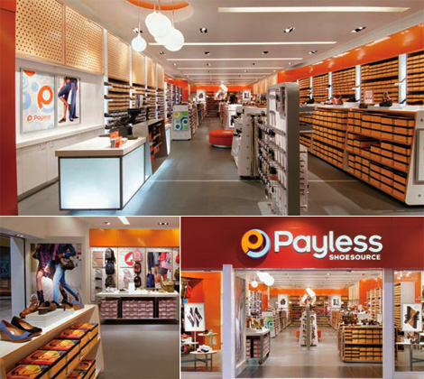 image source
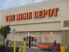
What strikes me the most is how so many businesses these days have embraced orange into their corporate branding image. I read a while ago that Home Depot initially chose orange for their logo to communicate that they were a discount brand. But now that Home Depot also owns Design Expo, decidedly not a discount brand, how does that effect the publics perception of their services and products?
So, readers, what do you think about this influx of orange into company brand images? Do you think the Payless redesign works? How do you perceive orange? Are we in for orange overkill, ala 1970's?
So, readers, what do you think about this influx of orange into company brand images? Do you think the Payless redesign works? How do you perceive orange? Are we in for orange overkill, ala 1970's?
