Got your sunglasses ready?

While walking down the hall of an office complex the other day, I came to a screeching halt in front of the most blazing pink doctor's office I have ever seen. So much so, that I snuck in and tried to discreetly snap pictures to show you all. Of course, the staff was quite suspicious, and I had to use the excuse that I just -loved- their paint job.
Faces have been obscured to protect identities in these "spy" photos

But honestly, I was ready to slide my business card across the counter and offer to do damage control if they ever wanted some help.

Some very well-intentioned individual was on the right track, striving to liven up the space with a cheerful, friendly color. But this salmon pink is so over the top, it's amazingly bright. My photos don't do it justice, so you'll have to trust me when I tell you that standing in that space, you literally vibrate!

Can classic black ever really be replaced?

The NYT just published an article about the rise of super star color plum. Yup, plum.
image source
Evidently, it's being touted as the "new black". Here's my take on the concept- black will never be replaced. Colors will come and go in trends, but we'll always have our staples like black, white, brown, neutrals.

In any case, it's refreshing to see variations of violet being embraced in the marketplace. In the past, it's been one of the least-used colors for marketing because it's so hard to pin down. Sandwiched in between red and blue, violet can swing in two radically different directions. Blue violets have similar characteristics to blue- calm, dependable, trustworthy, rational, cool. Red violets, on the other hand, tend to adopt those traits more like its companion red- active, strong, passionate, hot.
image source

Violet has often been used to represent the mystical or spiritual. It's often seen as artistic, eccentric, or quirky, even romantic. Deep violets can be regal and majestic. So now, marketers are tapping into those associations to bring you everything from credit cards, internet service, and water.
Plum TV is a a channel available in resort communities like Aspen, the Hamptons, and Martha's Vineyard.
“Plum says calm; plum says clean; plum says health,” said a rep at Penta Water in Carlsbad, Calif. “Other products in the water category are blue, clear, red,” he added. “This color came out as a consistent representation of vitality, a pure product.” source

Redplum coupons

What fascinates me is the reinforcement of the color with the name. All these companies seem to feel they must attach the word "plum" to their products in order to get across their meaning. I think alot of that comes from the ambivalence of the color's attributes. Plum can range anywhere on the spectrum of violets, and perhaps without the term "plum", could be misconstrued as having different characteristics from those marketers hoped to convey.
The Plum Card from American Express for business owners.
In the article, a marketer reinforces this issue:
“When we were looking at the color of the plastic (during the planning stages), we wanted something classy and sophisticated, and the choice was a shade we called 'burgundy.' " But the company did not want to call it burgundy when marketing it, he added, for fear of confusion with wine brands.
What's your take on the trend? Do you think these companies need the word "plum" to drive home the point of using this color for their product or service? What do you think of when you see the color?

Drawing on walls

My friend Amy just emailed me about a fabulous product she read about on Daily Candy: magnetic chalkboard paint.

image source
How cool is that? Not only can you now draw on your walls, but you can also stick stuff directly to them! The thing I most appreciate about this concept is that chalkboards don't have to be black or green. No, now you can have blues and purples and orange or whatever suits your fancy.
image source
I remember when I was a teenager, my walls were absolutely plastered with pages from magazines (mostly cute boys), photos of friends, posters, mementos... You could barely see the walls. And I can only imagine the damage I probably did to the walls themselves, with sticky tape and thumbtacks. This product seems like the perfect solution.

I remember seeing a great use for chalkboard paint in a family's house- they painted the bathroom walls, then wrote notes to themselves and each other (keeping it clean, of course).

Evidently, you can make your own chalkboard paint, too (via Martha Stewart)

image source
And here's another idea- the chalkboard paint doesn't have to completely cover a space- you can artistically end it wherever you please.

Alas, I can't vouch for the quality of the paint. Have any of you had any experience with this product? What creative ways would you use it?

Reader Design Dilemma-Penny's Kitchen

Reader Penelope wants to give her "kit" kitchen a cosmetic make-over. So let's roll up our sleeves and see what we've got to work with!

Here's her kitchen, ready for some sprucing up.
"The cupboards are a pale pinky beige that I intend to paint white and install new handles (chrome), as well as install a new shelf (white) somewhere above the cupboards.
My laminate benchtop is a swirly, "natural rock inspired" pink/violet/blue monstrosity, but we're stuck with it, and I'd like to make the best of it.
Here's the room on the other side of the kitchen which we don't actually use as a dining area."
And for the most important part- what colors does Penny like?
images source
"My eye tends to be drawn to soft colours, like icey pink and blue, even soft lavendar. I just don't know what will go best with the benchtops we have, although it does incorporate a mixture of these tones."

I think Penny is on the right track with her inspirational photos showing soft pastels with a retro feel. The counter-tops are unfortunate, for sure, but not a lost cause. With the focus drawn away from the counters, and onto the walls, they won't stand out quite so distinctly.

So, the first question I would ask would be about lighting. Is the kitchen dark during the day, or does it get lots of bright natural lighting?
In this mock-up, I pulled a pastel blue from one of Penny's inspiration photos for the walls, and a light pink for the ceiling.

images source
A nice solution to give the illusion of sunlight is using buttery yellow, like this photo Penny submitted. Love the copper pots against the yellow and white-lovely!
drape pattern source
In taking a closer look at the second kitchen picture, I see other areas where color can be incorporated. Notice I pulled the yellow up onto the ceiling to de-emphasize it's low height. The curtain leading into a back room (pantry?) could be replaced by colorful upholstery fabric quite easily. Our designer-readers might have some good suggestions for what might work there.

To draw attention away from the mauve tones in the counter-top, you could try pulling out one of the other colors you like better, like light blue or lilac (as long as it isn't too gray which can quickly translate to dingy )

Also, by swapping out the back splash tiles (if this is an option) for something more updated in color, it would draw attention away from the mauve theme going on.
You might even be able to paint over it. (but -only- if it doesn't get wet frequently) A crisp bright white for the trim would also liven up the space. Perhaps a fun light fixture with some full-spectrum bulbs to brighten the kitchen? Play around with the colors of the items displayed on the shelves-you can incorporate the pastel palette more completely.


image source
Since the kitchen is so small, several more shelves stacked above would offer more storage space, and more design opportunities. Granted, this kitchen example has lilac cabinets instead of white, but feel how refreshing and alive this space feels! Besides, who says cabinets have to be white or wood?

So, that's my initial take on Penny's kitchen make-over. What would you suggest for her space? Please share your ideas!

Stres-reduction test...in an airport

Does serenity adds security? BWI (Baltimore Washington International Airport) will be rolling out the first of its kind pilot program for stress reduction in specific airport screening areas. I think this is a fabulous idea, as airports (especially post 9-11) are extremely stressful places. Racing to catch a plane, stuck in lines that move at a snails pace, then jostling to strip off all offending articles of clothing and accessories at the screening area, etc. I find myself much more anxious and short-tempered in airports.
This is a description of the special screening area:
Mauve, blue and purple panels of lights glow, low decibel ambient 'spa' music hums, and smiling employees offer quiet greetings and assistance.
But if these images from TSA's promo video are any indication of what is to come, I'm not sure how "soothed" I'll feel!
TSA planners have been tinkering for months in a warehouse at Ronald Reagan Washington National Airport, testing these new aspects "You can actually influence some behavior subliminally through color," said Catherine Lillie, head of the checkpoint-testing team. source

Coming from a profession where the psychological effects of color is basic knowledge, I have to chuckle at her seeming incredulity over the idea.

What do you think of the concept?

Back to basics- Starbucks waxes nostalgic

There are three camps of coffee drinkers. Those who openly admit to loving Starbucks; those who love it, but are ashamed to admit it; and those who love to hate Starbucks. Don't you agree? That being said, whatever camp you come from, have you been into a Starbucks recently? Notice anything different about their logo?
image source
After a hiatus of 9 years, Howard Schultz is back to rescue Starbucks from its sad decline. "Starbucks unleashed an unprecedented wave of brand nostalgia by deploying the original Starbucks logo on the masses"-Brand New

According to the Wall Street Journal, this new itteration isn’t permanent–the retro logo is being used temporarily. But as they so astutely say, "in the annals of brand identity, switching away from a high-recognition logo–even for a promotion–is an unusual move."
There's a tidal wave of talk going on in the blogosphere.

For your reference, here's where the logo has been, and where it has gone again:

From affirming green, to dull brown, I fear the change was not a good move, other than to stir up buzz. (get it? "stir" up "buzz"? Ah, I crack myself up...) The Starbucks logo had established quite an identity for itself. Even from far away, the green circle on a coffee cup was pretty darn identifiable. Brown is a difficult color to use for branding because it lacks pizazz. UPS chose to use the color because it hid the dust on their trucks. Can you think of any other well-recognized brand that uses brown successfully?

What do you think of this new transition from what the public is familiar with, to something less, dare I say, remarkable?

Recreating your favorite franchise at home

Randomly surfing the variety of design discussion forums out there, I found a posting on HGTV's discussion board that "revealed" several of Panera Bread's interior wall colors. I never knew they were top secret, but I can't tell you how many times I have had a client ask for their colors. Instead of using these exact colors, I steer people towards using colors appropriate for their particular spaces that may be evocative of this franchise's visual look.
That warm orangey color is from Benjamin Moore called Golden harvest 2157-02

It's great to find inspiration in spaces you love, but don't get hung up on what color was used exactly. I want to tear my hair out when I read shelter magazines stating this or that designer's favorite paint colors, giving you the exact paint brand and code, as though you can replicate their design simply by using their color choices. Colors will vary dramatically based on the context of how they are used.
House Beautiful magazine

The gold color on the right is evidently Ben Moore Semolina#2155-40, just for your reference.
Love the blue and orange combo-isn't it cheerful? And really plays up the warm honey tones in the breads.These were the only pics I was able to snap at my local Panera Bread, as evidently, picture- taking in the store is not permitted. I was quickly asked to put my camera away. Probably didn't help that I was toting this enormous camera with large lenses... Not the most subtle of approaches- I don't think I'd make a very good spy!

Count-down to CA?

Some of you might notice I've got a new widget up on the right sidebar, part-way down the page. We're moving back to California at the end of June (!), and I thought this would be a neat way to keep track. After 7 years living on the east coast, first in upstate NY, then in Maryland, my husband, dog Lucy, and I are moving back to the Bay Area (we're both from the area originally). We've met so many wonderful people, and really grown attached to quirky B'more. I also thought the counter would be helpful for those of you in the Baltimore/DC area who might have been considering using my consultation services to help you with color selection, but hadn't gotten around to it just yet. Things are going to start getting crazy as our relocation date draws closer, so if you were thinking of calling me later, this is your heads up!

But not to worry, I love writing this blog, and will continue to pepper you with color tid-bits regardless of where in the world I'm living. That's the beauty of the blogosphere-isn't it fantastic?

Not your average kitchen appliance

Are you frustrated by the limited color options out there for kitchen appliances? Not into stainless steel, white or black? Join the club. Reader Denise wrote to me, asking for some advice:
I'm getting ready to buy all new kitchen appliances; hooray! The trouble is, my kitchen is very open into my family room, and my house is quite colorful, with lots of Mexican and abstract influences--and lots and lots of color. To me, stainless-steel (or, God forbid, black) appliances would look terrible in my house--too sterile in the case of the stainless steel, and too dark in the case of the black.

Although my preference for the appliance color is bisque (of the limited options), I'm trying to think ahead to the eventual resale of my home, too. Is there an up-and-coming appliance color that I should consider? Everything I see in model homes is stainless steel or black, both of which leave me (you guessed it) COLD!

Can you help me?
Denise
Rachel's humble kitchen
(We rent, so I didn't have anything to do with the design choices. I will say that white appliances are a pain to keep clean!)

To help tackle Denise's appliance quandary, I brought in the help of the very talented and knowledgeable kitchen designer, Susan Serra, author of the blog The Kitchen Designer.
Take it away Susan!

Colored Appliances, it's all the rage now. Color is in our lives as never before, and has entered our kitchens, often with gusto! And, why not? We are loving our strong, pro, appliances and often want to showcase them in an equally strong way, or, for that matter, in a whimsical way. The rules for blending and matching color have been continually redefined, and not by the "experts" but by you. Individual expression now trumps "safe!"
Jen-Air oil-rubbed bronze series
Appliance manufacturers have gone color-crazy! We have purples, we have bronzes, many colors of blue and on and on.
image source
I consider Viking to be a leader of color appliances, going back quite a few years now. Viking has only expanded their colors for their appliances year after year.

Aga, always into color, brought in a soft purple, called heather.
image source
note: AGA discontinued the yellow and royal blue and added pillar box red which does not appear on their site
image source
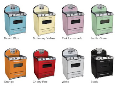
And one sees lots of color in retro appliances, such as the very cool Big Chill line of appliances. I'm not a retro fan, but this line is awesome.

And, talk about color? What about Blue Star? Sit down for this one...190 colors!
You can even play around with how one of their stoves would look in a variety of colors

It's all good. Or, is it?

Of course, the appliance manufacturers would just love for you to buy a whole suite of appliances in the color of your choice. And, so, one will see this concept in manufacturer's advertising. But, wait, what happens if, down the road, one appliance needs to be replaced and that color is no longer available? Something to think about, to plan for.

Color CAN be done in a temporary way for your appliances. Dishwasher and Refrigerators can have panels of bold color, changeable as one desires.
image source
Or, another elegant way to incorporate color, short of an entire suite of color, is to choose one appliance, perhaps the range, which may be situated as a focal point, and select a color that will be picked up elsewhere in the kitchen. Thus, the color is isolated, yet, significant. Yet, another idea is to have an appliance painted locally, via a special process just for appliances.
image source

As the color story for 2008 moves toward nature, such as greens and blues, even elegant shades such as our old friends, black and white, take care not to follow trends solely because the colors look fresh and new. Appliances are not pillows...they may last you decades!

Here's my advice...follow your heart, keeping one foot solidly on the ground.

Added thanks to Danielle from Canton Kitchens for additional picture links