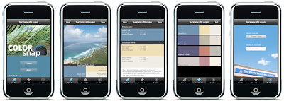
Phone color apps- are they really all that?

I don't personally have an iPhone, or other blackberry type device, but I'm always fascinated by the latest and greatest apps available...the color-related ones, in any case.
SW's Color Snap

Designhole recently wrote a great review of Benjamin Moore and Sherwin Williams color-matching applications, both free for downloading. She astutely summarizes, "No color app is going to identify a color correctly when the camera is the problem. How could both companies fail to see this? At least they’re free."
BM Color Capture

The cliff notes version? These apps are a great jumping-off point, but just remember you are looking at two completely different types of color- additive (light source) and subtractive (pigment). There are so many factors that get in between you and the recording of your perfect color. Like any other camera/compute screen, color calibration, color cast, light source, and many other factors will influence what you see. Color is all about context, so if the white point on your iPhone monitor is leaning more towards a warm tone or a cool tone, your color will not be accurate.

For another take, you can read this color app analysis.

Anyone have either of these nifty applications? What do you think of what paint companies are trying to do? Do you think it's successful? Let's discuss!

(Added 7-6-09: be sure to read the comments from this blog post, as there was a fabulous discussion that ensued. Great nitty gritty details about subtractive versus additive color mixing)

Designer advice...it depends

The Washington Post just published an article entitled, Grad Design Guide. There are some great little tid bits of advice, like
"for walls, use a super-matte finish, which will conceal imperfections."
So true. Shiny paint will only draw attention to any bumps, drips, nail pops, etc in the wall surfaces.
image source
Notice the difference in the wall surface between the shiny stripes and the matte/flat stripes? The shiny finish really magnifies those wall imperfections.

But I take issue with one of the tips in the Paint section:
"If you paint, use one color rather than trying to find a different color for each room; that will help the overall space seem larger."
So not true. Define each space so that it has it's own unique character.
image source
By paying close attention to how one color flows into the next and works as a cohesive palette, you can actually make a space feel bigger by mixing up your color use.

Anyone have any great color design tips they'd like to share? What tips would you advise someone just moving into their first teensie apartment?

In honor of SF Victorians

I give you: eye candy

I am always blown away by the spectacular color treatments of these buildings. They are all over San Francisco, but these particular ones are from the Hayes Valley area.

Color gets a boost Up in 3-D

You simply MUST go see the latest Pixar movie, Up. Make sure you see the 3-D version, as it adds a ton to the viewing experience.
The colors and the animation are just phenomenal.

image source
At the beginning of the film, a short montage, called "Married Life" fills the viewer in on back-history of the main character, Carl, before moving to the present tense of the story.
image source
It encapsulates Carl and his wife Ellie's life together, including a daring dip into reality with a really sad scene at the doctor's after a miscarriage. What really helps to drive home this montage is the use of color to illustrate each stage of the character's lives together.

I was thrilled to find an article that touched upon this topic a little bit:
If you watch the scene closely, you also will notice that the color palette shifts to reflect the nature of Carl and Ellie's relationship. When they are young, the shades are sepia-toned, suggesting something from the 1930s. In the prime of their lives, the colors are richer -- vibrant greens and blues. "Hopefully it's not something the audience is even conscious of," [director Pete] Docter says.
There aren't too many movie stills online yet, so you'll have to go see the movie to experience the full effect.
I am especially fond of the old man's house. A funny coincidence: before I saw the movie, as a joke, I had just created an outrageously colorful mock-up for a client, so I was tickled to see Pixar's version of an equally-vibrant paint job. Oh, how fabulous would that be to work for Pixar? Their campus is a mere 10 minutes away from me in Emeryville. Too bad they don't have a job position exclusively for color consultations. Ah well, one can dream...

all images (except my crazy house) copyright Pixar/Disney

Playin' it cool

Can mayonnaise be cool? Miracle Whip, the mayo substitute, is sure trying.
image source
Before on left, new label on right
Gone are the swirly-twirlies, the sunbursts and loopty-doo's. Instead, Kraft has reverted to a largely white label and simpler look. The brand colors are the same, but the balance has shifted from spritely blues to sterile white. To me, this feels distinctly "generic", but maybe that's because I've grown up associating white or plain labels with discount brands. Does anyone feel the same? I imagine European brands must have a different look and feel to them.

image source

With this brand new look, and a slick ad campaign, Kraft is courting youngsters in the 18-35 year old age group, relying on this sparse, retro feeling label and 'in your face' tag line, "We will not tone it down". But come on folks, it's still just mayonnaise! I never really pictured mayonnaise substitute as a rebellious, live-out-loud type of condiment.

image source
Added to that, they have placed videos on YouTube, and even have a Facebook page and free application called Zingr. I understand their demographic has gone digital, but this seems to be a bit of a stretch. Of course, they've got me writing and linking to it, so maybe it does work.

"If we can get 'zing' adopted as part of the digital vernacular, it will be tied into everything else we're doing," says a company spokesperson. (source)

Personally, I can't see getting that excited over mayonnaise. Any takers?

Healthy hospital design

Hospitals are for healing, right? So why do most fall short when it comes to the design aspect of the building? They always seem to be imposing, cold, sterile, and impossible to navigate. But there are some shining stars out there that take a completely different approach. Take King's Mill Hospital in the UK, for example.
image source
The designer chose warm colors for the entrance, drawing visitors into the building and putting them at ease. The colors become cooler blues and greens around the sides of the building, reflecting the countryside location and providing a calming feeling.
image source
This color coding also helps to direct visitors to the appropriate areas of the building.
image source
I just love that the designers have broken out of the monochromatic box to give patients, visitors, and staff a cheerful, uplifting environment in which to work and heal.

What do you think of this building?

Texting emotions

Not sure of the tone of a message? Soon, you'll be able to just check the color of your key pad. Nokia is applying for a patent for a system that would allow cell phone users to program a color to glow on the recipient's phone key pad according to the mood the caller/texter wants to convey.

image source
According to it's patent application,
"Light messaging allows a user to express a mood while having an ongoing call or while sending a text message. The light messaging may set the tone of the communication. People react to lights and colors very deeply and emotionally. Thus, using lights of an electronic device for light messaging allows enriched and improved user experiences with a new level of communication"

What do you think of this? Do you think people will "get it"?

What a difference a make-over makes

Want to see the power of color? I recently had coffee with a local interior designer, Florence Goguely, to chat about her collaborative work with Cecile Picard involving color design. While scrolling through images on her laptop of a fabulous elementary school project (more on that in a later post), I caught a glimpse of some amazing 'before' and 'after' shots of hotel make-over. Intrigued, I wanted to see more. Florence was kind enough to share those photos with me, so that I could in turn share them with you. Using just paint and a few decorative elements, this hotel went from blah to hazzah! Color me impressed.
The Stanford Terrace Inn was nothing worth stopping for, design-wise. Located in posh Palo Alto, across from Stanford University, it lacked the pizazz to draw visitors. It's drab exterior said 'out-dated residence', not 'chic, sophisticated boutique accomodations'. But wow, swap out the green awnings, brighten up the palette with warm, cheerful, punchy tones, and it suddenly becomes an entirely different establishment.This dark gauntlet of a hallway was anything but inviting. With a coat of high-gloss sky blue paint on the ceilings to reflect light, sconces on the walls, some big mirrors with ornate painted "frames", and a warm peachy wall color, it's a totally different story, now.
Love that mediteranean color palette. Add a few citrusy umbrellas, some potted plants and deck seating, and voila, a welcoming, relaxing environment.Can you believe it's the same hotel?
What an amazing transformation.

images copyright Florence Goguely
Sophie's Colours

I just came across the work of Sophie Smallhorn, a British artist.
Best known for her wall-mounted, chromatically-inspired pieced, she also takes commissions on larger pieces, working as a color consultant. Her work is vibrant and cheerful- more like fine art than interior design. She certainly has an identifiable "look" for which she is commissioned.

Here are a few examples I found of her work:
The City Academy school in Nottingham. I love how each floor or area is defined by it's own gradated palette of cheerful hues.
And a fabulous treatment of colored vinyl bands for revolving doors at the Canary Warf in London. Inside...images source
...and outside. So playful and whimsical.
image source
This installation makes for a dramatic greeting- bold blocks of color at the entrance to the Underground Station from Canada Place Mall.
It's amazing what art and color can do to spice up other-wise boring, utilitarian spaces, don't you think? Have you seen any great public art installations?