Guest post: The evolution of a product line

Today's guest blog post comes from Libby Wilkie. First, a bit about her fascinating line of work:
Other than being addicted to blogging (An Eye for Detail), what do I do? I earn a living by representing artists, surface designers specifically, and licensing their work to manufacturers of all sorts of home furnishings products. For many years before I became an artist’s rep, I painted and photoshopped many a product line for various manufacturers. I, too, am a surface designer, although I don’t have much time to design any more.
The evolution of a product line
By Libby Wilkie

Color, as you can guess, is critical to the marketing success of a product. If a product jumps off the shelf, asking to be bought, it is invariably due to the color(s).

I thought I would give you an example and walk you through the process with one of my Christmas programs (no longer on the market). But in it’s day (two years ago) it was probably the most lucrative program I have designed.


I’m talking about a collection of ceramics called “Nordic Stitch”. It was done for a specific retailer, and I worked through the manufacturer (a long time customer) who had it manufactured in China.
Christmas. It’s a wide open category…and yet, it is also very narrow. Color is critical. Red. And more red. And red yet again. Sure, we see those great contemporary, fun colors for Christmas, such as magenta, and bright blue and hot lime green. They are fun but they are trendy, and they appeal to a certain, limited customer base. To get to the mass market you need red.

Here’s the final collection, an ad from the retailer.
I had these linens from my mother-in-law. She had bought these many years ago in Scandinavia and every Christmas, as long as I knew her, she always had them out on the table. Most of what was left were small squares: not really large enough for napkins… they became a sort of doily or just a decorative detail on the table. I always had my eye on them! And one Christmas, several years before she died, she offered them to me. Yes! I gladly accepted.
I tried scanning the actual linens,


then manipulated the graphic elements and actually handpainted them on paper.
We (the stylist at the manufacturer) and I then researched all sorts of shapes and products that would be appropriate for this design, to then present to the buyer. Obviously, plates, mugs, bowls, serving bowls, and candlesticks were the first choice in shape. But we also wanted to add some unique and slightly different offerings.


A snake plate and compote bowl, to name a few. Here are the research pieces and the final formats.

Guest Post: A colorful tour of Ottawa


Today's post comes from designer Kelly James, half the dynamic due of blog of Design Ties.
Here's Kelly on color:
I'm totally obsessed with interior decorating. I think about it ALL the time. I need more rooms to decorate before my head explodes!! And I'm obsessed with colour too. The more colour, the more I like it!! I’m so honoured that Rachel asked me to write a guest post for her. I love reading Rachel’s colourful blog, and I’m excited to bring a bit of colour from my part of the world to Hue.
Ottawa: Canada's Colourful Capital
By Kelly James

I moved to Ottawa in 1998, and it feels like home to me now. There are lots of fun things to see and do here – and lots of colour too!! Let’s go on a tour of Ottawa, Canada's colourful capital...
image source
Winterlude 
Ottawa has the world's longest natural skating rink, and it’s the centerpiece of Winterlude , a two-week celebration of winter. Where else but in Canada would people actually celebrate being cold and covered with snow?? ;-)
image source
Winterlude highlights include skating the 7.8km (4.9 mile) Rideau Canal  
images source
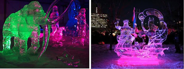
and colourful ice sculptures…

Canadian Tulip Festival
Once winter is over and the tulips start to bloom, it’s time for the Canadian Tulip Festival. Over 600,000 people from Canada, the US, Europe, and Asia come to Ottawa every May to look at the tulips and take in a variety of events that are part of the world’s largest tulip festival!!
image source
 In the fall of 1945, Princess Juliana of the Netherlands presented Ottawa with a thank-you gift of 100,000 tulip bulbs. The gift was given in appreciation of the safe haven that Ottawa provided to the Dutch royal family when they were exiled during World War II. Those 100,000 bulbs have now grown to over three million tulips, making Ottawa super-colourful in April and May…

Canada Day fireworks
Every July 1st, there's a huge party on Parliament Hill to celebrate Canada Day. This year is Canada's 143rd birthday.
image source 
I think we're looking pretty good for our age :-)


image source
There’s also the Sound of Light Fireworks Competition  for five nights every summer at the Casino du Lac Leamy, just over the bridge from Ottawa in Gatineau, Quebec.

Autumn colours
In the fall, the Ottawa region is alive with the colour. Maple trees turn blazing shads of yellow, orange, and red.
 image source
These are some shots of Gatineau Park

The ByWard Market
The ByWard Market  is in the heart of Ottawa. It was established in 1826 by Colonel John By, and today it’s one of Canada’s oldest and largest public markets. There are restaurants, bars, and shops to visit year-round.
 images source
In the summer, flower and fruit & veggie vendors add even more colour to the Market.

RCMP Musical Ride 

 The RCMP  was originally formed in 1873 to preserve peace on the Canadian frontier.

image source
 The RCMP Musical Ride, a world-renowned military pageant performed with 32 horses and riders, was first produced publicly in Regina, Saskatchewan in 1887. You can visit the RCMP stables and the Musical Ride Centre in Ottawa year-round. When they aren’t away on tour, you'll see the beautiful horses and their riders in action practicing their routines, as well as the farrier station, the tack room, and the carriages used in royal escorts.

BeaverTails
Don’t worry, no water rodents are harmed in the making of a BeaverTail — but your arteries might be!! A BeaverTail is a long, flat, oval piece of pastry that’s deep fried and then covered with various toppings.
  images source
My favourite is the Killaloe Sunrise – sugar, cinnamon, and freshly squeezed lemon juice. In the summer, you can hit the Beavertail shack in the Market and a few other locations around the city. But the best Beavertails are the ones on the canal in the middle of winter.

So there it is, a little taste of colourful Ottawa for you. There’s a lot more to do and see here, but I’m supposed to keep my post to around 400 words, which I’ve already totally overshot!!

Guest Post: What are Modern Colors?

Kelly Berg is an Interior Designer, Color Consultant and Writer/Blogger. Established in 2003, her business, Arte Styling, focuses on Interior Design and Color Psychology with the mission to inspire individuals and organizations to express their authenticity and truest design visions. Kelly holds a B.F.A. in Interior Design from the Design Institute of San Diego, a B.A in Communication from U.C. San Diego and is a member of the IIDA and IACC-NA. Her blog was born out a desire to learn and share unique color and design perspectives and to (hopefully) encourage others to do the same.

What are “Modern” Colors?
By Kelly Berg

Donʼt know? Letʼs do a little Google image search.

Hereʼs what Google image pulls for the term “Modern Colors”.


And hereʼs what pops up when we enter the search term “Modern Interior Colors”. Relatively colorful, right?

Now look what happens when we eliminate the word “color” and enter a term like “Modern Living Room”. Notice anything different?

Here, letʼs look a little closer...

What colors do you see?

Pretty achromatic.

Iʼm confused. Shouldnʼt a search for “Modern Living Room” bring up similar images to “Modern Interior Colors?” Why is it that by eliminating the word “color” we are left with no color at all? That might seem like a strange question with an obvious answer - I didnʼt ask for color, so Iʼm not going to get it. But think about that for a minute. Basically, whatʼs being communicated is that a modern living room is most often described, at least through Google images, as a room with no color.

Google images isnʼt the only place youʼll find this theory.

Check out some of these homes from Dwell, the shelter magazine with the tagline “At Home in the Modern World.”

image source

image source
image source
image source

image source


image source
Overall, weʼre not getting much color here, are we? Itʼs pretty much white, wood, and steel with an occasional pop of red and black. In looking at these images, I canʼt help but wonder if Dwell is defining a color palette for the “modern” home? Or is that giving the publication too much credit?

Who decides whatʼs “modern” anyway?

The dictionary defines modern as:
mod·ern  [mod-ern] –adjective
  1. of or pertaining to present and recent time; not ancient or remote: modern city life.
  2. characteristic of present and recent time; contemporary; not antiquated or obsolete: modern viewpoints.
  3. of or pertaining to the historical period following the Middle Ages: modern European history.
  4. of, pertaining to, or characteristic of contemporary styles of art, literature, music, etc., that reject traditionally accepted or sanctioned forms and emphasize individual experimentation and sensibility.

Not sure if that helps us with color too much. Maybe the idea of achromatic living spaces came from the Modernist architectural movement of the 1920s to 1940s? We generally think of this movement as producing streamlined designs with minimal decorative properties - color being one of those properties.

Although, it is a bit of a misnomer that color wasn’t used during the Modernist movement. Curiously enough, Josef Albers, famous for his color studies book “Interaction of Color”, was a student of the famous Bauhaus school. And early on, Walter Gropius, the founder of Bauhaus, hired color legend Johannes Itten to teach at the school! (Great article at AT , “The History of Bauhaus and Its Influence”)

image source 
And if that’s not enough, KT Color recently unveiled a collection of paint colors that are based on hues commonly used by Le Corbusier...and they aren’t just shades of grey.

So where does that leave us with “Modern” colors? I actually found my answer by looking into the past. (Ironic, huh?) I have this amazing book, Space for Living: Creative Interior Decoration and Design, written by Paul T Frankl in 1938. Mr. Frankl was an architect-turned-designer who embraced American Modernism. He explains the relationship between modern design and color so eloquently:
“To be modern is to feel young, to be full of vigor and freshness, to be exciting to ourselves and to others, to enjoy life, to enjoy what we do and to have our work communicate to others the joy and pleasure that went into doing it. What part of our job would be better fitted to express our moods, our joys and our sorrows than the color scheme in its liveliness, its animation, its fragrancy, freshness and vividness? To be successful we must have complete confidence in ourselves.”
So, what do “Modern” colors mean to you? Are they like Dwell, with a focus on “natural” materials such as steel, concrete, wood, etc? Or are they anything you want them to be, representing vigor and freshness and excitement?

Guest post: Why Do Men Fear Painting Wood?

Today's post comes from Kristie Barnett, the owner of StoneBrook Staging and Interior Styling. Additionally, she blogs about decoration inspiration, collections, bargain hunting, party planning, and using color in your home.  Kristie says, as a Home Stager, she knows that paint colors have a profound influence on a buyer's perception of a property's desirability.  And she's seen how the right colors can improve the place we call home and the way we live in it

Take it away, Kristie!


Thank you, Rachel, for letting me hang out on your fabulous blog today!  As an interior stylist and home stager, my job sometimes requires me to ask (and answer) the hard questions.  Read on:

Why do men fear painting wood
By Kristie Barnett

It's an age-old question:  why do men fear painting wood?  I can't tell you how many times the following has occurred:  I have a color consultation with the lady of the house.   There are some horrible 1970s-1980s pieces of wood furniture, dreaded fake paneling in the den, or  dated wood cabinets in the kitchen.     

After discussing budget and options, the lady and I come up with a frugal but dramatic plan that includes painting said bad furniture or paneling.  I show her relevant photos to build her confidence in our choices.  Lady is thrilled, I leave, she calls me the next day and says her husband vetoed painting the wood.  Vetoed?  What is he, the President of the United States?

image source
I've learned my lesson.  Now when I know there might be wood paneling involved, I insist on the husband being present for the consult.   Surely, I can make him see the error of his ways!  Well, sometimes I can.  Other times, not so much.  What's interesting to me is that men have difficulty articulating WHY they don't want to paint the wood!  Is this primal?  Genetic?  Hormonal?

So I've been asking men all over the same question:  why are you so resistant to painting wood?  Here are some of the responses I have gotten:
 image source
1.  "You should never paint good wood."   Uhhh, do you call thin 1970's fake paneling "good" wood?  It's not even real wood, is it?  Just wood-like.  Woodish.  I can understand not wanting to defile the real tongue and groove heavy-duty stuff (I'm not completely heartless), even though I might try to talk you into painting that, too, if it's holding back the overall design.

2.  "It's just not right.  It compromises the integrity of the wood."  Well, if you put it that way . . .  OK, do you really believe that painting wood is immoral?  A crime against nature and all that is natural?  Can knotty pine feel pain?

 I guarantee you that this kitchen was in a lot more pain before I got my hands on it.

image source
And my favorite:  3.  "You can never go back once you paint wood."  Why would you want to go back?  To 1972????  I have never known anyone to strip the paint off of painted wood paneling once it's been done.  And I've NEVER heard of anyone in the last 35 years running out to Home Depot as soon as they close on their brand new home to purchase some fake dark wood paneling to install in their den.
image source
After shot of same bricked-in den. Way better now, right?

image source
That's about it.  Those are the best arguments I've heard.  So I guess I have to delve into their psyches and take my best guess as to the real reasons underneath it all (my husband HATES it when I do that).   I have no doubt it is in large part due to testosterone and DNA.   Hunters don't paint their hunting lodges, do they?  And I suppose some men have fantasies of living off the land or in the woods, for at least a week or two.  No mountain men ever painted a tree stump they used to sit on while they skinned their meat. 

Guys, you can still have your man cave!

But with a little style and personality, like this transformation I did for my hubby.

image source
Most men don't like the idea of not being able to see the grain of the wood, which is covered up once painted.  Is there some correlation to preferring women naked rather than clothed, even though clearly most of us look better clothed? 

image source
It's still somewhat of a mystery to me.   But rest assured that I will continue to try to understand why men fear painting wood.  And I will continue to stamp out those fears and seek to beautify the earth.  With a fresh coat of paint. :)

Guest Post: An Ode to Yellow

Our guest blogger today is Ellen Reed. With a background in art and history, followed by a stint as a flight attendant, she is now a photographer, blogger, poet and handbag designer. Quite the Renaissance woman. Here's a little bit about her, in Ellen's own words.
I have always been seeking creative ventures. As a photographer, the world has opened up for me. I am in such great admiration of the women photographers whose blogs I follow. The digital world is a playground too large for me to comprehend, but I love it! I am a wife, mother, step-mother, friend, mentor, advisor, daughter, and artist. I am so fortunate, that I find it difficult to explain to others the depth of my gratitude.

An Ode to Yellow
By Ellen Reed
Yellow...
Mellow yellow...
Sunny yellow...
Pale yellow...
Lemony yellow...
Ribbon yellow...
I am curious, yellow...

How do I love thee, yellow?
Let me count the ways...
(sorry WS!)

The tulips in the spring,
A lollipop so tangy
it makes my tongue sting.

The sunshine, smiley face 
that dominated 
the late 60's.

The school bus that was faded 
from so many miles delivering 
in the hot southern sun.


Yellow can be irritating 
if found in your laundry of whites.
And more so, if your newspaper 
was left out to fry in the noonday rays.


But the yellow 
I speak of so glowingly...
is the yellow of young children's hair 
in the sunshine.

It is the pale yellow of cream
It is the yellow 
of lemon sherbet
and 
"nanner buddin".

It is sweet with a tang.
It smiles at you from across the room.
It is friendly,
courteous
and at times,
sophisticated.

It is never haughty
or presumptuous
and never demands
your attention.

It is
American 
in it's gesture,
with an outstretched hand
to welcome you.


It is the color 
of ballpark mustard
at the ol' ball game.


We make
lemonade out of 
the lemons life hands us.
And so it is 
with yellow,
the most positive 
of colors.

Smiles.

What are -your- associations with yellow? Any fabulous yellow memories?

All images copyrighted Ellen Reed