Oakland/Berkeley color consultant reveals: It's Elementary, my dear. Elementary.

I am working on a project for a small elementary school in the area, and have been poking around to see if there are any good examples out there of appropriately colored schools.

image source
You see a lot of this

image source
and this.
Does no-one ever consider the exterior of a school as contributing to it's image? What about the interior, and how it affects the attitudes of students and teachers?

Here's a excellent example I learned about: Carlin Springs Elementary School in Virginia.

Notice the nice tonal variations used? Middle value brick on the bottom balanced by a lighter peachy tone in the middle, topped by a strip of white. All this warmth is balanced by little bits of green here and there in window shades, awnings, and roofs. A nice cohesive, balanced palette that is pleasing to the eye.
The school's missions is to strive for excellence. I tip my hat to the architecture firm, who knew that the exterior (and interior!) of this building could help develop that image, promote the school's message, and make a more encouraging, inspiring learning and working environment for students and teachers alike.


image source
The school theme is “Making a World of Difference", and as it serves an international community of children in grades pre-K through 5, this is a nice touch. The building features a “Main Street,” where flags from the native countries of students and their families hang. 40 in all, I've read.
image source
The main staircase is walled with tiles depicting 3-d hand prints made by the students. The hands represent the many cultures and nationalities among the student body. Notice the use of color in this space, from the stairs, to the cheerful blue walls, to the yellow accents here and there.
image source
I wouldn't mind curling up with a good book in the organic reading area. Cozy with the natural light and warm light wood, and calming with shades of blue and gray in the carpet.
image source
The custom-designed vinyl floors throughout the school are meant to represent the idea of one world connected through natural resources. Here, we have a "stream" flanked by "beaches" in the cafeteria/performance area. I love the ceiling treatment with "cloud" panels- how whimsical

image source
To convey the concept of global ecology, the architectural team designed a number of corridor floors to represent blue and brown snow-capped mountains.

image source
The "streams" that run down hallways all eventually "flow" down to the main hall area. Nice idea for way-finding: can't figure out how to get to the main area? Follow the stream!

What do you think of the concept? How do you think it was executed? While we're on the topic of schools, and since education is so vitally important for shaping the minds of the next generation, why do you think so little emphasis is placed on nurturing them? From budget cuts for teachers and classes, to the total disregard for physical learning environments, I'd like to hear your thoughts.

Say it isn't so!

I'm sure you've heard by now, but I just learned that one of my favorite shelter magazines, Domino, is closing down. I'm really bummed!
This economy is really taking it's toll on businesses, and shelter magazines have been especially hard hit. Magazines that have recently bit the dust:
Style Home
Cottage Living
Blueprint
Country Home
O at Home
Home
Vogue Living
House & Garden

Now where will we tear inspirational images from? Online sources are great, but there is something so visceral and satisfying about turning the pages of a glossy magazine and immersing yourself in its images. Domino had such wonderfully colorful eye candy, and was much less stodgy or snooty than other interior magazines out there... So sad to see them go down the tubes.

Any thoughts on this? Why do you think all these design magazines are going under?

Michelle's message

What you wear can communicate a ton. Especially the colors.
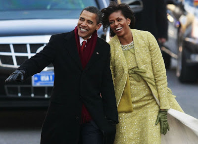
Take Michelle Obama's outfit during the Inauguration ceremonies.

image source

She wore a lemongrass-hued dress and coat ensemble with matching green gloves and green patent leather pumps.

image source

The colors certainly stood out against the traditional sea of black, red, and blue coats on the Capitol steps.

image source

The Swiss wool lace and French silk outfit was designed by Cuban-born American designer Isabel Toledo, who said she wanted to convey a sense of optimism. "For me, yellow represents hope," Toledo said. "It really feels like freshness to me. I wanted to capture optimism, I wanted it to feel happy."

'That color has sunshine in it,' she said. 'I fell in love with it. So did she.'(source)

P.S. for those of you who were wondering if she was freezing without a real coat, the upper part of the coat and the back of the sleeve were lined with a pashmina for extra warmth.

Got the blues for a facelift?

There's an op-ed piece in the NYT that discusses the politics around redecorating the public spaces within the White House.

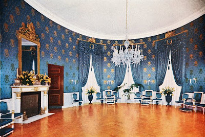
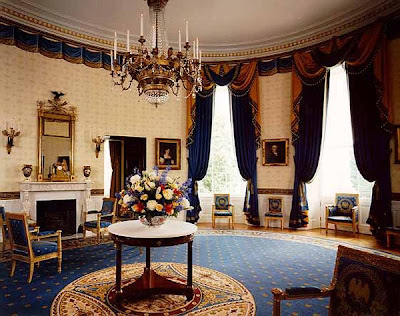
Let's focus on the Blue Room. The room is used mainly for receptions, receiving lines, and occasionally used for intimate dinners. From the beginning, everyone had a different idea about how the Blue Room should be outfitted. It's fun to see how the designs have evolved over time.

First it was done up in classic revival, then French Empire style after the White House was rebuilt.
1856 Pierce administration
During Buchannan's presidency, it was refurnished in a Victorian style called Rococo Revival. Sorry, no color pics yet!
1862 Licoln's presidency
A journalist of the time wrote about the room:
"The furniture is of blue and silver satin damask; the woodwork of the chairs, sofas, etc., being solidly gilt, as also are the heavy cornices of the doors and windows; broad mirrors,, with massive frames, surmount the marble chimney-pieces, and a blue and white velvet carpet covers the floor. The ceiling is painted in fresco, in which blue is the prevailing tint, and the walls are covered with blue and gold hangings; in short, it is all so 'deeply, darkly, beautifully blue,' that one feels quite cerulean therein."(source)
1867
President Johnson's daughter redecorated the room in geometric patterns, blue wallpaper with black and gold borders and velvet carpets

1887
1898

1903 Roosevelt's presidency

1904 During Roosevelt's presidency, the room is returned to an Empire style
1910
1946 before Truman's renovations
1952 after Truman's renovations
1963 Jackie Kennedy's renovation
Story goes, Jackie Kennedy did a little political maneuvering to get permission and funding to spruce up the place when her family moved in.

Jackie was able to get Congress to pass legislation designating the White House a museum, complete with a curator. The Fine Arts Committee for the White House was installed to locate and raise money for the acquisition of 18th- and 19th-century furniture and art relating to the history of the presidency.

To cover herself, she called it a "restoration"and hired a figurehead authority on antiques to oversee the project. At the same time she turned around and hired herself a fancy French designer who was "historically minded rather than historically accurate." (source)
Tricky, eh?

1972 Nixon renovations
1999 Clinton renovations
The same committee that functioned largely as a charade for Mrs. Kennedy still operates today, to the White House’s detriment. (It’s now known as the Committee for the Preservation of the White House.) According to the piece, it's unfortunately mired in bureaucracy, weighed down with literalists who obey the mandate word for word.

I find it fascinating to see the changes that have evolved over time in the Blue Room. I wonder what we'll see next! What would you do to the Blue Room?

images source


thanks to
designhole for the tip!

Lighting temperature and color

There's a great article on lighting on atticmag.com
image source
Do you consider the type of lighting you use when selecting colors? What about when you're designing or redoing a space? It's so important, as our perception of color is completely dependent upon context: what the color is surrounding by, and what kind of light is illuminating it.

Beating the doldrums in Alaska

I wanted to share with you this great story from reader Lisa in Alaska:
"I've been enjoying your blog, Hue, for the last year or so and really have enjoyed your take on color and design. I was seeking inspiration for a new color in our kitchen and finally made the leap this week. I thought you'd enjoy the change. The blue is Turkish Tile and the ivory is Decor White, both by Sherwin Williams. We are very pleased with the update, removing the 1980's era wallpaper made the room look less cluttered and the color, while deep, makes the room brighter during our long dark days in Alaska."
-Lisa
Here's the "before" picture of her kitchen, all decked out in 80's country charm.
Ta da! The "after" picture, totally crisp, clean, perky and SO much better! The bright blue against the warm orangy wood really pops, don't you think? (opposites on the color wheel are a sure-fire way to go) It's amazing what a coat of paint can do to cheer up a space.

Thanks so much for sharing your fantastic kitchen makeover, Lisa!

Inauguration Day

In honor of big changes to come (we hope!) I'd say it's high time for the White House to get a exterior face lift too, don't you agree?

Try your hand at re-coloring the White House and lets see what you come up with!
image source
When you're done, click the "share" link at the top in the black bar, then copy and paste the url from the gray pop-up box into your comments so we can see your creation.

Wild Hotels

While researching inspirational images for my hotel room prototype, I came across a fun array of really crazy hotel spaces. None of which were appropriate for my presentation, but I wanted to share them with you anyways.

image source
Reminds me of Alice in Wonderland, with this whimsical over-sized, swoopy sofa and lovely rich violet walls.
image source
Chandeliers don't have to be clear crystals. Why not try something sexy, like red? Looks great with those warm glowing golden walls.
image source
Beautiful jewel tones, but dark and edgy with dramatic lighting. Notice the dark brown/black ceiling? This feels like a movie set to me, with bold contrasts and a flair for theatricality. Incidentally, this is the Gramercy Park Hotel in NYC, designed by Ian Schrager.
image source
This style is dubbed "haute Bohemian".
image source
Aren't the colors fabulous? I guess I'm like a crow, drawn to sparkly objects. I need those red velvet lounge chairs.

Anyways, I had originally wanted to do something Hollywood Regency/Philippe Starck-esque, but have been advised to par it down to a single historical style. Back to the drawing board I go!

Go for the Wild Experience

Ready for an amazing experience? Try the Burj Al Arab hotel in Dubai. Another crazy find in my search for cool hotel spaces, this one is so over the top, I just had to share with you.
image source
The building exterior is
"designed to resemble a billowing sail, the hotel soars to a height of 321 meters (1,053 ft), dominating the Dubai coastline. At night, it offers an unforgettable sight, surrounded by choreographed colour sculptures of water and fire. The all-suite hotel reflects the finest that the world has to offer."(source)

image source
Part of the night light display.
image source
Another view of the lights at night. Shall we step inside?

image source
The worlds' tallest atrium. (590 ft) From the bottom, you can see the lower levels have ocean-blue undersides that fade to a light green as they get closer to the atrium's ceiling. Kind of a neat effect.

image source
This shot is taken from the top, looking back down. I'm dizzy just looking at the photo...
image source
Let's check in at the front desk. Like a giant roulette wheel. Care to gamble away your savings account? No problem; it is one of the most expensive hotels in the world. A suite begins at $1,000 per night and goes up to over $15,000 per night; the Royal Suite is the most expensive, at $28,000 per night. Red to make your heart race as you give them all your green.

image source
Can we say, go big or go home? The combination of highly contrasting black and yellow is really hard on the eyes, especially at this large scale. While its listed as a deluxe 5 star accommodation, the hotel has taken the liberty of self-declaring it a 7 star destination.
image source
Khuan Chew, Design Principal of KCA International, was responsible for the interior design. I would love to have been a fly on the wall during those initial concept meetings. What were they thinking?
image source
A critic noted, "this extraordinary investment in state-of-the-art construction technology stretches the limits of the ambitious urban imagination in an exercise that is largely due to the power of excessive wealth."(source) Yeah, I think it's rather excessive, too...
image source
I don't believe the term "soothing" was included in the design plans, do you? Really overwhelming, visually.
image source
A suite. Is there such a term as "Maximalism"? If so, this would be the definition.

image source
Hungry to be impressed? The Al Mahara (or "The Oyster") restaurant comes complete with its own aquarium. But not just any aquarium. This seawater aquarium, with 7.5" thick acrylic glass (to reduce the magnification effect), holds roughly 35,000 cubic feet (over one million liters) of water.

image source
One of 8 on site restaurants, one more insane than the next. I do like the cool blues and greens against the warmth of the chairs, floor, walls, etc. Makes for a striking palette.
image source
Quite an experience that would be, don't you think?
image source
Taking one last look on our way out.
Look at the attention to detail/color overload everywhere. Even the individually-lit wells in this fountain are a rainbow of fruit flavors.

Well, I have to say, this hotel tops my list for most colorful, fabulously gaudy, Las Vegas on steroids hotel I have ever seen! Any other contenders out there you'd like to nominate?