Vetrazzo tiles: More Than Just a Pretty Face

Guest post by Hollie Jackson

Hollie lives in Sacramento, California. She is an associate member of the IACC-NA and has been involved in interior and exterior color and material selection for commercial projects for 7 years. She also dabbles in developing residential palettes for color-challenged friends and family. Her current obsessions include cork flooring and paint colors named after delicious foods.

Vetrazzo tiles: More Than Just a Pretty Face

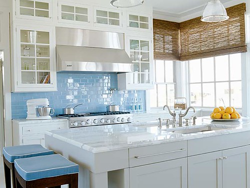
Looking for a new way to bring some dramatic color into your kitchen or bath? Check out the recycled glass countertops by Vetrazzo. Made from recycled glass mixed with concrete, Vetrazzo is as environmentally friendly as it is beautiful.

image source
When you think about the glass that you find in curbside recycling bins, you usually think clear, right? But what about the green and amber glass used for some beer bottles? Or the deep blue of some fancy brands of water? Throw in some red, yellow and green from de-commissioned traffic lights and you can start to see why Vetrazzo is such a colorful choice.

image source
Look at this color, called Charisma Blue. It calls to mind a day spent at the beach in a tropical paradise with its blues, greens, and golds.

image source
But look what happens when a patina is added to the concrete mix. The same colors are transformed evoking a completely different mood. This one makes me feel like I’m spending the night out on the town, maybe having a cocktail at a sophisticated jazz club. I think this color would be a great choice in a restaurant or nightclub as a bar or tabletop surface. Mixed with understated wood tones, it would also be beautiful as a kitchen countertop.

image source
Not all of Vetrazzo’s color schemes are so dramatic. Hollywood Sage has a soothing, monochromatic look, while still having the textural light-catching quality of its counterparts. Because it evokes both serenity and luxury, it would be the perfect choice for a day spa or residential master-retreat style bathroom.

And this is just the beginning! Vetrazzo has 16 colors currently available, and their collection is always evolving. But the most important color associated with Vetrazzo is, of course, “green.” Eighty-five percent of every countertop comes from recycled glass. The glass mainly comes from curbside recycling, but can also come from post-industrial usage, stained glass, or demolished cars and buildings.

Helping the earth while still looking fabulous…what’s not to love about that!

tile images source

Going Coastal in the Kitchen

Today's guest blogger is Danielle Burger, a friend of mine and wonderful kitchen designer at Canton Kitchens in Baltimore, MD. In addition to her design degrees, she studied art and architecture abroad in Rome, Italy for a semester and during that time traveled extensively throughout Europe. For the past 4 years, she has been working in the kitchen and bath realm and loves every minute of it.

With summer finally here, people are drawn to the water for some relief from the heat. Why not bring the cooling effect of the coast into your kitchen through color?

Going Coastal in the Kitchen...

It's the newest trend to bring hues inspired by the sand, the sea, and the sun into the kitchen. A splash of color through the use of paint, tile, cabinets, appliances, or dinnerware – be it a little or a lot – can add a dynamic effect to the overall feel of your space.

image source
Along with these paint swatch colors, some tangy oranges, mandarin golds, salmon, taupe and oyster hues would complete the coastal palette.
image source
In a white kitchen, the calming blue of a ceramic tile backsplash gives this otherwise blank canvas some visual interest.
image source

image source

image source
For a significant change, cabinetry lines are offering new finishes with coastal aesthetic and fun names, for example, Sundance, Seagrass, Islander, White Sand.
image source
This vibrant turquoise range is another bold way to bring in color. For the less adventurous, start off with a smaller appliance, such as a kitchen mixer or blender.
image source
Finally, accessories such as these pastel cups, bowls, and plates can be incorporated into the space very easily without having to renovate your kitchen. Even vibrant seat covers, lighting fixtures, or dish towels make a difference.

Thinking of your favorite destination can be a great way to get inspirations for color ideas in your home. So if it's the coast, or the mountains and forest, look at the colors in the environment and you'll have your palette. Has anyone used a specific location to get ideas for colors in your design projects?

Guest Bloggers

With the majority of my house packed in boxes and stacked to the ceiling in my dining room, I've held out until the last possible moment to pack up my desk and computer. What would I do if I can't check email at least three zillion times a day?

So I'm going to start the guest posts this Thursday to get the ball rolling. We head out on Saturday, and begin to make our way west. We should be in CA by July 12th or so, and hopefully I can get my internet up and running right away, as I'm sure I'll be going through blog-withdrawal. I may try to check in from the road, but we'll see how that goes.

So, please welcome our wonderful guest bloggers and be sure to leave them lots of comments!

The Joys of Moving

Crunch-time has arrived, as our moving company comes Friday to retrieve our belongings. Then, we hit the road for CA! I can't believe how much stuff we have acquired over a relatively short period of time. The last time my husband and I moved, we color coded the boxes so we'd know which rooms to deliver them to. But this time around, we don't even have a place lined up for when we arrive! Eeks...

More later when I catch my breathe. I might start the guest blog posts early!
If anyone still wants to contribute a post for July, I can accept them up until this Wednesday.

Thanks!

Crash Course in Color

Great little video touching on color theory and how we perceive light and color. Points out some really important concepts, like looking at color in context (how your perception of it changes based on what is around the color in question)

Learn anything new?

When Color Risks Pay Off

As an architectural color consultant, I work with a really wide range of tastes and aesthetics. For the most part, I find that people are pretty intimidated to try something too daring. But every once in a while, I take on a client who is willing to take some risks, and really embrace the colors she or he (99.9% of the time it's a 'she'!) truly loves.

This client was remodeling a condo unit she and her husband had just purchased. I arrived to find a gutted space, the carpet ripped out, and stacks of blonde floor boards ready to be installed. Luckily, she brought over a few items to give me some idea of her taste in colors and palettes.
She had some paintings and a folder full of magazine clippings. That's all I needed to get started.

Here are some of the results of our coloring adventure.

When I first entered the condo, I was struck by the overwhelming paleness of the space. The architecture was so impressive, with a dramatically-slanted, vaulted ceiling, that it really needed to be emphasized somehow. My client showed me a book cover she loved in a ripe apple green color. I asked her if she were willing to try something dramatic, and she was. This was going to be fun!
Bright apple green emphasized the fireplace wall which extended up to the loft space. The other walls were left a soft caramel color to balance the bright green.
In the back right corner, you can see the dining room with a rooster painting. We matched the yellow from his legs for the wall behind the art. Another punch of color to balance the saturated green and keep the eye moving around the space.
The kitchen was another challenge, as the home owner didn't care for the dark wooden cabinet faces, but wasn't sure she would have them resurfaced. She knew stainless steel appliances were going in, with dark granite counter tops. But how to bring it all together?To balance out the warm wood, we looked to the other end of the spectrum. How about a steely gray blue? Now, the space felt balanced, and the wood cabinets contributed yet another punch of color to the overall scheme.
The guest bathroom began with a light, too-sweet violet color. My client disliked the space so much she kept the door closed all the time. We chose chocolate brown to give it some elegance. Tiny closet-like spaces such as powder rooms are excellent candidates for deep colors. You can't pretend they are bigger than they are, so why not have some fun, and embrace their tininess. In fact, deep colors can sometimes make a small space feel bigger, erasing the boundaries so walls recede. Finish up by painting out the cabinet in black, and the space is now updated and ready to show off.

By using pops of saturated colors around the house, balanced out by less-commanding neutrals, we designed a color palette that really transformed the space. As for how it was received? My client says her neighbors are always bringing friends by to check out her space, and she and her husband are really pleased with how everything came together. I don't often get a chance to return to spaces I've designed, so it was gratifying for me to see the end results.

What do you think?

Sexy apartment in the city

Okay, I have to admit it, I was a Sex in the City series fan. So when the movie came out, of course I was excited to re-unite with my favorite characters Carrie, Miranda, Charlotte and Samantha. But after seeing the movie, what wowed me weren't the Main characters, but the Secondary characters- the costumes and the sets. I almost feel like they over-shadowed the actors! Did any of you feel the same way?
image source
But I sure was impressed with Carrie's re-decorated apartment. Loved the blue walls. So lively, and yet sophisticated by pairing it with browns and golds. Yum.
image source
"We felt like she needed to grow up a little," says Lydia Marks, set decorator for "Sex and the City: The Movie." Jeremy Conway, production designer, dialed up the apartment's old pale blue walls with an intensified version, Benjamin Moore's Electric Blue. "We thought of it as bringing out her personality even more," he says.(source) I'd say it was quite successful, wouldn't you?
image source and source
How's this for before and after?
In the original show, Carrie's apartment was a grayed-out green washed with a lavender iridescent glaze. (A neat screen trick to make the walls appear less flat, and flatter skin tones by contrasting against the warm tones.) I always thought it was a bit dull for her character's personality, but it has been argued that this space was her sanctuary, and needed to be a peaceful respite from the craziness of her life (and wardrobe!) More about her apartment styling in this design break-down.
image source

What do you think of her updated digs? Anyone see the movie?

Great Color Research Journal

The long-awaited second issue of Colour: Design & Creativity has finally arrived, and it looks fantastic!A sneak peak:
(click to enlarge to read text)
It might be a bit scientific for some of you, but after I get a chance to read it myself, perhaps I can offer some boiled down reviews of articles I thought were interesting. Or, if any of you read the issue, and want to write a little commentary on a bit of what you read and got out of it, I would be delighted to include your thoughts in July as a guest blogger!

Trim- to contrast or not to contrast, that 'tis the question

When people get ready to paint a room, does the color of the trim ever come into question, or do people always opt for white? A great post on this very topic over at My Notting Hill got me thinking about the dilemma.
image source
I think the one-color approach works really nicely in this scenario because there is so much trim detail- the fireplace surround, chair rail, panels, crown molding, window trim... It adds visual interest to a large wall space without breaking it up as much as it would if the trim contrasted.
image source
White against another color presents you with a certain level of contrast, heightened, obviously, the darker your wall color goes. Sometimes, white trim against another color just doesn't give you the desired effect, instead. In the picture above, white trim would have been too busy, and competed with the architectural lines of the furniture.
image source via desiretoinspire

Another way to look at the white trim dilemma is to head to the dark side. This luscious chocolate brown room wouldn't be nearly as successful broken up with light trim. I think in the above scenarios, matching trim to wall colors is really seamless and clean.

I'm here to officially state, "It's okay to try something different!"

So, I'd love to know, how many of you have experimented with trim colors? How did it turn out?

The many colors of house-hunting

Phew! I am back from our whirlwind trip to the Bay Area to try and secure housing. Emphasis on "try"... Boy oh boy, are houses out there expensive! I guess it's all about "location, location, location".
Nondescript white-walled room. Totally forgettable.
Really dated kitchen in desperate need of a make-over.

While house hunting, I had a completely different perspective from that which I normally inhabit- that of adviser. Often, I have clients who want to spruce up their house, but are concerned about selecting colors that will make the house easier to sell, eventually. So, here I was, a potential buyer, examining houses for my own needs. I have to say that staging and colors helped a TON with the appeal of a property. Of course, I'm rather biased, but in my head, I imagined I could see through what wasn't there to what I would do to the spaces. But after days and days of touring properties, you don't want to expend the energy. Turns out, I was much more intrigued (as were other house-seekers I noticed), by those spaces with color.
Love, love, loved the colors in this house. We were ready to move in, and I didn't even have the desire to change their paint choices. This house wasn't staged, but really tastefully done by the owners. After peeking in an office cabinet, I discovered someone living there works as a color consultant.

For those of you unfamiliar with the term, staging refers to taking a house for sale, and spiffing it up to make it more appealing to potential buyers. Sometimes, a stager works with existing furniture and accessories, editing where necessary, re-arranging items to maximize space and flow. Other times, stagers will bring in furniture and pieces into an empty house, to give the buyer a sense of how the space would feel when its inhabited.
Testing the authenticity of a staged "bed" that turns out was just cardboard boxes draped in fabric. Aren't these walls just screaming for chromatic assistance? A distinctly unsuccessful staging, I hate to say.

Sometimes, stagers will go further, advising refinishing floors or painting walls. I've got to tell you, it made a huge difference as we were strolling through our 15th house of the day.
Soft yellow walls and muted sophisticated accent colors (check out the throw pillows, rug, even the golden bowl on the table) really made this room appealing. The touch of green helped round out the palette. This was another favorite house, but alas, an offer was already in on it.
Those properties with unique, rich or even just understated colors on the walls certainly made the place feel more homey and more personal. Loved the pumpkin.
There's something so sterile about an empty, white walled house. This fireplace wall would have looked much better with an accent color to ground it in the space.
I'm not big on black counter-tops, as they are hard on the eyes, ergonomically. Not enough contrast between the work surface and items on top. But I loved how the stager took cues from the existing palette to bring in black and white plates in the empty cabinets and pulled in touches of bright blue here and there. I couldn't get enough of the sunshine streaming through the window-just like a cat, I suppose...

I noticed it in new apartment complexes, as well. They advertised "designer colors" and would point out accent walls in the model unit that were either standard, or not included.
image source
Unfortunately, I forgot my camera when we toured the complex, so I can't show you the cool hall and unit colors. In any case, evidently, the general public has become much more color and design savvy, for the salespeople to emphasize color so much.

So, that's just a little taste of our adventure out west. For the time being, I think we will settle for a rental while we continue the quest for our house. I'd like to hear from those of you who have gone house-hunting in the past: how important were the wall colors in your impression of a property? Did it make a difference in the end when you bought something?