Dealing with pinky-oak cabinets

I did a color consultation for a lovely woman this past weekend. Moving into a rental unit while she searches for the perfect house to buy, she wanted to perk things up a bit, and got permission to paint over the "landlord beige" color.

You never know what sort of challenges are waiting for you at a consultation. Every project has a "stump the consultant" room. Armed with my architectural paint chips and fan deck, it's always an adventure.

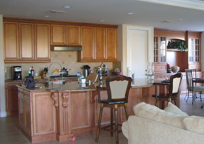
Her kitchen was a stumper, for sure. Had this been her house, I would have suggested painting or restaining the cabinets, but as it's just a rental, I didn't want to push it.
I don't have pictures of her actual kitchen, but here is an example from another client's kitchen of the color of her cabinets.

With pinky-undertone wood, the client wanted to de-emphasize the pink cast. To note, with a large picture window showcasing dull gray balconies next door, she didn't want to draw anymore attention to the gray outside.

What would you suggest she do? Susan, will you weigh in too?

HGTV Design Star week 2 weigh in

After 2 weeks of Design Star on HGTV, I am rather baffled by the incredible amount of work thrown at the designers. Not only did they have to design and remodel a kitchen, but they were expected to do all the demolition and install the cabinets, appliances, etc. I thought designers were responsible for DESIGN! Apparently, that doesn't make for good television drama.
image source
The objective for the design team: to give an Italian family a Moroccan-inspired place to entertain and gather.

What went down on the show:
Color expert Jen took control of the paint choices and decided on three colors: red, blue and yellow in warm tones. The combination did not please the judges. Vern said, "It looks like a rainbow threw up in there." Candice thought the room looked like it was designed by a committee "without having a strong overall vision."
I have my own opinions, but I'd love to hear yours. Soooo, I'm dying to know, what did you think of Jen's design decisions?

Travel for creative inspiration

After undergrad, I took the quintessential post-collegiate European trip. I spent two weeks in Italy and fell in love with the country. The food, the history, the art, the landscapes... I vowed to return as soon as possible. 12 years later, I am finally returning for a 10 day vacation with my husband this fall. We're flying into and out of Rome, but still have to decide where we are going, and how long we'll stay in each place.
image source
I know we want to see the Cinque Terre hill towns dotting the cliff sides. But the Amalfi coast is pretty spectacular, too.
image source
Back when we were living in Baltimore, one of my husband's colleagues, originally from Italy himself, mentioned that there was a place in Italy where the pasta was so good, it could make you weep. My mission? To hunt down this place and test his theory. We might, in fact, have to eat our way through Italy. But I'm up for the challenge, as long as there is plenty of gelato for desserts. Okay, who am I kidding- I can eat gelato as a meal!

So, where should we go? What should we do? I'd love to avoid the more touristy things, as we've both experienced them before. But something off the beaten path, that only a local would know about. That's the experience I'm looking for. Lodging ideas also appreciated!

Up for a make-over challenge?

Feel like trying you hand at color designer for a day? Of course, if that's what you do already, please share your ideas, too! I'll give you the pieces of a recent project I just completed, and you can play around with how you'd solve the problem. Once everyone weighs in, I've reveal what my final design looked like. (no fair cheating if you're a local!)

Got your paint chips ready, and designer hat on?

Details:
This small, private, bilingual elementary school was ready for a make-over. Nestled in a quiet residential neighborhood, it was about to get some major exposure due to the much-anticipated arrival of a large specialty supermarket that was being built across the street. The elementary school campus was comprised of several disparate buildings cobbled together:
a Tudor revival house in front,
and an industrial "L" shaped building behind. (what else could you call this style?)

Nothing went together, and the dingy sage green tones of the little house certainly didn't communicate the unique and wonderful qualities the school had to offer.
The industrial building in the back has all sorts of weird angles and nooks, like this corridor. And nothing lined up, architecturally.
Here is a street-side views. You can just barely see the main building on the far left.
And for added surprise, here is the school's playground. Rumor has it, one weekend, an enterprising parent took it upon his or herself to select and paint the orange and purple wall you see here. Basically, absolutely nothing went together.

Things we know:

The bilingual school is over 30 years old, has a reputation of academic excellence, and is located in the Calfornia bay area, just outside San Francisco. The school's logo is blue and orange.

Things we learned about their desired message
(after the client filled out an extensive branding questionnaire)
nurturing, warm, secure
sense of community
self-confidence in children
affluent families from 47 different nationalities

Challenge:
So, given that information and the buildings themselves, how would you make-over the school? What colors would you chose? Where would you put them? How would you back-up your design decision?

Have some fun with this! If you are tech savvy and want to link to a mock-up or email me pictures at [rachel.perls (at) gmail (dot) com] , I will post them, too.
HGTV-the myth of the super-designer continues

My friend and colleague Kelly has a fantastic post over at Arte Styling on the realities of design shows.
image source

The world of HGTV has been a blessing, and a curse for us designers. On the one hand, it has given the public a vocabulary through which they feel empowered to try their hand at design, or at least communicate their vision to the designer. On the other hand, people have the wrong impression that these televised make-over designs come together much more quickly than they really do.
Apartment Therapy remarks, "we were astonished by how many hours it took to shoot scenes that will probably amount to only a few minutes of airtime in the final cut."

For more of what goes on behind the scenes, check out HGTV-Friend or Foe?

Oakland color expert explains: Color messages- why recipes just don't work

Branding firms like to use color messaging lingo to plump up their argumentation for a design. "X" color communicates _____. It's true that understanding the psychology of color is imperative in developing a successful product or service. The issue I take with this is that companies risk making blanket statements that are too broad and generalized to stand up to further scrutiny.

Take for instance a recent example of color messaging manipulation.

Fiserv provides automated account-keeping and other technology to help banks and credit unions operate efficiently. They wanted to be seen as a "vibrant, fresh and energetic" company (source). My first thought was, this is an enormous $4.7 billion dollar company, they've sucked up more than 140 companies while in business, and they work with financial institutions. Fresh and vibrant? Um, yeah right. But, since that's how they want to be perceived, off they go to be re-branded. Tada! The new face of fiserv. Your perception of the company is totally altered, right?

Brand New makes a great point about their new look, "this is a simple, strong corporate design and major bonus points for ditching the industry-issued color blue in favor of orange."
Orange is a great alternative to banking blue because it stands out in a sea of corporate clones. They further support the color choice by adding that it "has a certain heat and energy to it, but not the kind of danger you perceive when you see red,"(source).

True, but does this rule work for every case? Is red inherently taboo in the financial institution world? The resounding answer is, "nope".

I give you, HSBC Direct banking, branded by the same firm that designed fiserv. The very same firm that argued against using red as "dangerous". Go figure. Snark Hunting did some detective work on Landor's design and dug up the case study. "The strong use of white exemplifies the clarity and simplicity of the brand while the bold red registration pods demonstrate how HSBC Direct is a future-facing and contemporary brand."(source)

So, it just goes to show you, color recipes do not work. There are just too many nuances within color, and without the context around which a color is used, it's meaningless.

How climate affects color choices

In San Francisco, the fog rolls in, covering everything in a blanket of subdued gray. Other locations deal with white hot sun beating down daily. While some cities fight the wash-out from weather with brights (think Albuquerque or Miami), San Francisco opts for a more sophisticated palette of hues. Now, there are certainly exceptions to the rule: take Painted Lady Victorians, for example. But even within that palette, you won't find much lime green or turquoise as the dominant color.
image source
In a recent San Francisco Chronicle article, it's discussed how the weather and fog effect San Francisco design. Three different designer's approaches to coping with the fog: select opposites, embrace it, or fight it all together.

Do you think the regional climate in your area has an effect on how you chose colors for your home? If you've lived in different cities, did your palette change, depending upon where you were living?

The blogosphere and how you fit in

I'm having an aha moment. Whether you write, read, or write/read blogs, I think this can apply to everyone.

Learning about blogging etiquette and trends has been a fascinating process. Some blogs have been around for years, with a small handful of loyal readers. Others have just started up, but have a huge following. Some blogs get 2, maybe 3 comments per post, while others collect 30, 40, sometimes even 100's of comments. I got to wondering what it was about blogs that inspired people to come back again and again...and comment to boot!

image source
Through Curb Appeal (via another new favorite read of mine, Color Me Happy), I read an interesting post by Penelope Trunk, a career therapist. She says that the most interesting posts are not those written with absolute certainty, but those topics about which you are uncertain. That leaves room for dialogue, and everyone, writer and readers, on more equal ground, opening up the topic for discussion. No one wants to write in a bubble. The concept of two-way conversations is an intriguing one- to inform readers, while still engaging them in discussion. I want this for us! I know many of you are bloggers yourselves, and still more are dedicated readers of at least a few sites. So, what brings readers back regularly? What inspires you to comment on a blog? How has blogging been for you?

What else can you do with paint chips?

David Stark has a love affair with paint chips. Instead of the end product, he uses them as the building blocks for his larger creations. Like dabs of paint in an impressionist painting, or squares of color in a Chuck Close montage, Stark uses the chips to create color fields that snap into focus once you step back.
image source
Here's his table for Benny Moore's Dining By Design entry in 2008. That wall behind the table? Yup, all paint chips. See, there are things you can do with paint chips once you've selected that perfect color.

For a great interview with the designer, head over to Living in Color with Sonu.

Anthropologie knows color

Have you seen the latest Anthropologie's July catalog? They always chose a strong theme to base each photo shoot around, and this month, it's all about form and color. I love that it's all about the structures and angles behind the model, the negative spaces, and the environment created by the colorful shapes. I'd love to know where they shot these photos. Any ideas? Of course, the clothes aren't too shabby, either.

But what I loved the most were the incorporation of color quotes:
"I found I could say things with color and shapes that I couldn't say any other way- things I had no words for." -Georgia O'Keeffe
"It is not the form that dictates the color, but the color that brings out the form." -Hans Hofmann
Take that, architects! Form cannot exist in isolation, it needs color and texture to define it.
images source
"Color is my day-long obsession, joy and torment" -Claude Monet
Do you have a favorite quote that encapsulates something you are passionate about?

Color education goes prime time- hopefully

One of my fellow IACC-NA colleagues is a contestant on HGTV's Design Star this season.
Way to go Jennifer! I'm certainly going to tune in to see if she can incorporate some color education for the viewers into her projects. It's high time a professionally-trained color consultant gets some air time.

One thing the website got incorrect: "Jen is one of only 51 color consultants in the U.S. certified by the International Association of Color Consultation...."
Actually, we have close to 100 members in our North American chapter now. Then, there are the much larger chapters in Europe and Asia.

Tune in Sunday nights, (Premieres Sunday, July 19, 10/9c ) and let's discuss the show. I've never seen it before, so I'm curious to see what it's all about.

Thanks Lori, for the tip!