Private versus community decisions on house color

My lovely residential neighborhood has a charming mix of architectural styles.  No two are exactly the same, but the homes all still work together nicely. Then, there is the lime green house. Not even kidding. If I could get organized enough to walk by with my camera sometime, I will snap a shot for you to see. I've never had the guts to actually approach the owner of the house to inquire about his or her "unique" color selection, but I would bet the other neighbors have voiced their displeasure.

So seems to be the case with a home in Atlanta, Georgia that is listed on the Historic Registry.
image source
Here's how the Henry B. Tompkins House looked in the historic registry. Designed by Atlanta architect Neel Reid, it's an excellent architectural example of Georgian Revival architecture.
Limestone stuccoed; 2 stories modified rectangle, hipped roof sections, interior chimneys, slightly projecting front center exposed limestone pedimented section featuring a single entrance with ornate transom flanked by stuccoed rusticated pilasters and surmounted by open segmental-arched pediment with cartouche, exposed limestone corner pilasters; rear formal garden with pool and garage.
 Well, until it's new owner opted for a updated color palette...
image source
It's been lovingly restored with a bright orange coat of paint across its exterior. T. Ruben Jones, the 80-year-old new owner, says the exterior color, Maple leaf by Behr, is meant to replicate the hue of an Italian villa. It will fade, he assured. (Is this true? I thought the whole point of paint was selecting a color that wouldn't yield to the pressures of mother nature and her elements. Any thoughts on this?)

This raises an interesting question that is postulated in an article I happened upon recently:

image source

“Where do you draw the lines between private property and the good of the neighborhood?
Do owners of historic homes “have a duty to the community to maintain them in a fashion that is not offensive to the community?”"(source)

Where do you stand on this issue?

Guest post: Why do we love black?

My name is Karen Haberstro-Walls. Having been formally trained in the studio arts, specifically ceramics, I ultimately found my niche with interior decorating. I tend to operate from instinct more than rules and theory. Over the years, color has proven to be the best tool in my decorating tool belt as it can totally shift the feeling, focus and theme of a room. Regardless of the project I am working on, color is what inspires and informs my process.  


Why does everyone love black?
Karen Haberstro-Walls

When Rachel asked me to guest post in anticipation of the arrival of her new little one I was honored and nervous. What about color could I write about? So, I brought it down to basics. I, like most people have a favorite color: black.
image source
This color choice came to me at a young age. One day I took every crayon I had and scribbled each color over the top of the other. What resulted was a big black blotch. It then occurred to me that black is the sum of all colors. However right or wrong that thinking was, I still embrace that definition.

I have read a few books on the history of color and its place in our culture and it has dawned on me that color is a social phenomenon. Our feelings about and reactions to a certain color change with the times. Let’s take a look at how our culture has more recently used the color black both literally and conceptually.
image source
In fashion, black covers a lot of bases. It is so widely regarded as sophisticated that the term "the new black" is often used to describe and give merit to a color trend. Perhaps Chanel's branding with the 'little black dress' can take the credit for that. (and since it’s black that dress would be very slimming!)

Branding with the color black is very effective for high-end products but less expensive items branded in black statistically do not sell as well …… Black is polarizing; it exudes power & authority. Think of tuxedos and limousines. Or have you ever seen a judge wearing mauve robes?
 image source
The black leather jacket will forever be associated with the cool aloofness of Marlon Brando's biker role in the “Wild One”. Johnny Cash is known as “The Man in Black”. He chose black as his way to honor and connect with the downtrodden. And in every “B” movie ever made in Hollywood what color did the tough guy wear? Yep; black.
Being “in the black” is a financial positive in today's world (think Black Friday, the day after Thanksgiving, which is considered the best shopping day of the year) But earlier in that same century the term Black Friday referred to the day following the devastating 1929 crash on Wall Street.
image source
In decorating our homes, black has traditionally been limited to utilitarian or functional pieces. Nowadays, black-painted walls, though still used very judiciously – are making a place for themselves in what are usually considered our more formal rooms.
image source
Black sheep, black humor, black list….it seems like all doom & gloom. But, then there’s the undeniable feeling of potency & confidence when wearing your favorite black suit. Black gives off an aura of mystery and possibility.

Whether good or bad, black makes a statement.

A social phenomenon indeed! What’s your take on black?

Guest Post: Harmonizing colors

Today, my guest blogger is Safir Kaylan. She is a color specialist whose work has encompassed major home appliances, counter top appliances, stand mixers, furniture and textiles. She has worked for Whirlpool Corporation and its subsidiary brands such as KitchenAid, Kenmore, Maytag, and Jenn-Air. The full spectrum of color subjects, from science to art and design, is her passion. Recently, she has
been supporting, communicating, and advocating color education, color relativity and the recognition of color by contributing feature articles to various media, namely Decotime and Maison Francaise. She also has a blog, colorineverdaylife.wordpress.com


Inspired by The Mediterranean colors
by Safir Kaylan


Recently, I have been focusing on harmonizing colors with free studies based on Josef Albers' methods while traveling back and forth between Turkey and Michigan.


The idea of East and West combined with the Albers' intuitive approach to color inspired me to write a few words about the colors of Mediterranean.

image source
Josef Albers was a teacher, writer, painter and color theorist. In his print series of Homage to Square he examines the interactions of colors using the simplest form squares arranged concentrically. He also developed a pedogogical method to teach color for design and art students. He says that color has many faces and can be deceptive. Albers also points out that “Color is the most relative medium in art”. Alber's course was not a theory of color, but a method intended to sharpen the eye and provide some understanding about how color behaves in different contexts. (source)

The Mediterranean sea is surrounded by twenty one countries and three continents. It is where east and west mingle.

The Mediterranean region has a pleasant climate, rich history, plenty of vegetables and fruits, beautiful nature, healthy kitchen and a mix of diverse cultures. The use of colors in interiors, for objects and in art represents the richness of this region's characteristics.


Some interiors have a mystical quality about them, as if two unlikely elements have come together to form a composition. This reminds me of Albers' encouragement to use any colors and to make them work. Also, the quality of the Mediterranean colors originates in its rich natural resources. The quantity of colors used in spaces create dramatic sensations and interesting visuals. The use of materials is natural. The finishes also reflect the authentic textures of the environment.

Some of the Mediterranean colors are rough and earthy. Some of them have evolved from the beautiful nature of the region. Others depict the climate and the farmland. They include colors like warm terracotta, buttery yellows, corals, eggplant and lavender.

Yellows, oranges and deep reds represent the fantastic sunsets of the area. Yellow, pink and greens are found along the coastal areas in lush countryside. Seaviews are breathtaking. Blues are inspired from the sea ; they bring splashes into spaces. Nature provides a great sense of color harmony. Surrounded by this fabulous natural palette one could not consider using any other tool for selecting colors but his or her own intuition and senses.

images source 
This “hard to explain” sense of color balance that exists within each of us grows more complex as we explore new places. For me, discovering Albers' approach to colors as well as my various travels have brought me to this new place where seeing colors become an inspiring and delightful experience. Colors give us a large amount of possibilities. As professionals in the field of design and art, exploring in the magic of color with the hopes of bringing its subtlety into our projects can be a strong starting point.

Guest Post: Thinking “faux?” Reading Color

Today's post comes from Barbara Jacobs, of Barbara Jacobs Color and Design.
An IACC-accredited color consultant based in the Boston, Mass. area, Barbara has worked locally and nationally for over 20 years. Her focus is to help people create supportive environments for their homes and businesses. Barbara's IACC thesis subject was on using color in elementary schools. In addition to advising clients on the best colors for their home and work environments, her extensive experience, coming from her fine arts background, includes actually mixing paints and pigments, whether in glazes, plasters, wall paint, or fine arts and pastels.  Barbara also has a blog, ColorViews, you should check out.


Thinking “faux?” Reading color and looking at your space
By Barbara Jacobs

If you’re thinking of doing a “faux painting” project (or…is it a “real” project you want to do?) you will no doubt be making some decisions about color. Technically, a decorative finish will fall into one of these very basic categories:

1. Using applied color that’s opaque: Paint only
2. Using applied color that’s semi-opaque: a glaze base mixed with paint as the colorant
3. Using applied color that’s translucent: a glaze base mixed with tint as the colorant

This multi-colored layered glaze surface includes a variety of reds and earth hues to create the sense of depth.

In any of the above, you will have to make some color decisions, starting with…what color do you want to see as the result? To do this, you need at least a fundamental understanding of color mixing and how colors interact to produce a particular result. But that’s not why I am looking at this subject at this time. What I want to share are a few tips on looking at your end-result color to break it down into components that you can work with.

1. Base, and applied colors
2. Base: decide if warm or cool. Your applied color layers can even include colors that have opposite qualities, to have a toning effect and give a more visually interesting result.

Samovar Tea Lounge, San Francisco
3. Pattern: smaller scale pattern for a more ‘blended’ and uniform look;
larger scale for more contrast of shape (not necessarily contrast of color).
 The more contrast, usually the greater the drama. Smaller scale pattern will usually pull a space together better than a larger scale.
Samovar
4. Contrast of light and dark/warm and cool: yes, back to that again: more contrast, more drama, more “look at me” with walls being the focus of the space

Look through the color—like rose-colored glasses
Here’s one example of thinking through to your end result and how to get there:

Let’s say you want a soft green, not too saturated but not a pastel either.
  • Do you want a yellow-based green or a blue-based green? (you already know that green = yellow + blue)
  • If you want a stronger-color green you might use brighter, more saturated blue and yellow
  •  If you want a toned-down green you might use a more subdued, orange-based yellow.
In this image, for example, we’re looking at a blue base with yellow over glaze. Result: the green.
The 2nd image gives you the idea of a result when a different yellow tone is used.
  • Use a pattern scale that emphasizes the color type you want to pitch toward
  • Use the base color that establishes the color direction
More examples of seeing color as layers

Here's another one.

In the images, we’re looking at a various base and over-glaze colors. Of course, these are just digital examples for the purpose of illustration, and as such are nothing like paint!

My personal disclaimer: the colors noted are just examples, not instructions.

For more about this subject, check out 11 tips for Decorative Finishes

All images copyright Barbara Jacobs

Guest Post: What does your car color say about you?

Marie Brady is an architectural colorist based in Oakland, CA.  She has a background education in interior design and is a member of the IACC-NA. Her website is ColorMarie.com and a great blog.

What does your car color say about you?
By Marie Brady

We put so much thought and effort into our color choices for our homes and wardrobes.
image source
One choice that is not often on our radar until it's buying time is our car color preferences. Just as in color marketing and trending for fashion, household goods and other retail items, automotive color palettes evolve and shift yearly. The car industry is kept on it's feet guessing what we will want next.
image source
Ford Motor Research has shown that 39% of consumers will leave a dealership if they don't see the color of their choice. One of the biggest trend predictors for the automotive industry is DuPont.
image source
Each year they publish their Automotive Color Popularity Report. Car companies use this research as an authoritative baseline for color trending.

DuPont reports that as many as 40% of people would switch vehicle brands to get the color of their choice! Determining color palettes is not simple process. Designers seek to create harmonious interior and exterior color packages that will appeal to customers and enhance the design of the vehicle. GM rotates it's colors and tries to anticipate our color preferences each year. They introduce 3 new colors yearly while 3 colors get kicked out of production.
I recently was thrilled to find a stash of old 1960's Sherwin Williams/Ford car guides at an antique store. I wish I came across these little treasures more often! I purchased one from 1961 and one from 1967. It's startling to see how different the color palettes moved from the early to late 1960's! Experts say that the leading position of white in the 1960's and early 70's coincided with economic expansion.

image source
Later into the 70's, of course, we saw an explosion of earth tones.

image source
Did anyone have a parent driving around a lovely mustard yellow Corolla or avocado Plymouth?

image source
Boy did I want a LeCar in 1980 even though I was 3 years away from getting my license!

The 1980's was seen as a period of color while the 90's was an era of neutrals. Color started reappearing in the new millennium in a big way. For Asia, Europe and North America, silver is still the most popular color for cars. North America, says DuPont, is starting to lead the way in trends with rich shades of medium to deep metallic gray along with cooler reds and other high-chroma colors. This hints at a major shift of what's to come for automotive palettes.

Look at the change in color choices over the decades! Remember, paint technology evolves as well with each decade.

Color preferences become more distinct when you look at different lines of cars. White dominates 25% of the truck and SUV market.
image source
The higher end cars such as Mercedes-Benz tend towards more conservative colors such as silver, gray, black and white. The couture cars of the world, Rolls Royce and Bentley, are often custom ordered so it's not unusual for a customer to ask for a specific custom color. They will even match a fabric or color sample the customer provides.

Black is still perceived as upscale and classy so it is the most popular color in the luxury class. Yellows and blues are becoming quite sought after in sports and compact cars, while darker greens are receding. In fact blues across the board are gaining fans. For retro lovers, limited editions are advertised by some companies in unique palettes.
image source
This year Chevy Camaro is offering it's own version in the form of “Synergy Green” which hearkens back to their “Rally Green” color from it's first edition Camaro.

How much does color influence YOUR car buying decisions? Would you give up certain options to get the color of your choice?

Guest post- How Old is that Color?

Today, we welcome back Sonu, better known as slowburn online. You might remember her from the super informative post on Caste versus Colorism, here on Hue. Sonu is a South Asian emigre who's lived in the US for twenty years. She is married to her much beloved American husband who is upfront about being fairly clueless about color and attire unless something's hideously off. Mother of two, writer for hire, and rapidly approaching 40 she's less worried these days about "what goes" - between keeping it together it's all about not scaring the kids or alarming passersby. She cleans up well and figures stylists will show up with the producers if she ever makes it to the big show.


How Old is that Color?
By Sonu

You're probably familiar with Jenny Joseph's poem, “Warning,” the one that starts:
When I am an old woman, I shall wear purple
with a red hat that doesn't go, and doesn't suit me
The poem is primarily about getting to a certain age and no longer giving a hoot what other people think. But I always found the idea of purple and red behind those lines kind of baffling. Because where I come from purple, as in deep rich eggplant purple, is totally an older woman color! It's a color of maturity, of someone who is no longer young, someone who runs things such as a household and budgets.
image source
It says matriarch.  It's something young'uns, they who are still in the fresh bloom of youth, do not age themselves by wearing. And red, oh red.
 image source
Fire engine red is a classic wedding color for a blushing bride,
image source
and deeper reds, everything from vermilion to maroons, are the color of matrimony,
image source
from sindoor in a married woman's part,
image  source
to bangles on her wrists.
image source
The only women who don't wear red, or tone it down heavily, are widows.

Before I go any further, I should mention that although I'm still technically an Indian citizen, I've now lived outside India for the majority of my life. And my memories of India, and of Indian wardrobes are heavily informed by the fact that we usually went home for vacations, aka, wedding season!
 image source
Where no one is dressing soberly or normally. Can you say “My Big Fat Indian Wedding”? So if you're Indian and you're reading this post, you may well disagree, but you have to admit, there are young colors and there are the, um, not so young colors. But I digress....because the point is, who decides what ages should wear certain colors? It's up there with the other Indian idea of how people with certain (read: darker) complexions shouldn't wear certain colors.
image  source
Imagine my epiphany when I arrived in the U.S. to find African American women, many much darker than yours truly, wearing precisely all those colors – bright blues, hot pinks, bright reds, and yeah, pastels of every sort. And they looked great! Which goes right back to one of my firmly held beliefs, that beauty is an utterly social construct. And like humor, especially the culturally specific kind, those constructs do not always travel well. Once again, I digress....

I do understand that as we age, we should dress appropriately, or rather, in ways that do not make us look silly. I'd say that's a fairly universal idea. But in the west, where dress has changed drastically in the last 150 years, dressing appropriately – even in a society where the definition of “older” has changed drastically, (thank you baby boomers!) has meant retiring objects of clothing, not colors of clothing. It means dressing tastefully as you age in terms of how much skin you show and how the clothes are cut.
image source
Exhibit A: Helen Mirren at the 2010 Oscars,  where she looked good wearing something that was sexy and sensual. But she looked like herself, an older person who wasn't trying to look a minute younger than her age. Her clothes were not young and would have aged a younger woman. But the gorgeous Ms. Mirren was wearing a lovely steel gray,
image source and source
which was also worn by Kathryn Bigelow, who is a few years younger, and Kate Winslet, who is fully 30 years younger.

The color didn't matter. The clothes weren't defined by them. And I say this because gray turns out to be another older lady color in India, and I learned that one the hard way while sari shopping. Because the sari and the salwar kameez in everyday garb hasn't changed all that very much in the last century. Blouse styles, prints, and fabrics certainly go in and out of vogue. And how you drape the sari may get finessed a bit. But it's still a five-yard long length of cloth, wrapped artfully regardless of age or figure. And what separates the maiden from the mother and the crone seems to come down a little bit to print, a bit more to fabric, and a lot to color.
I ran right into the brick wall of “aging colors” when I was not quite 30. It was my first trip back to India in a long time, and I was finally in a position (aka, making real money for a change) to build my own collection of saris. I wanted more than the two I'd married in (standard red, and an un-standard very lavish cream), the two “little black dress” work horses I'd worn over and over (both black, one plain, one very embroidered), and the random assortment of “young debutante” saris I'd been gifted over the years (apple green, creams with colorful borders, busy prints).
 image source
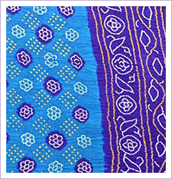
Certainly, approaching 30, not yet a mom but much married (whole other blogpost!), I was starting to look a bit long in the tooth in the bandhanis and garhwals. They were perfect when I was in my early twenties what with their light weight and colors and big and pretty borders, but married and approaching 30? In weight and color both, they lacked …. gravitas.

So there I was at the sari store. And I fell head over heels for two grays. Steel grays. Sophisticated grays. I'd seen my mom wear both (which should have been my first hint), and although she's lighter in complexion, I didn't see why I couldn't pull it off. At least not in the US where no one cares about such things – here I just look Indian, know what I mean? Anyway, I had this vision of me as an Indian lady who lunched, and it would be perfect if I was ever invited to some fancy sit-down embassy dinner where they would be thoroughly appropriate (and that should have been my second hint). Then we got home and Mom, trying to be supportive, said something to the effect of, “You seem to have shopped strategically, not just for now but for later!” Huh? “Well you don't know when you'll be able to shop for saris next, so you've got a good variety, including some for when you're older. Like the grays”

Oh.
image source
Grey, regardless of print, was apparently for the older set. And yet I'll bet that is not something you'd think here in the West – where grey, particularly in a well-cut suit at work that makes you look grown up, but not over the hill by any stretch of the imagination!
image source
And then of course, there is black. I've already alluded to the two black saris I owned. They were my mouthiness made apparel. Even the heavily worked up one had the lush grandeur of a lacquered Chinese wall hanging. Dressed in it, I noticed that people didn't walk up to me so much as they approached, carefully. (Could just be the shock of seeing me nicely turned out for a change, but work with me....) Thing is, my black saris were not for the faint of heart, and neither was I when I wore them. Important data point: For years, at any Indian party, I was nearly always the “feminist!”, and the confusing one at that. Because I looked the part of a conservative in a sari, after all I learned to wear one from my grandmothers who saw no reason to change how they dressed, regardless of what they thought. But they were far from conservative too. And you couldn't pay any of us to be demure or soft-spoken. So not happenin'. So not in the black sari. Which is when it hit me – they were my version of rebellion.
image source
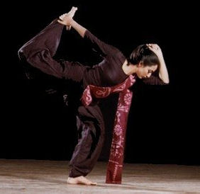
They're what a modern Indian danseuse would wear to announce a departure from tradition before taking a single step. They're very … Martha Graham. Not that I looked scary or anything. But I wasn't a docile traditionalist in them either. Which is highly ironic because I really am rather traditional in how I wear my saris. Meaning, I love Bollywood, but for the love of God, it's entertainment. Not real life, where the pallu is meant to cover your chest, not show off your cleavelands.

I do have other colors in my sari collection, by the way. Because the two grays were part of twenty-five saris I picked up that afternoon. (No, I don't do anything by half measure.) And I have added to them since then.
 So I have bottle greens, deep fuchsia pinks, mustards, saffrons, brick oranges, and many many grown-up creams, the kind with intricate borders and gold embroidery. Young women could wear these saris, and indeed I do remember wearing some like that when I was a teen, borrowed from The Store of Mom.
image source
But I distinctly remember looking as many think Miley Cyrus did at the same 2010 Oscars. A bit nervous. Like I was trying very hard to fit in at the grown-ups table. Because while they're bright colors, they're grown-up colors. And I like to think that when I wear them now I look like I've come into my own, elegant, soignee.
 image source
I look like someone who can make witty banter at a cocktail party, someone who can go from Sandra Bullock to Cap-and-Trade to Eyjafjallajokull without skipping a beat. Heck, I look like someone who can actually say Eyjafjallajokull. Operative words, “look like.” But it occurs to me that even in my child-free days, when I was a newshound, I didn't wear certain colors.

I've always refused to wear lime greens, aqua blues, canary yellows, or fresh oranges, even when they were what a young person was supposed to be able to wear –
 image source
I am from a tropical country, I'm not an Actual tropical country.

And then there are beige, pastels, and soft pinks. Beige is …. beige. 'Nuff said. I was never a beige girl. I have no desire to disappear into the woodwork. There are other ways to be a quiet and dignified presence. And pastels and pinks? “For babies and good girls,” as my equally arch sister puts it. I sneered at both as a kid because I wasn't that nice or well-behaved. I'm better behaved now, but I avoid them anyway because well, I'm an adult. And it wouldn't make a difference if I wore a medium weight pastel kanjeevaram or a light weight organza pastel.
 image source 
That whole section of the store always seems to me the equivalent of a …. snow cone, a cotton candy confection, a frilly A-line Easter confection. Complete with big bonnet. I'm staring at 40 and I would rather wear a paper bag over my head in public. And yet, pinky beige, and soft pinks of all sorts are precisely the color I have seen on many a mother-of-the-bride in the US. Here in the U.S. they're colors just about anyone can wear. They do not say older, or younger. They just say sweet on a good day. Innocuous in general. And no, I refuse to be put into that box because I've gotten older.
image source
Funnily enough, it is precisely that palate – beige and pale pink – that I was gifted by my grandmother when I was married. (The same grandmother who wondered at how classically – aka boringly – all my sari blouses were cut. “Don't you want to show off any skin at all? You're not even 30! You still can!”) It's a lovely, incredibly elegant, beautifully woven, and very expensive number sari. Every time there is an important event, I take it out of my cupboard, look at it with great affection and promptly pass it up for something brighter, something hipper, something with a bit more oomph, something more me. I don't think it's an age thing. I think perhaps I'm just not mellow enough to wear it yet. Meanwhile I have yet to wear my two beloved grays and equally “old lady” aubergines – oh yes, bought a couple of them too! Because between young children, life, budgets, Eyjafjallajokull, and life in general, there just haven't been that many opportunities. But that's the upside of saris. They never go out of style and my boring cut blouses will still be just fine when I finally have some of my life back. I will even be age and color-appropriate for some of my collection, collected back in my late 20s. But I will wear what I because I want to. Just like the lady in the poem. It's a very nice thought.