I feel so sneaky when I get my hands on "classified" information. Okay, so I just pulled this off an RSS feed, but it's still fun knowing this information was no supposed to get out to the public yet. A slide from a leaked Intel presentation reveal Core 2 Duo and Core 2 Quad are out, come January 1st, 2008.
I'm a loyal Mac user, so while this technical information doesn't mean much to me, I do like to see how large corporations handle branding multiple products under the company name. They must be differentiated enough to stand out, organized within the group, and cohesive under the company name. I like how they are reorganizing their processors through the use of color coding. Centrino is red, Core2 is blue, etc. etc. Even for the presentation, brands were organized clearly with colored columns to differentiate between the models.
For those of you familiar with Intel's processors, does color help you remember the different brands available under the company name? Do you think their re-branding will help?
article via source

Reader dilemma- bungalow bedroom
This color dilemma comes from Jen, a reader in Pittsburgh, Pennsylvania. She and her husband have purchased a Cape Cod bungalow (congrats!), and want to spruce up their bedroom before they move in.
The bedroom, before the wood paneling was torn out, and my "mock-up" of what it will approximately look like with dry wall.

The mosquito netting was originally brought in to add some color to the room. The plum-wine brought out the similar tones in the duvet cover; otherwise, it appeared very orange/rust. Jen loves red, so we should keep this in mind.
Here's a close-up of the bedding, a duvet cover embroidered silk shantung. I can usually pull colors from favorite pieces, but since the colors appear so grayed-out in this photo, I think we should stick with the sunny shot above, instead.
I tried to hunt down some photos of rooms with dormered ceilings, to try and get a sense of how others have dealt with this architectural feature.
Here an example I found of a darker base wall paired with a lighter sloped wall.I think it works nicely here to define the work space.
Here's another room with sloped upper walls, and darker base walls. Just trying to get as feel for what the split wall color treatment looks like.
And this is rather off-topic, but I just liked how the words were incorporated into the slope of the walls.
So, what are my thoughts? The desired mood is cozy, elegant, comfortable. So, where do we go from here?
Taking inspiration from this Moroccan restaurant, Babouche, with its deep chocolate browns, golds, lush fabric, soft lighting... it's a big space, but doesn't it feel cozy and inviting? This is the desired feeling, right?
And then, the crowing glory of my search...
A red-walled room with sloped walls. Can you stand it?
I'm thinking, deep rich crimson red, something really edible and sophisticated. It will look sparkly and vibrant in the day, but soothing and elegant at night, with soft lighting. If an entire room in red is too over the top, then perhaps a warm chocolate or coffee brown, with lots of red undertones. Other robust exotic colors could include eggplant or wine purple. Any of those could be lovely.
Unless the desired effect is to break up the space, I wouldn't chop it up with different colors. If the ceiling feels too low, I would paint it the color of the walls, too. Definitely go for wood flooring eventually. Oh, and I would ditch the mosquito netting, as it will just draw attention to the low ceilings. Consider instead, perhaps, draping rich fabrics across the sloped walls instead.
But I have monopolized this post long enough. I want to hear what you all think. Can you help out Jen and suggest what she should do with her bedroom?
The bedroom, before the wood paneling was torn out, and my "mock-up" of what it will approximately look like with dry wall.

Here's the bedding and furniture: eclectic modern, kind of 40's/50's swank with a splash of warm and cozy Moroccan.My dilemma? With us moving into the house within two weeks, I was wondering about colours for the walls; perhaps putting a richer, darker tone on the "bottom" part of the wall that is straight and then a lighter version on the sloped part?
I do *LOVE* colour, having spent too long in apartments and too long in an ad agency that apparently thought battleship grey cubicles, walls, and carpeting inspired creativity. The room's architecture alone makes it fun, as does its large size (straight walls on the sides, before the ceiling begins to slope, are about 4' and the slope is 5.5').
But, I'm not sure if I really want a contrasting colour for the walls and window coverings. For our bedroom, I want something soothing, enveloping, and I guess more elegant than fun. While a contrast might be very pretty, the room is of such size that the bed would get lost and we'd run the risk of losing continuity, flow, and that feeling of peaceful, cozy comfort we'd like for our bedroom.-Jen
The mosquito netting was originally brought in to add some color to the room. The plum-wine brought out the similar tones in the duvet cover; otherwise, it appeared very orange/rust. Jen loves red, so we should keep this in mind.

Here's a close-up of the bedding, a duvet cover embroidered silk shantung. I can usually pull colors from favorite pieces, but since the colors appear so grayed-out in this photo, I think we should stick with the sunny shot above, instead.

I tried to hunt down some photos of rooms with dormered ceilings, to try and get a sense of how others have dealt with this architectural feature.
Okay, not exactly low ceilings, but they are pitched! This has that sort of warm, cozy feeling with the darker persimmon colored straight walls contrasted against the white ceiling.
I thought this treatment was interesting, with the upper walls tinted a soft color, and the base walls left creamy white. Nice, but not what I'm looking for...

Here an example I found of a darker base wall paired with a lighter sloped wall.I think it works nicely here to define the work space.

Here's another room with sloped upper walls, and darker base walls. Just trying to get as feel for what the split wall color treatment looks like.

And this is rather off-topic, but I just liked how the words were incorporated into the slope of the walls.

So, what are my thoughts? The desired mood is cozy, elegant, comfortable. So, where do we go from here?
Taking inspiration from this Moroccan restaurant, Babouche, with its deep chocolate browns, golds, lush fabric, soft lighting... it's a big space, but doesn't it feel cozy and inviting? This is the desired feeling, right?

And then, the crowing glory of my search...
A red-walled room with sloped walls. Can you stand it?

I'm thinking, deep rich crimson red, something really edible and sophisticated. It will look sparkly and vibrant in the day, but soothing and elegant at night, with soft lighting. If an entire room in red is too over the top, then perhaps a warm chocolate or coffee brown, with lots of red undertones. Other robust exotic colors could include eggplant or wine purple. Any of those could be lovely.
Unless the desired effect is to break up the space, I wouldn't chop it up with different colors. If the ceiling feels too low, I would paint it the color of the walls, too. Definitely go for wood flooring eventually. Oh, and I would ditch the mosquito netting, as it will just draw attention to the low ceilings. Consider instead, perhaps, draping rich fabrics across the sloped walls instead.
But I have monopolized this post long enough. I want to hear what you all think. Can you help out Jen and suggest what she should do with her bedroom?
Synergy of industries and color
Lovely new logo that launched in June. MTK is an interest group in Finland encompassing a wide spectrum of wilderness tracts, managed forests, rural landscapes and people, livelihoods and trades. Each sector is assigned its own symbolic color: Central Union of Agricultural Producers (yellow), Forest Owners (green) and other 'rural entrepreneurs' (blue). I love how the colors were carefully chosen to -mean- something.
 logo designed by Porkka & Kuutsa
What do you think of it? Is it successful? Kind of looks like crop circles, doesn't it?
 logo designed by Porkka & Kuutsa
What do you think of it? Is it successful? Kind of looks like crop circles, doesn't it?
Red, white and blue presidential candidate brands
Every election, politicians struggle to develop their image into a cohesive, marketable package to sell to voters. Everyone gets a logo that is wrapped up in a (hopefully) unique brand message. But frankly, I'm pretty bored with what is out there. The few variations include the green tail on a star (a nod to environmentalism?) from John Edwards, the black background symbolizing John McCain's military background. Chris Dodd's is beige, brown, and boring.* Barack Obama has a nice modern design, very "Web 2.0", though.

image source
*Update: evidently, Chris Dodd has had a new look since May. I couldn't find a logo, but his header is strikingly similar to the background on Mitt Romney's logo...
A brand is all about consumer experience represented by a collection of images and ideas that help to uniquely differentiate products or services that appear to be identical. Packaging is a key component of brand appeal, especially for consumer products. In many ways, a presidential candidate is the ultimate consumer product - and, for better or worse, the package that brand comes in is important. (source)What do you guys think?
*Update: evidently, Chris Dodd has had a new look since May. I couldn't find a logo, but his header is strikingly similar to the background on Mitt Romney's logo...
Lord & Taylor re-invents itself
Lord & Taylor is doing some serious re-branding of their store's image. It will be a balancing act between developing a more modern appeal, while still maintaining its 181 year old heritage. Here's the look they are hoping to project: "unapologetically classic with a multi-generational attitude".
 Well, it's certainly "patriotic", with all that navy, white and reddish couch. Well, except for the teens making out in the background, and the blond losing her shirt...(just poking fun, don't mind me!)
The upscale department store’s shopping bags and boxes have undergone a transformation and will be introduced in the stores September. Bearing an updated script logo in gray on white, they will have a bold orange/yellow interior, a stunning “sunrise” color.
What do you think this is meant to symbolize? The campaign starts later this month, so keep your eyes peeled if you have a store in your city.
 Well, it's certainly "patriotic", with all that navy, white and reddish couch. Well, except for the teens making out in the background, and the blond losing her shirt...(just poking fun, don't mind me!)
The upscale department store’s shopping bags and boxes have undergone a transformation and will be introduced in the stores September. Bearing an updated script logo in gray on white, they will have a bold orange/yellow interior, a stunning “sunrise” color.
image source
Pantone matching game
For those of you who are never far from your Pantone swatch book (graphic designers, this means you!), here's a fun game a fellow blogger dreamed up.
It's called "tHUEsday challenge", and the goal is to photograph something that matches the designated PMS color of the week.
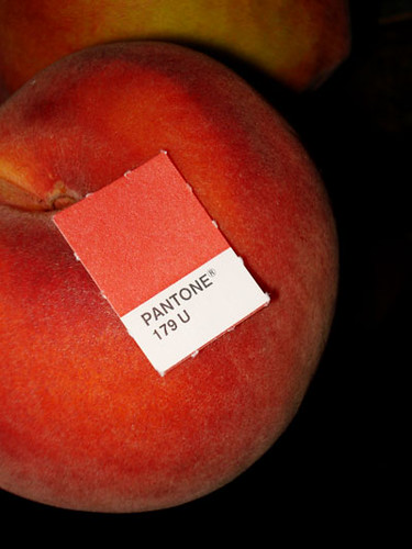 image source
It's called "tHUEsday challenge", and the goal is to photograph something that matches the designated PMS color of the week.
image sourceAlmost enough magenta to be a true red and way too much to be an orange, PMS 179 sits somewhere in between. In the Pantone flip book, PMS 179 has way too much attitude to live with fun loving oranges… it chooses to reside next door to Warm Red instead! Sometimes hard to find, look to mother nature… peaches and flowers love PMS 179.
Reader Dilemma-cover that couch!
We all know this situation. You fall in love with a new piece of furniture, or in this case, a rug. You proudly display it in its new location, only to discover everything else has now been thrown out of balance. This brings us to this week's color dilemma, from Raven in Pennsylvania.

I am 'color challenged' and need some help picking out the best couch and chair cover colors to coordinate with a new rug we just moved into our living room. The only major consideration is that we have a dog who sheds white fur.... so what do you think?-Raven

So, the focus point in this room has obviously been shifted to the "olive" rug, and now her blues look out of place. So, the colors she has to work around are the orange-undertoned wood of the chair and couch frame and the yellow-greens and browns in the carpet. Raven's palette looks like this:
 She could have a lot of fun with these colors. Here's an example of what one design did with this same palette (well, minus the orange tone wood). Notice how he incorporated the colors of the room in the throw pillows.
I would suggest one of two solutions. If she doesn't want to go too crazy with colors, pick a color out of the rug to use on the sofa and chair covers; either of the two greens would be beautiful.
Here's what the light green might look like against the wood furniture.
The lighter of the rug browns would hide white pet fur better, but the chocolate brown would contrast nicely against the light wood. Perhaps find a fabric that is textured with light and dark browns?
Just for fun, if Raven wanted to get crazy with her color scheme, she could pull in violet from across the spectrum, to create a split complementary palette.
 I'm not suggesting purple in its purest form, but a color as equally-muted as the greens. A dusky tone.
 And if she really wanted to go hog crazy, refinishing the furniture in a rich chocolate stain would really bring this room together.
Raven also mentioned that she rents, but if painting the walls were allowed, I would highly suggest toning down the bright white with a soft neutral green or taupe.
So, that's my two cents. I'd love for you readers to jump in and offer Raven your advice, too. How would you suggest she pull this living room together?
 She could have a lot of fun with these colors. Here's an example of what one design did with this same palette (well, minus the orange tone wood). Notice how he incorporated the colors of the room in the throw pillows.
I would suggest one of two solutions. If she doesn't want to go too crazy with colors, pick a color out of the rug to use on the sofa and chair covers; either of the two greens would be beautiful.

Here's what the light green might look like against the wood furniture.
The lighter of the rug browns would hide white pet fur better, but the chocolate brown would contrast nicely against the light wood. Perhaps find a fabric that is textured with light and dark browns?

Just for fun, if Raven wanted to get crazy with her color scheme, she could pull in violet from across the spectrum, to create a split complementary palette.
 I'm not suggesting purple in its purest form, but a color as equally-muted as the greens. A dusky tone.
 And if she really wanted to go hog crazy, refinishing the furniture in a rich chocolate stain would really bring this room together.
Raven also mentioned that she rents, but if painting the walls were allowed, I would highly suggest toning down the bright white with a soft neutral green or taupe.
So, that's my two cents. I'd love for you readers to jump in and offer Raven your advice, too. How would you suggest she pull this living room together?

Waiting for approval
Well, I had this great sneak peak all written up to share with you, but my client is hesitant to reveal to the world her new logo color scheme until its gone through final approval, and is up on her site. Darn it!
Never fear, we can still discuss the other project. I've been working on another color palette for a different client, and since I haven't even -seen- their new logo design, it's safe for us to discuss my process in generalized terms. My client (a graphic designer) is working to create a new logo and brand image for her client, a pharmacy school. After researching the competition, and affiliated industries, I came up with some color options for them.
Their current color to date is a muddy, purply burgundy. (The Pantone colors don't really appear accurately on screen, so I've tried to match web-safe colors in smaller, inset squares to give you a better idea of the tone). The school wants to be seen as progressive, innovative, and cutting edge in science. I don't know about you, but their current color feels staid and conservative to me, like it's embracing the past instead of looking to the future.
 So, I proposed a more lively, energetic claret red (it's hard to represent the actual color on screen), if they don't want to stray too far from their current color.
Next, I suggested a deep, rich teal color, blue for dependability and leadership, green for its life-giving force and growth, all wrapped up in a package that says sophistication and confidence.
Lastly, I showed them a vibrant blue. I felt that innovation has a sense of lightness, of rising above pre-existing notions, a message of open-mindedness. Dependable in its everlasting quality, blue is always reaching, stretching for wisdom, enlightenment.
What would you suggest?
Request for Submissions: Reader Dilemmas
Anyone have a color dilemma they'd like discussed here? I'm looking for a submission for next week...anyone?
Thanks!
Thanks!
Wild and Crazy Week
You know the saying, "when it rains, it pours,"? Well, after months of slowly plodding along, I have a wave of deadlines that just hit me. So, I apologize if my postings are a bit sparse this week. I'll try to include you by giving you little peeks at what I'm working on...
Wish me luck!
Wish me luck!
Color Conversation Interview
I had the great honor of being interviewed with Marisa, author and creator of Creative Thursday, by Holly of decor8 fame, on Marisa's podcast this week.  These two women have been such inspirations to me as I've moved forward with my career and blog. They really are the reason I started blogging in the first place, so you can only imagine how excited I was when Holly suggested the idea of a group podcast. We had an in depth conversation all about color, bringing together color consulting, fine art and interior design into 55 action-packed minutes. This is my first podcast ever, so let me know what you think!
Colorful Conversation with Marisa, Holly, and Rachel
Update:
Marisa just created a daily painting inspired by the three of us and our favorite colors: pink (Marisa), orange (Rachel) and turquoise (Holly)- How cool is that?!
These two women have been such inspirations to me as I've moved forward with my career and blog. They really are the reason I started blogging in the first place, so you can only imagine how excited I was when Holly suggested the idea of a group podcast. We had an in depth conversation all about color, bringing together color consulting, fine art and interior design into 55 action-packed minutes. This is my first podcast ever, so let me know what you think!Colorful Conversation with Marisa, Holly, and Rachel
Update:
Marisa just created a daily painting inspired by the three of us and our favorite colors: pink (Marisa), orange (Rachel) and turquoise (Holly)- How cool is that?!

I'm late, I'm late, for a very important date!
Where did the time go? I just realized that it is August 2nd, and I haven't posted a new monthly banner. Yikes. So sorry, ya'll.
I'm getting ready to launch a color consulting service for small businesses with Sensational Color. Suddenly, our official launch is just around the corner, and there are still so many things to do!
Could I get your feedback on something? Right now, I am working to determine what colors represent "Confidence, knowledge, inspiration". In other words, if you were to translate "resource for color information" or "color know-how" into a color or few, what would you see?
Subscribe to:
Posts (Atom)