Will color make you drink more?

Pepsi is in the process of revamping their logos for their major beverage brands to struggle back from drooping sales. It's interesting to consider that a redesign, or refreshed color scheme, could encourage people to chose their drinks over competition's.
image source
No official pictures to post as of this posting, but we've got this rendering as a teaser. The new logos will loosely form a series of smiles. A “smile” will characterize brand Pepsi, while a “grin” is used for Diet Pepsi and a “laugh” is used for Pepsi Max (s0urce) What do you think? An improvement, or big mistake?

image source
When Canada Dry’s sugar–free ginger ale can was changed from red to green and white, sales went up more than 25%. The red can had evidently sent a misleading cola message to consumers. (source)
image source
M&M's wanted to roll out a transformation of their M&M's brand, so instead of quietly making the change, they turned it into a major promotional opportunity, calling it the "Great Color Quest".
image source
The new M&M's would have more vibrant colors and the M's would be printed larger (the first logo change in 60 years). So instead of just advertising a make-over, the marketers took the colors away so that the consumers would notice the new colors.
"By involving consumers in the process of reclaiming color through a nationwide contest, we've made the brand transformation into a fun and interactive process, and by taking color away from M&M'S®, we've demonstrated just how important it is to have it back." (source)
I find it fascinating that marketing can be that manipulative in terms of boosting sales simply by swapping out colors, or tweaking designs just a tad. Are we, as a consumer society, that easily persuaded by marketing?

Last call for submissions

October is drawing to a close, and our coloring contest deadline is almost here. If you would like to submit your idea for this house, please email it to me before the 31st. (if you still need the files, just email me for those, too at rachel.perls [@] gmail.com)

Some ideas I came up with, to get your creative juices flowing, and to show you how much the character of a house can be altered, just by adding color:
From understatedto a little more contrasty
to more saturatedand ending with really colorful

Come on, I would love to see what you come up with!

Put your sunglasses on for this one

The NYT recently published an article about an eclectic couple living in the artsy mountain town of San Miguel de Allende and their rather colorful abode.
Okay, that's putting it mildly.
It's an art project, eternally in progress, as they add layer upon layer of murals, shrines, mosaics, decoupage, and paint. The colors are absolutely wild. See for yourself:
“The palette is ‘no rules,’ ” says Anado McLauchlin, one half of the dynamic decorating duo. “When you have rules like only beige or oatmeal, you’re limited to that palette. When you use all the different colors, there are no rules, there is no editor. It’s very freeing.” (source)
Doubling as a showroom, most of the outside art and furniture in the house is available for sale. For those of you with creativity block, they also offer workshops.

A bit over the top as a living environment for most people, I would assume. But it just goes to show you that everyone has a different approach to what constitutes "home" for them. Regional differences also play a huge role, as a palette found in Mexico is going to be vastly different than a popular color scheme in say, San Francisco. What colors do you use in your house to reflect your personal taste and aesthetics? Do you find your color taste is an accurate reflection of your specific region?

images source

Reader Dilemma- home gym colors

Reader Rachael wrote in to ask for advice about her workout room. Let's see if we can't help her out!
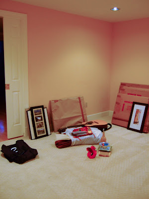
I was wondering if you could recommend one or 2 colors to paint my home gym. It's an empty basement room, 11x14. I was thinking something relaxing yet energizing, perhaps a calming blue or toned down lime green. What do you think?
- Rachael
I'm always fascinated by the reaction color elicits in individuals- Rachael says the existing soft peach walls make her want to curl up and take a nap. Generally, the warm hues are recommended for encouraging activity. But perhaps this specific tone is too soft and cozy. There's always a very personal aspect of color-what is calming to one can be stimulating to another.
image source
The first thing I would do, to give the feeling of space and light, would be to add some large, floor to ceiling mirrors. The room will hopefully feel more expansive that way, since there are no windows. You don't want to feel closed in.
Also, make sure there is adequate lighting in the space, otherwise, the dim environment will encourage relaxation, instead of stimulation!

image source
Here is an image of what I would NOT do. Dark, cave like, this feels way too oppressive to be conducive to exercise. Yikes....

image source
Going a bit over the top in the other direction, the thing I like about this home gym is the energizing orange and other active, bright, colors. There will be no napping in this space.

image source
A warm, yellow-green like chartreuse or lime, could be energizing, while still relaxing. It's a great way to bring a sense of the outdoors inside. The warm undertones keep the green from being too calming.
image source
Perhaps a perky blue with green undertones? People often see blue as a calming color, but there are certainly variations that are quite active, like this example.

Those are my thoughts. Do you guys have other suggestions for Rachael's home gym? Anyone have one of their own they are especially proud of?

Reader Dilemma- 50's bathroom

Teresa read about my bathroom quandary, and sent in photos of her own 1950's bathroom for help.
Here is my gray & burgundy tiled bathroom. We are at a loss here. If you care to suggest a color, we'd be thrilled!
-Teresa
I'm inclined to suggest a nice rich burgundy color, to balance out the activity down below. Or perhaps a middle value gray. Be sure to match the gray against your tiles so you select a gray in the same temperature range. If the tiles are a warm gray, make sure your paint is warm too, and so forth. The white is just too stark, and doesn't compliment the palette and retro feel. You all were so fantastic with the last bathroom, that I'd like to get your ideas. What do you think, everyone?

Apartment Therapy Finalist-will you vote for me?

I submitted pics of our house for Apartment Therapy's Fall Colors Contest, and we are one of 16 finalists for the Northwest region! Since we just moved here, our house is definitely still a work in progress; it's fun to see what others have done to add color to their spaces.

Every finalist is competing head-to-head in face-off voting through a bracketed voting system.
The bracket voting for our face-off only lasts 24 hours - switching at 3:00am (EST) on Thursday morning, October 23rd.

It's up to viewers to select the 2 finalists from each category at this stage in the game, and I'd LOVE it if you'd vote for me! Remember, voting ends tomorrow, so please click here to vote today.

P.S. it's kinda challenging to login for voting, but when you click "login or register", it will take you to a random post. just scroll down to where you can comment, and sign-up there. then, it makes you sign-in, then navigate back to the voting page, where you have to refresh the screen to see the voting boxes below the images. Confusing? Yup, I agree. But appreciated? Completely.

Trim-does one white fit all?

Poor trim, it always seems to get the short end of the stick when it comes to color choices. While people obsess over paint colors for walls, trim is often neglected, along with ceilings, and by default, assigned the all-encompassing white. There's an excellent article posted on the history of trim colors, and a plea to readers to consider all the various color options out there.
image source
The journalist's enthusiastic argument is a compelling one:
Our eye goes automatically to the lightest and brightest thing. Why should this be trim? Against colour, it grabs the eye and takes it on a bumpy ride outlining walls, crashing around room perimeters, separating the walls from the floor, interrupting every vista and joining up with doors to make big clunking visual statements. White trim tries to make us think that the wall colour is darker than it is and that colour is oh so tiring! Colour gets the blame, but the busy and bossy effect of white trim is at fault.
image source
It's true, there is no one solution to every color palette when it comes to trim. While pastel walls might look striking when outlined in crisp white trim, the darker colors can often look garish and the effect, too choppy. It's a matter of context, and contrast. The article suggests:
Grey, tans and taupes will still read as white against a dark wall, but they won't read as bleached or as plastic edging. The effect of reducing the contrast between trim and wall is like taking a slow, deep breath. Suddenly there is visual flow, elegance and a relaxed calm that only good colour uninterrupted can bring.(source)
image source

Have any of you tried trim in something other than white white? How did it turn out?

Dripping walls- what's going on here?

Up until now, I have been a firm supporter of Benjamin Moore's new Aura paint line. I used this high-end paint product for virtually every room in our house. But look what has happened to my newly painted bathroom walls!
Ick, right? Those streaks, evidently caused by moisture build-up from the shower, are permanent. They look wet, but they are actually dry, shiny streaks. We don't have a ventilation system in the bathroom, so always leave the window open to air out the room. We also shower with the door open, which you would think would cut down on the moisture.
When we first painted the bathroom, I used a semi-gloss finish, knowing that moisture can wreck havoc on painted surfaces. But the walls are so uneven and full of imperfections that the shine caught every bump, crack and ridge, drawing way too much attention to the flaws. So I repainted it in a matte finish. But these streaks are awful.

Have any of you ever experienced this before? Help, what should we do!

iPhone color application

My husband has been drooling over the new iPhone, as he is obsessed with technological toys. While we're holding off buying one until Apple changes its ridiculous service provider policy, it's still fun to check out all the great third party applications being developed for this toy.

image source
One that caught my eye was a color application (surprise, surprise!)
Color Expert helps artists and designers identify, translate, capture and show color using their iPhone or iPod touch. You can use an interactive color wheel to identify a target color and then find several palettes backed by color theory. When you're satisfied with the palette you have created, you can e-mail it to yourself or someone else for future reference.
image source
I was initially skeptical about how this little program could be useful to anyone, given the screen can't really be calibrated accurately, (as far as I know). Skimming through comments at the end of an article, I read an opinion that changed my mind:

I've been working with a very fussy client on a website. We just couldn't come to an agreement on the colors. She loves green, Today, I was in her office and she pointed to her sweater and said that was the color she wanted.

I pulled out the iPhone and opened Color Expert. I took a picture of her sweater, selected the green I thought she would like and showed her the analogous colors based on that selection and she was excited as those were the colors she wanted. -DreamweaverMM (source)

image source

I can definitely see how that would be useful. Do you rely on technology when you are creating or designing something, or do you prefer to use more traditional media?

Video games...for artists?

This is hilarious. Never in a million years would I imagine a video game aimed at creative types and color. But the day has come, and Wii has the paint-themed game deBlob. I think I've played a video game maybe a handful of times in my life, stretching back to Pac Man days, and then some racing game where I drove a milk truck into a tree. Might be fun to try my hand at saving this make-believe city from the evil empire of black and white drabness :-)
de Blob: Flip, bounce and paint your way past the all-powerful I.N.K.T. Corporation to launch a revolution and save Chroma City from a future without vibrant color.
Long Live Color!: Join the Color Revolutionaries in the resistance against the evil Comrade Black and his diabolical array of hot plates, electric shocks, and ink turrets.
Free the Citizens: Free your friends from a black and white world by dodging ink cannons, flattening I.N.K.T. tanks and outsmarting Inky soldiers.
Save your City: Remix Chroma City’s towering skyscrapers, expansive bridges and massive landmarks in your own style using custom paints, patterns and soundtracks.
Make a Mess: Super-size your blob as you splash, spray, and splatter everything you touch in sprint, race and combat challenges.
Multiplayer: Compete for control as ink levels rise and wind cannons fire in eight multiplayer-specific gameplay modes

images source
The trailer explains the history and plot of the story. It's actually kinda cute...

For more info on the game, the Washington Post has a great article.

Organizing game- put your skills to the test

Reader Julie wrote in with this really challenging color test. The object of the game is to arrange the blocks of color within each row so that there is a clean transition from one color to the other. It gets really hard when you get down to the nuances of one color to the next, and sometimes difficult to decipher the differences depending upon your monitor and unregulated lighting conditions. image source
There is also a non-virtual version of this test for those looking to improve their ability to discriminate between colors. They even suggest a daylight viewing booth to help see each color accurately by regulating the viewing conditions.I'd like to know what it is supposed to look like on a calibrated monitor, but here's what I got when I tried the test. Give it a shot! How did you do?

Rachel Perls, color expert, weighs in: Color trends- no business in home interiors

House Beautiful magazine recently hosted an event that traveled around the country to major cities like New York and San Francisco. As I read an article about the lecture series, dedicated to color, I found myself disagreeing with many of the comments and quotes from designers who spoke there.
For example, in a section titled, "Hot right now", they provide a list of 10 colors that a representative for Kelly-Moore paints said "work well with the colors of consumer goods and goods for the home currently available in the marketplace." Right now, that means "warm and earthy with some kicks of bold and unusual color."(source)

As I've written before, I take issue with following trends when it comes to painting interiors. Color trends are predicted sometimes up to 3 or 4 years in advance by color forecasting groups. Consumers are presented with those pre-selected palettes in order to push merchandise and keep products fresh and relevant (article).


image source

But what happens 10 years from now?

Case in point:
1960s: Avocado green and harvest gold
Early 1970s: Bright primary colors: red, yellow, blue
Mid-1970s: Electric blue and Kool-aid orange
Early 1980s: Gray with mauve and jade accents
Late 1980s: Miami Vice pastels
Early 1990s: Dark earth tones: gold, green, burgundy
Late 1990s: Pale citrus tones: tangerine, lemon, lime (source)
image source
(is that green fur on the walls?!)
Great if you are trying to sell someone yet another widget, but not so great when that trendy color has to withstand the test of time on someone's walls. My suggestion would be to play it safer with larger purchases like couches, and then refresh and update with less-costly accessories.
image source
(eegads! Via desire to inspire)
Paint, while cheap enough to do-over more frequently, is often a hassle. I find homeowners are willing to embark upon major repainting projects maybe once every ten years. Exceptions include new homeowners, who almost always want to put their personal mark on a new place. Businesses, at least retail storefronts, will often spruce up their palettes more frequently. But for the majority of us, who wants to repaint every 3 years?

What are your thoughts on using trendy colors in your home? Thumbs up or down?