Getting rid of brushstrokes

When I look at a piece of nicely refinished furniture, I am always amazed when I learn that it was brushed on instead of sprayed. Of course, investing in a spray gun, compressor, and all those fun toys is a step beyond what most DIY'ers want to spend. I, myself, have done some refinishing in my life, and believe you me, it's more work than I think the pieces were worth. Not to mention, I could never completely get rid of those darn brush strokes. So imagine my delight when I read on Centsational Girl today about paint conditioners.

Here's the blurb:
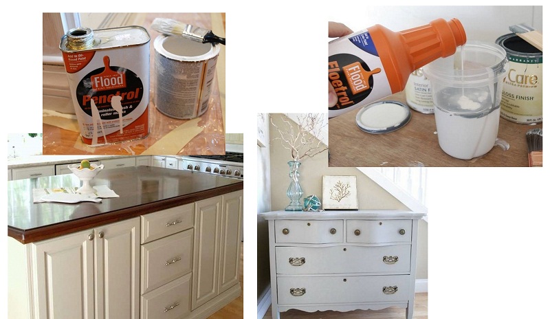
"...paint conditioners are key for me for refinishing cabinets and furniture.  Penetrol is for oil based (alkyd) primers and paints.  I used it to refinish my kitchen island and the finish is so smooth, you simply cannot tell it was painted with a brush.   Trust CG on this one.  Floetrol is for latex paints and I used it on the gray blue dresser in my foyer. 
image source
These two favorites are not paint thinners, they are conditioning additives available at larger home improvement stores in the paint department.  They practically eliminate brush strokes and drag in your paint, plus they lengthen your drying time just long enough to get a smooth finish.  I love these conditioners, and won’t paint furniture with a brush without them anymore." (source)
Have any of you worked with this additive? Does it do as promised? I might be more inclined to slap a fresh coat of color on more items if I had a secret weapon in my back pocket that really worked!
The fine art of mixing color


The wonderful thing about Justin's demo blog is that he goes into great detail about his color use and layering to achieve the final effect.
For instance, he says that it's easier to judge colors more accurately by painting on a warm grayish tone on the canvas versus a bright white. Hm, sounds just like what I do when I'm presenting color palettes to business clients- I mount my images on a neutral 50% gray matte board to best represent colors and value.

Ever wonder how to mix colors for realistic Caucasian skin tones? Justin mixes yellow ochre, alizarin crimson and viridian to create the shadows for this little girl's face. (For those unfamiliar with traditional paint colors, yellow ochre is a brownish yellow, alizarin crimson is a blueish red, and viridian is a blueish green.)

Layering one color over another can also help achieve a greater sense of depth and dimensionality. Justin states, painting cool colors on top of warm colors often adds an effect of realism. Want to learn more? Head over to his new blog to see for yourself.

These tips and examples are not exclusive to fine art painting. Borrowing from a diverse range of sources and backgrounds can sharpen your color knowledge and help you in just about any color application.

The Color of Sustainability

Is blue the new green? Can green design, ie environmentally-responsible products and design decisions, be defined by any color -other- than green? Heck, do we even Need to have a specific color define this movement at all? Can't we just do away with the marketing tag lines and color coding?
image source
When this first went mainstream, I predicted we would be 'over-greened' with companies taking the eco-friendly spin. No longer a specialty niche market, or a passing trend, consumers now expect to find environmentally-sensitive products in every category. Sustainability is now a cultural shift.
 image source
"Reduce, reuse, recycle" was where it all started. But environmental responsibility is evolving, and the new mantra requires one step further: adding back to our world. For the design profession, this means "clients will hire design consultants with the ability to both envision a design solution and quantify some sort of value on a ‘green to blue’ spectrum," explains Janice Barnes from the architecture firm Perkins+Will (source).

Some examples of blue design, include:
  • fitness clubs where energy used is generated by treadmill and exercise bike usage
 image source
  • Alice Waters's Edible Schoolyard program in Berkeley; a one-acre garden and kitchen classroom where students learn about, grow, and harvest healthy produce. (source)
image source
But it goes further than just blue. A recent report, called The SHIFT Report: Defining Sustainability and Selling it to Consumers, report identifies four colors of consumer perception about sustainability:

Orange - Personal (balanced life, feeling connected, personal well-being)
Yellow - Spiritual (higher purpose and meaning to life beyond material possessions)
Green - Environmental (eco-fashion, global warming, pollution, recycling, etc)
Blue - Social (fair trade, treatment of employees, community involvement, etc)
A review of the report determined that the top 5 sustainability issues that consumers associated with sustainability were orange, yellow and blue. Nope, green was not in the top.  (source)

 image source
The cultural shift in consumerism has brought to the surface some interesting ideas.
I like how this article puts it: "the solution is not a congratulatory pat on the back of consumers communicated by images of clear blue skies and lush green vegetation. Rather, designers must challenge the status quo and rethink the very core of consumption." (source)

What about this for a theory: “Sustainability is transparent, void of obscuring color. It is clear, open, and visible. Sustainability is naked.” Do you agree? If we need a broader platform than green, where do we go from here?

Stir column: 6 Tips for a Great Client-Designer Relationship

My latest article for Stir magazine is online and available for viewing and commenting!

Full Spectrum: 6 Tips for a Great Client-Designer Relationship
Well, it was sweet while it lasted … A gung-ho designer and enthusiastic client may work well together during the “honeymoon” stage of a project, but things can often turn rocky — fast. So, with a nod to New Year’s resolutions and fresh starts, I thought I’d provide some practical tips and suggestions to help keep your relationships with clients healthy and enjoyable all year long. Remember: Great design is the result of a great client-designer relationship. More...

Do you have any tips to share on what makes a great relationships with designers or clients?

Colorscripts-a dream job

Were there to exist micro-careers where you could hand-select any aspect of a larger profession to specialize in, I would have found my calling.

I stumbled upon it just the other day.  I went to see  Pixar: 25 Years of Animation, at the Oakland Museum of Art.
image source
It's an exhibit that has been traveling around the world for the past 5 years. Now it's come home to Oakland,  just minutes away from Pixar's home base of Emeryville, California. It's only on until January 9th, 2011 so if you are in the area, Do try to get in to see the show. Reservations are required.

The show is amazing; I was BLOWN AWAY by the talent and  creativity of Pixar's artists. The storyboards, character development, modeling, and so much more. But one particular aspect of the movie-making process really caught my attention: Colorscripts. Aha! Sounds right up my alley!
"A colorscript is artwork that visually supports the emotional content of an entire story through general color, lighting and mood. It depicts the whole story in chronological format that allows one to see the basic color structure to be applied to the entire film. The colorscript is one of the first opportunities to see the story as a whole. It is a low-resolution view that reveals the full emotional arc of the film. Colorscripts work because detail is removed and ideas are presented in their most concise form." (source)
image source
Colorscript from the Incredibles 

The highly-coveted job is held by production designers and art directors, so their responsibilities extend past determining the film's tone through color palette selections. How cool would that be if this position were for those of us who -just- want to work with color? I'll keep dreaming....


 image source
Dice Tsutsumi is responsible for these two gorgeous colorscript drawings, setting the mood for two specific scenes in Toy Story 3.

 image source
Up colorscript by Lou Romano (here's a link to closer detailed drawings on his blog) The progression of tone and mood from scene to scene is so powerful when you see the entire movie encapsulated in a series of rough thumbnails like these. Color and lighting go hand in hand, so colorscripts are extremely important to the lighting designer for cues. 


 Toy Story colorscript by Ralph Eggleston (love love love his work...)

Finding Nemo colorscript by Ralph Eggleston

Bug's Life study of underground light and forms by Bill Cone

Don't these little vignettes just blow your mind? In my next life, I'll have to come back as an art director, just so I have the chance to work on colorscripts.

What's the coolest career (or micro-career) you've heard of?

Art for 2011: hibiscus flower painting

Happy New Year!! To start out 2011, I thought I'd share a recent art project my friend and I completed when I visited her in Kauai. Everything in her house is enormous, so all the art and furniture has to be to scale...very large! She wanted an over-sized hibiscus flower painting for her gigantic mantel.


We painted this four by four foot canvas in a number of days. Alas, the photos just don't do it justice- somehow, fuchsia just doesn't translate to pixels. Instead, it looks very red; weird. Cue new-fangled camera for X'mas? 

An in-progress shot. See, it really is quite big!

And speaking of big: due to popular request, here is a current shot of Nina. Wish I had a shot of me painting with her on my back in her Ergo baby carrier- she was a great assistant!

What are your goals for 2011? You know, saying them out loud, writing them down, or better yet, declaring them in public (ie this blog!) is a great way to really commit. Not to mention the encouragement and support we can then lend one another.