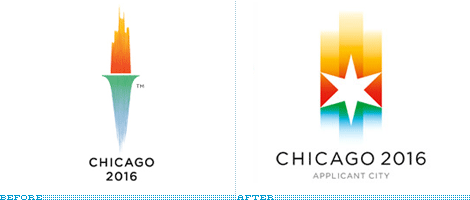
Did you know this? In May of 2007, the International Olympic Committee (IOC) changed the rules of the bidding process for cities, with one clause stating that city logos "shall not contain the Olympic symbol, the Olympic motto, the Olympic flag, any other Olympic- related imagery [such as] flame, torch, medal, etc."
I had no idea.
I had no idea.
 image source
What colors do you think of when you consider your home town? Please share!
via Brand New