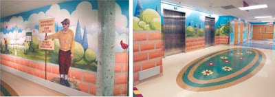
 St. Jude Children's Research Hospital in Memphis, TN has the right idea in keeping a child active and engaged during their sometimes lengthy stays in the hospital. They have created spaces literally covered in murals and visual stimulation to stimulate a child's imagination and interest. Representing different areas of Memphis, it's like taking a virtual tour of the city through the halls of the hospital.
Unfortunately, I think it's bit over the top, and runs towards the side of over-stimulation. There is so much going on, visually, that it's a bit dizzying.
 Because of the long lengths-of-stay children may experience, the artists attempted to provide enough detail so that viewers would need a long time to discover every event, place, and character. In response to patients' comments that certain patterns and colors reminded them of unpleasant chemotherapy drugs, the artists avoided using moiré patterns and large color fields in oranges, yellows, and chartreuse.(source)
I do like that the hospital is working to engage the patients, get them playing and interested in their surroundings. They obviously wanted to create an environment that fosters healing, encouraging the children to stay engaged, or at the very least, distracted.
 Children's Healthcare of Atlanta pediatric hospital employed a similar concept with their design, but with a bit more of a branded, sophisticated approach. With several campuses, the hospital re-design included a cohesive color palette and look that is shared amongst the buildings. With a master plan documenting the colors, finishes, and materials, the hospitals can easily pick one of the palettes out of the master plan books and implement it at a satellite clinic or new addition.
 The eight palettes are all derived from natural elements. Rather than the dated palette of pinks and teals common in hospital facilities, the design team looked to the vibrant essence of fuchsia, mango and lime for inspiration.(source)
 Additional color was added through lighted nodes in the ceiling, painted to reflect the specific department palette. Casting colors down across the floor, the lights also serve as navigational aids marking for way finding.
Making an environment more user-friendly makes a world of difference, not only for the patients, but the staff and the parents of patients. “The parents are so grateful that the new space is improved and brighter, and even the attitude of staff members has picked up because they like the space.” is the feedback on the hospital's redesign.(source)

