Kelly began her design career in Los Angeles as a set decorator and stylist working in the mediums of TV, print, and film. She has worked with celebrities including Reba McEntire, Emeril Legasse, and Tia Carerre and has developed and produced projects for HGTV, The View, and Soap Talk. Arte Styling, established by Kelly in 2003, focuses on interior design and color psychology with the mission to inspire individuals and organizations to express their authenticity and truest vision. Kelly holds a B.A. in Interior Design from the Design Institute of San Diego and is a member of the IACC-NA.
Stuck in Neutrals
Getting Over Your Fear of Commitment
By Kelly Berg
There is a lot of confusion regarding “neutral” colors lately. Especially when it comes to our living spaces. Everywhere you look, designers and home experts are coveting these non- committal hues. But the definition of neutral seems to constantly be in flux. And when it comes time for selecting the perfect paint colors for the home, many homeowners are left feeling perplexed and overwhelmed. Before we all reach for the latest and greatest shade of beige, perhaps we should delve a little deeper and ask ourselves what exactly are neutrals and why do we want them in our homes anyway?
Let’s start with the definition of “neutral” colors.
 image source
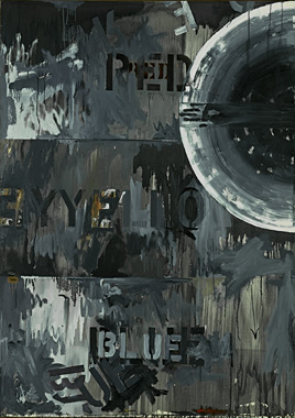
But true neutrals are actually grays - the hues that are created when two complementary colors are mixed together.

And every season an even newer “neutral” seems to pop up on the color radar. One year it’s orange, the next it’s lavender. This year it’s gray, or “greige”, that is getting a lot of attention as the latest go-to neutral. (Ironic, since gray is really the original neutral!)

We’ve been trained to think that being neutral is a good thing. The word “neutral” has a mostly positive connotation in our society. If we’re neutral, we’re not hostile. We are not out to offend anyone. We are calm and under control. We go along with everything and are considerate of others. We don’t take risks, we don’t make statements, and we don’t express our true feelings. We do and think as we’re supposed to and in doing so we live in a safe and uncomplicated world.

But there are downsides to being neutral, especially when it comes to using color in our homes. Contrary to what many color, home and design “experts” are feeding us, neutral colors do not equate to neutral emotions. Too much “neutral” can actually create under-stimulating environments which can contribute to elevated stress levels. Humans are designed to require a certain amount of stimulation from our surroundings. And although our individual thresholds for color stimulation vary slightly from person to person, overall we do not respond well to overly-muted environments.

So, if this is true, why has beige infiltrated our built environments to begin with? One theory, according to this Sherwin Williams Stir article , is that beige, and all of its incarnations, was popularized by builders during the post World War II housing boom. Because aluminum and vinyl siding materials were quick to fade they “began painting the siding in softer shades, blanketing the cities and suburbs in whites, beiges and grays” leading to a sort of “numbing effect on our society.”

So when we use “neutrals” in our homes are we, in a sense, stuck in the 1950s? Not necessarily. When most of us talk about using “neutrals”, we are usually referring to the desire to have colors in our homes that are both flexible and relaxing. We are not trying to recreate the 1950s. But somewhere along the way - with a little help from those mid-century suburban builders - we have developed a very inaccurate belief that to have flexibility and relaxation in our homes we are strictly relegated to beige. Nothing could be further from the truth.
Do you ever say to yourself when gazing over a beautiful green meadow sprinkled with wildflowers, “I love this landscape, but it’s just not neutral enough for me. I really would have gone with Tawny Taupe for the grass color. It would be much more relaxing”?

No? That sounds rather ridiculous, doesn’t it? And isn’t nature the ultimate representation of flexibility and relaxation? Nature doesn’t care about being “neutral”, and neither should we.

So, perhaps it’s time to clear up all this confusion and simply banish the word “neutral” entirely from our color vocabulary. What do we need “neutrals” for anyway? “Neutrals” were created out of fear. Fear of offending. Fear of committing. Fear of making the wrong choice. Fear of standing out and being different. But who wants to live in an environment built on fear? It’s time for us to
all say no to “neutrals” and happily embrace the hues that nature intended.