Here's the scoop:
Rachael is a professional photographer. Her in-home office/client meeting area is in great need of a paint job before her new furniture arrives.
 Here's what her space looks like now. A blank canvas, waiting for an infusion of her personality.
 In terms of light, the room's windows face north, so there is never any direct sunlight coming through them. The existing yellow color is a bit too dark for her taste, as the room isn't generally very bright.
 images source
It's not the biggest space, but it has loads of potential
 This is the new office furniture that is arriving any day now.
 And the new desk will go right here. Look how organized she is- floor plan and everything! Here's how the new office will be arranged. The two walls above the new corner desk will feature a large display of her photography, both gallery wrapped canvases and framed prints.
 As this space also functions as a client meeting space, it's super important that the atmosphere of the room reflect the character and aesthetics of the photography Rachael sells. The work should be showcased in this space. She describes her work as,
"fresh, fun and candid. That's exactly the feeling I want people to get when they come meet with me. My work is colorful, honest and full of personality...Here are some images Rachael provided for inspiration from 2 other photographers' studios she liked:
When a client walks into my room, I want them to see a space that is modern, clean and airy while still comfortable and relaxed. The room should feel light and open. I want clients to know they aren't getting the same old stale, posed, traditional photography."
 image source
More rooms she likes. Rachael likes the idea of doing something in the blue/gray/lime green range. Her preference is to have some fun with the walls, injecting them with life and color. I personally like the 1st image in the second row down, as it seems more friendly and inviting to me; more in keeping with Rachael's photography aesthetics.
But what do I think? The most important thing to consider here is setting a mood, creating a branded "look" for the art and services being sold.
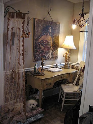
I'm certainly not suggesting this for Rachael, but think this makes an excellent example of creating a mood. By taking inspiration from the art piece above the desk, the furniture, textiles, accessories, and color palette all reinforce that "look". Rachael needs that for her office/meeting space. Gotta have the cute little designer dog, of course.
Since the photography to be showcased is quite colorful on it's own, I would not opt for injecting too much of a competing color into the space. A strong color might over-power the work. With that said, I've seen some amazing museum exhibits where the underlying color of a body of work is brought out in the wall colors. Here's an article I wrote about how museum exhibition designers maximize color.
 image source
So where do we go from here? I'd like to enlist the help of you designerly- readers to weigh in, so start thinking of your own solutions...
 Here's the overall color impression from Rachael's grouping of photos: very warm and earthy. My first reaction is to bring in a more arts and crafts style feeling- harking back to a simpler time of strong family values and pride in your craft. After all, her main subject matter does focus on family bonds...
 image source
I see wood furniture, big colorful throw pillows...
...a cozy woven rug, and warm-toned walls (maybe pick one color from the rugs above). I'm not pushing for stuffy, or stale, but the overall feeling that is evoked in the art. It's the whole package- art reflected in the space, in the color of the walls, the furniture, and accessories.
If one doesn't reflect the other, a strong brand impression opportunity is sadly lost.
But what do you guys see? Please share your ideas!


