Design: the Battle of Necessity Versus Aesthetics

Reality is not glossy and perfect like in design magazines. Reality is messy, awkward, and not always beautiful. Those gorgeous photos of baby rooms, pristine and decorated to the nines- without an item out of place? Not real.
All the truth is most likely stashed out of the picture frame, heaped in piles or shoved in closets. Such is my reality at this point. But I shall spare you that picture.

 Before my (almost) 5 month old was born, I day dreamed about setting up her nursery.

 I'd be creative, witty, and inventive. Oohdeedoh.com would feature her room in their kids tour.

People would swoon.

 Then reality hit, (she was born) and her room remains a work in progress.

 image source

Fretting over the rug, I have yet to purchase one that really holds everything together. We've been through 2 already: Anthropologie's Mantadia rug. Gorgeous, but thin and delicate, and much more conducive to being hung as a tapestry.
 image source
Then we tried Company C's Porcelain round rug: also gorgeous, but the brown was too much and the rug ended up being too small for the space.

So, with rugs on hold, (unless you've got a suggestion for us?) we've entered into the territory of window treatments. 'Out the window' goes my idea of flowing sheers, or soft delicate cotton prints. Nope, we're heading straight for budget-friendly, utilitarian blackout curtains.
 image source
Opting for the beige blackouts was nixed as my friend has a pair, and they just don't do the job. Purple was unavailable, or I would have gone with those. Pink was too, well, pink. Fuchsia would have been great, but alas, no fuchsia. The next, least-offensive color was navy. I cringed with resignation. But if they succeed in keeping my wee one down for lengthy naps during the day, this means I can work on professional tasks, (like this blog!), and that's the ultimate goal.

So, now that I have hideously unattractive navy blackout curtains, I figured, might as well dress them up. Here are my ideas:
Hang ribbons from the top in shades of turquoise and blue. Glue/sew pom poms/pom pom fringe or other doodads to the curtains, perhaps circles of turquoise felt. Maybe hang a sheer overlay of a lighter fabric across the top of the navy, something lacy, iron on appliques of flowers, paint a pattern on the fabric (not sure how it will adhere...) But reality has to rear it's ugly head once more, reminding me that I can't spend a fortune just to put lipstick on a pig.
With a certain someone in the picture now, there is little time for craftiness.

So, how do you view design out of necessity? Are compromises "acceptable"? Are budgetary restrictions a cop out, or a challenge to get creative? What about usage needs- an impediment, or just another challenge to meet?

Fashion With Compassion


Fashion With Compassion. 
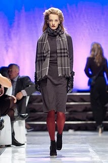
Julia, Gloria and Ciara of Mode Models.  Hair by Mousy Browns, clothes courtesy of Blu's. 


Shot by Dong Kim, Styled by Ari from Gravity Pope, Jessica Esposito from Mode Models. 

Behind the paint job

My latest Stir column is live!
What Will the Neighbors Think

All about public versus private color choices, a favorite topic of mine...

Ever wonder about the back-story behind a building you pass by regularly?

For this Stir column, I finally had a good, credible reason to contact Giovanna Tanzillo, the owner of this fantastically 'out there' house I've been eyeing forever. I left her a note in her fuchsia painted mailbox and crossed my fingers she would get back to me. Luckily, she did!
 The houses around it 'pale' in comparison.

In front of the house, there's a sign with a quote on it.

 image source
It turns out this quote hails from the children's book, "The Big Orange Splot" by Daniel Pinkwater (of NPR fame) When the main character's house is splashed with bright orange paint, he decides a multicolored house would be a nice change and one by one, he convinces the neighbors to follow their hearts and make their homes reflections of who they really are inside.

How perfect is that?!

Interviewing Giovanna Tanzillo was so much fun. I met her at her place of business, Uptown Body and Fender. Stepping inside, I thought it might be a design firm, with modern furniture, art prints on the walls, and a shiny espresso machine. Nope, it's a body and fender repair shop! Who knew. Turns out the same architects who renovated her home designed her shop as well.

I like the architects' analysis,
"Among life's more predictably dismal experiences is banging up your car, and the subsequent trip to the body shop." - Ace Architects
Not Giovanna's shop, that's for sure. Her auto-body shop motto says it all; "Smoothing out life's little wrinkles. One car at a time."
Why take yourself too seriously? Take the whimsy behind this tongue-in-cheek concept- steel panels resemble a shiny giant monster, with the mouth opening onto the shop's front garage doors. This structure forms the lounge/office area. The architects call it the happy "car-beast."
I knew I recognized it from somewhere, it's been featured in a multitude of design magazines.

Where else can you find fine art hanging in the "gallery" of repaired cars, waiting for their owners to come pick them up. (The actual bodywork happens at a nearby location) Its no wonder this location is a popular venue for art, music, and culture gatherings.

Anywho, back to my interview.  At the risk of sounding new-agey, Giovanna positively radiates good energy. She has sparkling green eyes and was dressed from head to toe in emerald green the day we met. She offered everyone who came through the door a cappuccino. Were it not already late in the day, I would have had one myself...

Really delightful, she was as cheerful as her orange house. Turns out she has thing for oranges. The last paint color of her 1920's house was a lovely terracotta. Her painter patiently put up something like 16 different versions before he finally hit upon the -exact- shade as Giovanna remembered it from her trip to Assisi, Italy. Incidentally, her painter Dean Byington is also a fine artist.


Looks like Ace Architects, who determined the exterior color scheme, really like orange and purple.
These colors are also used on their logo and website.

It was a pleasure interviewing Giovanna for my Stir piece. I just wish more images of her place could have accompanied the article. So I'll leave you with some detail shots I snapped.

Detailing of ellipses above front door

Railing painted in auto-body paint
Spiky orange and fuchsia plants, complete with custom-dyed wood chip mulch.
Graphic gate and inlaid mosaic spiral leading to garden oasis.
A sneak peak in the backyard over the gate.

Blog design envy

My cool color colleague Annie from Bossy Color has moved her blog to Wordpress and I have to say, I have blog design envy.

It's so nicely organized, with sections on color, living rooms, window treatment, and more. Want to look up posts on a particular style? No problem!
These days, my world consists of getting a regular nap schedule down. So when I looked up 'blackout curtains' in her Windows section, I was pleased to find just what I was looking for. Oh so very exciting, I know. But if I have success, this means more time for work, and for blogging so that you don't hear crickets chirping on dear ol' Hue.

Great job, Annie!
Have any of you moved from blogger to Wordpress? Is it worth it?

Otomi textile mural

My fascination with Otomi hand-embroidered textiles started when I first saw this super cute stenciled dresser by Lena Corwin on Apartment Therapy.
image source
Accidentally labeled "simple, folky Scandinavian look", someone in comments corrects them with a link to an explanation of Otomi embroidery

These hand-embroidered textiles are created by the indigenous Otomi Indians from the mountains of Mexico. A tradition in jeopardy of extinction, the craft is explained in great detail on this textile research site.

 images source
The whimsical characters, oh so slightly edgy with their crisp graphic shapes, were really charming. I tucked them away in a source folder for "someday".

Also added to my "all I want for X'mas, hint hint hint" folder.

Then, last week I was visiting a dear friend in Boise, Idaho, and she wanted to do a mural for her little girl's room. She couldn't stand the dingy grey blue wall color and sloppy flowers painted by the previous owners. Our ultimate goal was to create a child-friendly space that might (hopefully!) last her little girl into her pre-teen years. Aha! "What about an adaptation of an Otomi pattern?", I thought.


First we selected a soft aqua color for the walls and mixed a second batch with a little white to get the lighter color we'd use for the silhouettes.


We selected the animals we liked the best, and set to work chalking up the characters. Pardon the poor quality of the photos- we'll have better ones once the room is re-assembled. (okay, Sooz?)


But I was pysched how well it came out, and couldn't wait to share it with you all!