This is our bedroom before the transformation. Blue blue blue. We have about 5 different navy blue duvets we swap out, so the walls were really an isolated selection made before we had anything in the house. I would lie in bed, staring at the ceiling that wasn't quite the right tint of the wall color, and it Drove Me Nuts. Red undertoned wall color, green undertoned ceiling. I lived with it for 3 years, but could bear it no longer.
SO what color did I chose?
Wait for it...
...light pink! Craziness, I know. Especially coming from someone who has basically sworn off light pink since childhood, for no other reason than it has always seemed rather taboo.
image source
Like, if you admit to liking light pink, you are either anti-feminist, or still wearing kids clothes. (This is not to say that I, personally, don't rail against marketers for all the sexist and demeaning advertising that unfairly portrays women and girls) But that's another rant. Back to pink for now. So recently, I've spent a lot of time hanging out at friend's houses in little girl's rooms. All decidedly pink.
Every time I am in a pink space these days, I feel happy. Something about the friendly, warm, cheerful nature of the pink walls just makes me smile.
So after this happened time and time again, I thought to myself, " why can't I have my own pink room?" Who says it's just for little girls?
image source
Perhaps I am influenced by the book I am currently reading? This is a super-fascinating book: "Pink and Blue; Telling the Boys from the Girls in America" on how pink and blue evolved as gender-specific colors:"Jo B. Paoletti’s journey through the history of children’s clothing began when she posed the question, “When did we start dressing girls in pink and boys in blue?” To uncover the answer, she looks at advertising, catalogs, dolls, baby books, mommy blogs and discussion forums, and other popular media to examine the surprising shifts in attitudes toward color as a mark of gender in American children’s clothing. She chronicles the decline of the white dress for both boys and girls, the introduction of rompers in the early 20th century, the gendering of pink and blue, the resurgence of unisex fashions, and the origins of today’s highly gender-specific baby and toddler clothing."(source)
So that might have "colored" my view on embracing pink simply as a beautiful hue and not worrying about Barbies, Hello Kitty, or what it would do to my husband's masculinity.
Cautiously approaching my husband with the proposal, I expected him to shoot it down immediately. Luckily, I have trained him in the finer points of color variation, and he knew not to write off pink without investigating which -specific- pink I had in mind. He has an open mind, thank goodness!
Searching for sheets to go with our new color palette, I was astonished to discover that pink sheets are really unpopular. I mean, Really really unpopular. Unless you are searching for crib bedding, little girls twin sheets with roses, or bright fuchsia bedding, forget it.
I give you my partial search:
Macy's zilch
Bed Bath and Beyond Really, that's all? Yup.
Linens and Things nothin'
Crate and Barrel fuchsia
Garnet Hill (nothing but peach, really)
The Company Store only brights
Target but really scratchy
Pottery Barn nothing available
ZGallerie nadda, which is surprising to me since I thought they would be more flamboyant and brav.
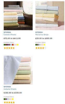
Now, interestingly, from a demographic standpoint, there -are- options if price is no object...
Now, interestingly, from a demographic standpoint, there -are- options if price is no object...
image source
SFerra brand: $258 for a queen fitted sheet, anyone?There are a few options through kid's stores, but the thread counts are low and the prints are juvenile.
So I've been buying sheets online, crossing my fingers they work, then returning them. What shows up on my monitor as nice clean pink at Bellacor arrived as a champagne, with the slightest hint of pink. No joke!
Well, accessories aside, the room is ready!
Several sample boards later, (always test on boards first!) we had a winner. To tie in the ivory trim and make the space feel more sophisticated, I used a light mocha color on the ceiling. I just love it. At night, the room has a warm cozy glow.
My conclusion? The general public is really stuck on the idea that pink is a juvenile color, not to be messed with unless it's more racy like fuchsia with zebra stripes. Personally, I think any color can be customized to work with your environs. Just takes a little legwork.
How do you feel about pink for adults?
Many thanks for my friends for sending pics of their kiddo's rooms


