Today we are happy to have a guest blogger,
Helen Green, for a visit.
A graduate of the National Design Academy (UK), Helen designs home interiors that are reflective of the homeowner's personality and life style. Currently working on a major renovation and complete home interior re-design in the heart of rural France, (doesn't that sound like fun?) Helen dedicates her spare time writing a
blog as her way of inspiring others into the world of Interior Design styles and concepts.
So, take it away Helen!
Victorian color palettes-how to go wildEver wonder about the details of Victorian color palettes? Many people are surprised to discover that the Victorians were far from reserved; they loved vivid, bold colors both inside and outside their homes. They gave careful consideration to the balance between colour and textures used on walls, ceilings and woodwork. Different textures for walls and woodwork could be seen in marbling, sponging and stenciling.
As brilliant white paint had not been created in Victorian times, cream tones were used as a base colour. Walls in dining rooms and parlors were usually divided into three areas. At the bottom were deep skirting boards, often made of pine. These were very rarely left unpainted.
The bottom half of the wall was usually a dark, muted colour topped by a painted dado rail in a contrasting colour. If the top half of the wall was not papered, a third contrast colour was used.
Coloured stencils and friezes were often used as part of the top wall.The late Victorians were inspired by Gothic trellises.
These were painted in rich earthy tones which incorporated floral and leaf styles and used in many rooms.
Here is a typical palette to create your own Victorian palette.
Here are more historical guidelines regarding colors and treatments.
During the first half of the Victorian era, walls were usually light colors except for dining rooms and libraries.
It is interesting to note that lighter colors were avoided in cosmopolitan areas because of pollution. Dark greens and blues minimized the effect of pollution from coal dust, and staining from gas and oil lamps.
Color options also depended on the availability of pigments. For instance, in the country, interior decor was often peddled by traveling craftsmen who carried limited supplies. Various lime-washes and distempers were mixed on site with whatever locally-available ingredients could be found. The blue-green colorwash used on wood paneled walls in country homes of Britain and North America was derived from the earth pigment terra verde, mixed with egg whites and buttermilk. (
source)
By the second half of the Victorian Era, deep, rich colours were thought to enhance the importance of a room. Popular colors included ruby reds, forest greens and golden ambers.(
source)
The parlour and dining room remained the most important rooms in the house. Used for entertaining guests, the parlour was lavished with objects and colour. A bare parlour was considered to be in poor taste. High ceilings were usually painted three shades lighter than the walls.
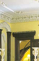 image source
Ornamentation on ceilings was also highly fashionable.
The drapes were made of white muslin during the spring and summer, and dressed with heavy fabrics such as plush velvet in the cold months. These were also in deep, rich greens and reds with large two-tone tassel tie-backs to hold then in place.
Victorian interior designs were based on achieving a neat and orderly appearance.
Because they did not want hallways to detract from the more important rooms in the house, the early and mid Victorians used dull and somber grays for these spaces.
By the late 19th century, emphasis had been placed on more elaborately decorated stairways and hallways. Shades of deep reds were favored. Wall paper had elaborate patterns with primary colours used as the background.
The influences of
William Morris, best known for his designs of repeating patterns, (many based on a close observation of nature) could be seen in wallpapers and fabrics used.
Something we can take away with us from the Victorian aesthetics of design is how they embraced decorating as an art form. It was all about the selection and balance of patterns and use of a full palette of colors; mixing designs, not 'matching' them. Just like in nature, a room should take on the full array of shades and colors found in a country garden.(
source) Lovely inspiration, don't you think?
 image source
 image source
 image source
 image source
 image source
 image source
 image source
 image source
 image source
 image source
 image source
 image source
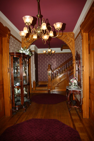
 image source
 image source