You might be wondering, with Walt Disney so closely-tied to Southern California and Hollywood, why Northern California for this museum? Seems Walt's daughter Diana Miller wanted to keep her dad close to her home in Northern California. "Walt Disney was a huge fan of the military and Gen. Pershing [who commanded the Presidio] in particular," explained Diane. In addition, she says, the museum building "recalls the Main Street USA in Disney World." San Francisco firm Page and Turnbull was retained to design a museum to pay tribute to her father's life and work.

image source
The museum occupies a former barracks building located in The Presidio in San Francisco. The barracks were built in 1898 and housed soldiers during the Spanish-American war. I wish I could find a picture of the building located directly next door to this renovated one- it's amazing to see before and afters side by side. 
A wee synopsis:
"Inside, Page & Turnbull collaborated with Rockwell Group and used influences from the existing building’s inherent character to feature the existing brick walls and exposed ceilings as a backdrop to contrast against more modern materials. Modest wood flooring, plaster walls, stamped ceiling panels, and original windows serve to ground the bright exhibits in which color was prominent, due to Disney’s successful focus on animation. To represent this cartoon creativity, the designers opted for a more theatrical approach to the interior lighting, alternating galleries between light and dark, to coincide appropriately with the exhibits’ back stories, and playing with the control of natural light within the space." (source)

What I was really impressed by was the immersive design of the museum, leading you through room after room chronicling Disney's life story. A bit of stimulation overload, with Disney's voice piped through speakers just about everywhere you turned. Storyteller and all that...


Special highlights to justify this cost(as mentioned in PR)
• Original multiplane camera displayed through two gallery floors


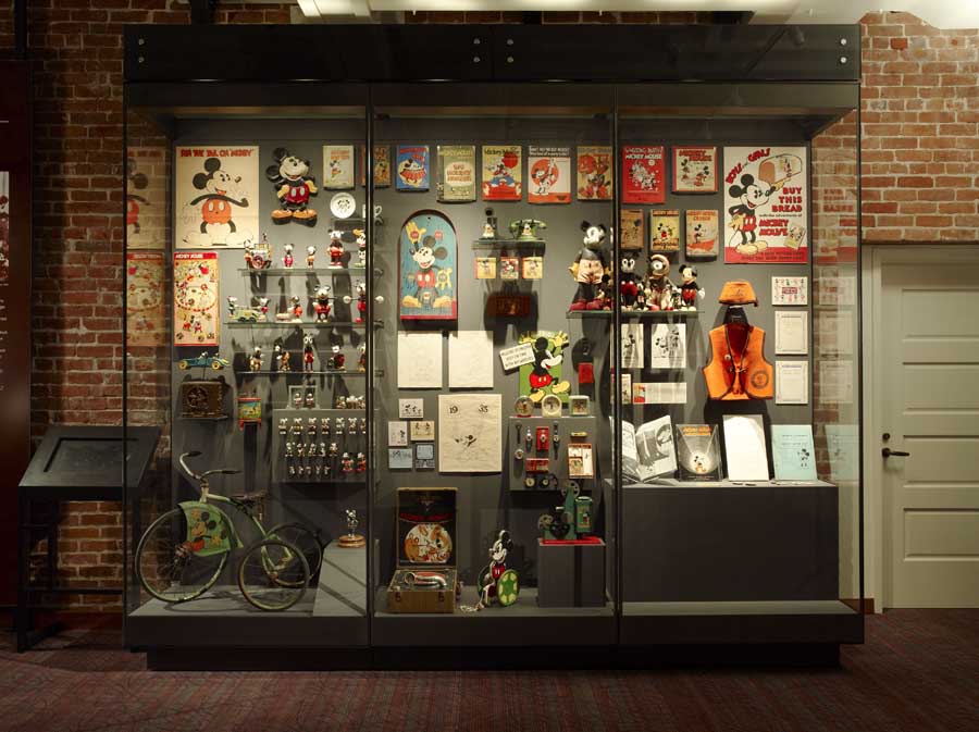
• Display case with over 100 examples of early Mickey Mouse toys, watches and other memorabilia

• A 13 x 13 foot model of the Disneyland of Walt’s imagination


But my favorite space in the museum?

Yup, it was all pretty impressive. I know we've got some Hue readers with museum and exhibition design experience. What's your take on this project? Is that chump change for a project of this size?
For those too far away to visit, here's an in depth synopsis of each gallery
images source, source, source, source, source