Geisha; all about symbolism

Geisha, traditional high-class Japanese entertainers, throughout history, have been wrapped in an air of mystery and intrigue. While Geisha today stand out as exotic and rare, their aesthetics were once very mainstream in Japanese society. In fact, before Western culture infiltrated their society, Geisha were considered the forerunners of high fashion. But once western culture began to take hold, especially after World War II, most other Japanese jumped on the bandwagon, modernizing their look. Geisha, on the other hand, dug in their heels and traded in their trend setter roles for that of the holders of a traditional culture.

image source
Ever wonder about their makeup? The traditional face paint of geisha is their most recognizable trait. It's all about sharp contrast: chalk white faces with crimson, bee stung lips and black eyebrows and lined eyes.
image source
Apprentice geisha wear this white face paint almost constantly, while established geisha generally only wear full face makeup during special performances. In addition to painting the entire face in white, the white makeup also covers the neck and chest.
image source
Two unpainted areas (three for formal), forming a tapered triangle, are left exposed on the nape of her neck, to accentuate this traditionally erotic area, and a line of bare skin around the hairline, which creates the illusion of a mask.

image source
Here is an example of more formally painted necks.

image source
Trainees, called Maiko, will sometimes color their teeth black. In contrast to the pure white makeup, teeth appear yellow, so coloring the teeth black gives the illusion that they disappear. Evidently, this practice, called Ohaguro, was once common among married women in Japan and in the imperial court. Geisha have held onto many cultural traditions that have otherwise been long ago disregarded.
image source

Here is a great chart explaining the different stages of a Geisha's training, and how her makeup application and colors change throughout those stages. (Click on the image to enlarge it.) Notice in the chart how the amount of red in the eye make-up starts to decrease with time from when a maiko becomes a geisha. Eventually the red eye color will be minimal or may even be excluded all together.
image source
One discussion forum I read through theorized that red is worn by the younger trainees because the color is considered a color of youth and virginity. This is why so much red adorns a maiko's outfit and then gradually, for the most part, disappears as she advances and becomes a geiko.

image source
Isn't it fun delving into other cultures and traditions? Color has such a powerful and significant role in so many different societies and groups. I'm fascinated by the breadth and depth to which cultures embrace it on a symbolic level. If you're curious about other cultural or historic uses of color, keep the suggestions coming and I'll investigate!

Meat and potatoes for dinner? Be careful!

Ever consider the color tricks food manufacturers use to get you to buy their foods?

image source
Leanne from A Life Filled With Colour ran into this issue with a bag of potatoes. Opposite hues on the color wheel basically cancel each other out, creating a neutral color. Wrapped, unripe, green potatoes in pink plastic bags essentially look brown through the plastic...until you get home and realize you've been tricked.

image source and source
Take meat counters, for another example. They are often lit with red lights to make the meat look fresh and "healthy". No-one wants to buy grayish meat, right?
image source
Notice all the red banners above the meat counter? All very calculated to push the message of fresh raw meat, while creating a warm glow over the products.

image source
Wild salmon derive their color from the krill they eat in the ocean. With their artificial diet, farmed salmon are normally a dull gray color. Other fish are naturally gray, but for whatever reason, consumers expect their salmon to be pink, pink, pink. The industry says the research suggests that people may be willing to pay a higher price for a salmon of the 'right' hue.(source)

image source
Get this: the producers of the dye even have a color fan deck for fish manufacturers to select from, like a paint fan deck. Pink dye is added to the salmon's processed food pellets for the desired effect. It's called a SalmoFan. I'm not even kidding!

FYI, the Monterey Bay Aquarium offers a handy free pocket-sized guide on purchasing seafood.

image source
But wait, there's more. Think your egg yolks, all a lovely consistent golden yellow color, are left up to nature? Think again.

image source
I give you, the DSM Yolk colour fan deck, for "reliable measurement of reproducible yolk colour"
After determining the desired yolk color, manufacturers feed birds the required amount of a nutritional supplement, and voila, lovely yellow pigment.

I feel so manipulated!

Have you ever seen so much purple at once?

Just came back from a fancy family wedding in Los Angeles. I felt badly for my hubbie- the affair was black tie, and his fashion options were really limited. Any color pop had to come in the form of a cummerbund, vest, or tie. After days of searching high and low for a purple velvet bow tie to match my dress, I even tried sewing one for him. Needless to say, that was a major disaster, and in the end, he ended up with a traditional black satin bow tie- your standard penguin suit, I fear.

image source
But men are in luck this season, as there is a prevalence of purple peppering the marketplace. There's an article in the NYT about purple for menswear that I thought ya'll might like to read. "The masculine form of pink" it's been dubbed.

Road barriers can be beautiful, too

What do you do when your city is just overwelmed with public works projects? How do you ease the stress for those living in the city, to make it more enjoyable for people to go about their business in a sea of barricades and contruction? How about turning those obstacles into art!
image source
image source
This geometric pattern of waves is installed on 1,900 feet of concrete barriers, part of the Harlem River Drive project. Known also as “Re:Construction”, these projects are an extension of the revitalization public art and architecture program for downtown Manhattan. Ultimately, the five boroughs of New York will receive installation. The projects will include traffic barriers, chain-link fencing and sidewalk shed scaffolding as canvases for art and "architecture interventions".
image source
"Best Pedestrian Route" was pre-fabricated structure to replace the conventional sidewalk shed scaffolding corridor along a construction site in downtown Manhattan.
image source
"Fulton Fence" re-used orange and yellow plastic construction meshes, industrial caution lights, safety signage, and the existing chain-link fencing to construct more than 30 patterned modules that edge the water main retrofitting on Fulton Street.

“With our temporary art program, we are looking to enliven the city’s public spaces and infrastructure, in unique, unexpected ways,” said Janette Sadik-Khan, the commissioner of the Department of Transportation (source)

image source
The site of this installation is a corrugated metal fence alongside a Department of Transportation storage yard in Dumbo, Brooklyn.

image source
Here's another fun installation: zebra stripes, entitled "Concrete Jungle". Although the critical mass of construction projects taking place in Lower Manhattan is pretty crazy, the DOT (Department of Transportation) is working hard to make walking around downtown a more pleasant experience.

image source
Speerheaded by the NYC DOT, some large companies are donating volunteers to aid in the beautification efforts.

I'm telling you, a coat of colorful paint always makes a huge difference...

Holiday cheer

Happy holidays to everyone! Taking a short break from more academic, enriching posts to bring you this sugar-induced greeting.

I'm really an over-sized child. I love craft projects, and the more colorful, the better. Take this recent holiday cookie-decorating party we hosted.
It's all about the toppings. Plastic hair dye bottles from the local drug store work great as icing applicators. Did you know Twizzlers came in a rainbow variety? Oh, and glittery sprinkles are a must...

With cookie-decorating, restraint is not necessary.
The grown-ups had as much fun decorating as the kids. Bird by illustrator Lloyd Dangle. How cute is that?

Even though we tried sending everyone home with the cookies they decorated, some of the more prolific artists left us with plate-loads of cookies. With every ounce of self-restraint, we managed to make the left-overs last at least 2 whole days before they were demolished.

Do you have any creative traditions you like to do, year after year?

Victorian color palettes-how to go wild

Today we are happy to have a guest blogger, Helen Green, for a visit.
A graduate of the National Design Academy (UK), Helen designs home interiors that are reflective of the homeowner's personality and life style. Currently working on a major renovation and complete home interior re-design in the heart of rural France, (doesn't that sound like fun?) Helen dedicates her spare time writing a blog as her way of inspiring others into the world of Interior Design styles and concepts.

So, take it away Helen!

Victorian color palettes-how to go wild
Ever wonder about the details of Victorian color palettes? Many people are surprised to discover that the Victorians were far from reserved; they loved vivid, bold colors both inside and outside their homes. They gave careful consideration to the balance between colour and textures used on walls, ceilings and woodwork. Different textures for walls and woodwork could be seen in marbling, sponging and stenciling.

As brilliant white paint had not been created in Victorian times, cream tones were used as a base colour. Walls in dining rooms and parlors were usually divided into three areas. At the bottom were deep skirting boards, often made of pine. These were very rarely left unpainted.
image source
The bottom half of the wall was usually a dark, muted colour topped by a painted dado rail in a contrasting colour. If the top half of the wall was not papered, a third contrast colour was used.

image source
Coloured stencils and friezes were often used as part of the top wall.The late Victorians were inspired by Gothic trellises.

image source
image source
These were painted in rich earthy tones which incorporated floral and leaf styles and used in many rooms.

image source
Here is a typical palette to create your own Victorian palette. Here are more historical guidelines regarding colors and treatments.

image source
During the first half of the Victorian era, walls were usually light colors except for dining rooms and libraries.

image source
It is interesting to note that lighter colors were avoided in cosmopolitan areas because of pollution. Dark greens and blues minimized the effect of pollution from coal dust, and staining from gas and oil lamps.

image source
Color options also depended on the availability of pigments. For instance, in the country, interior decor was often peddled by traveling craftsmen who carried limited supplies. Various lime-washes and distempers were mixed on site with whatever locally-available ingredients could be found. The blue-green colorwash used on wood paneled walls in country homes of Britain and North America was derived from the earth pigment terra verde, mixed with egg whites and buttermilk. (source)

By the second half of the Victorian Era, deep, rich colours were thought to enhance the importance of a room. Popular colors included ruby reds, forest greens and golden ambers.(source)

image source
The parlour and dining room remained the most important rooms in the house. Used for entertaining guests, the parlour was lavished with objects and colour. A bare parlour was considered to be in poor taste. High ceilings were usually painted three shades lighter than the walls.
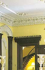
image source
Ornamentation on ceilings was also highly fashionable.

image source
The drapes were made of white muslin during the spring and summer, and dressed with heavy fabrics such as plush velvet in the cold months. These were also in deep, rich greens and reds with large two-tone tassel tie-backs to hold then in place.

Victorian interior designs were based on achieving a neat and orderly appearance.
Because they did not want hallways to detract from the more important rooms in the house, the early and mid Victorians used dull and somber grays for these spaces.

image source
By the late 19th century, emphasis had been placed on more elaborately decorated stairways and hallways. Shades of deep reds were favored. Wall paper had elaborate patterns with primary colours used as the background.

image source
The influences of William Morris, best known for his designs of repeating patterns, (many based on a close observation of nature) could be seen in wallpapers and fabrics used.

image source
Something we can take away with us from the Victorian aesthetics of design is how they embraced decorating as an art form. It was all about the selection and balance of patterns and use of a full palette of colors; mixing designs, not 'matching' them. Just like in nature, a room should take on the full array of shades and colors found in a country garden.(source) Lovely inspiration, don't you think?

What color was that film?

Reader and fellow blogger Jennifer wrote to tell me about a cool color project she had read about called, "Pie", by artist Alan Woo. In this experiment, he boils down movies to their overall color scheme, in order to compare films. A program written in processing captures each frame of each movie and essentially creates a 'pie chart' of the colors contained within each film producing a simplistic and abstracted representation.
Here is the representation of three films directed by Sophia Coppola: The Virgin Suicides, Lost in Translation, and Marie Antoinette
image source
The Virgin Suicides was a movie that rambled along slowly. I seem to remember many scenes were shot outside in nature- hence the over-riding green theme. Did I remember that correctly?
image source
Lost in Translation was a movie laced with a sense of loneliness and despair running through-out. The cool blue tones from harsh fluorescent lights and darker night scenes certainly seem appropriate here.

image source
Marie Antoinette was all pastel candy colors as the teenage main character partied her way through the film. The overriding color scheme of warm peachy tones is an obvious one to catch in this film.
First row: The Godfather, Second row: Back to the Future
Two trilogies where the director & cinematographer remained the same in each film, hence, a consistent look and feel to the over-riding color scheme.
image source
The Godfather movies cast a warm, sentimental glow over even the most gruesome of circumstances.

Back to the Future is full of nostalgia, as well, as the warm browns and pinks suggest.

Or how about this one: Teenage Mutant Ninja Turtles I, II & III

image source
Certainly gloomy and gray, that's for sure.

It's an interesting approach to analyzing movies that I hadn't thought of before, but certainly puts movie-making in a new "light" for me! Can you think of other films that have a distinctive feeling to the overall lighting and palette of the movie?

Weather-predicting crown of lights

The top of One Ricon Hill in San Francisco is ablaze with colored LED floodlights at night. The lights, in addition to simply looking festive, act as a weather beacon, forecasting with glowing amber, blue, red or green lights. As one article puts it, "a bit like a 64-story mood ring".

image source
The lights atop this residential high rise building will go on at dusk, and remain on all night. Every day, the National Weather Service forecast for San Francisco will be reviewed, and the color predicting the next day's weather selected.

image source
Here's how to remember what each color means:

Glowing red, warmer weather ahead

Shining blue, colder weather in view

Going green, rain foreseen

Amber light, no change in sight.


image source
Other weather beacons across the country and the world include:
  • John Hancock Building, Boston, MA
  • Syracuse, N.Y
  • Minneapolis, M.N.
  • Dubuque and Des Moines, Iowa
  • Bismarck, N.D.
  • Toronto, Canada
  • Brisbane and Adelaide, Australia