Colored foods-naturally appealing?

A friend made an excellent point to me the other day:"I've grown used to unwaxed, dull apples to avoid the treatments but I still expect bright orange baby carrots and rich, burgundy kidney beans. If colorants are deemed safe, are they still worth it?"

image source

Color provides visual information about a food's quality and condition, and influences the perception of its flavor.  In nature, color is determined by a food's inherent qualities, indicating types of flavor, and degrees of sweetness, ripeness, or decay.  From very early times, however, people have added or changed the natural color in foods: be it for visual appeal, appetite stimulation, symbolism, or to mask defects. Ah, color tricks...

Today, color additives are used in foods for reasons such as:
  • to offset color loss due to exposure to light, air, temperature extremes, moisture and storage conditions
  • to correct natural variations in color
  • to enhance colors that occur naturally
  • to provide color to colorless and "fun" foods
Without color additives, colas wouldn't be brown, margarine wouldn't be yellow and mint ice cream wouldn't be green.
 image source
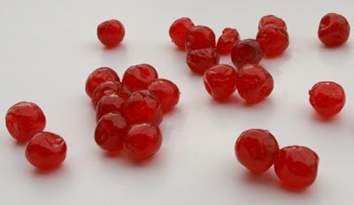
Did you know glacé cherries, without the addition of red food coloring, would be an unappetizing beige?
image source, source
Or how about this? Orange carrots weren't always orange. This color is the result of Dutch cultivation in the 17th century, when patriotic growers turned a vegetable which was then purple into the color of the national flag.

Here are some natural dyes that are being used more frequently:

Caramel (caramelized sugar) used in cola
image source 
Annato (seeds of the achiote tree) is a reddish orange and can be found added to chocolate ice cream, cheeses, and even some lipsticks

Cochineal (cochineal insect) red/carmine (what will vegetarians do?)
Food industries are aggressively opposed to the idea of writing "insect based" on the label, but because a subset of the population has food allergies to this bug, beginning in January 2011, you'll be able to find products labeled with "carmine".

 image source 
Saffron and Turmeric (a cheaper coloring alternative to the first) are used interchangeably in such foods as mustards, rices, and bouillon cubes.

 image source
There has been considerable concern regarding the carcinogenic properties of colorants. Manufacturers have gone to great lengths to adapt to these concerns, moving away from synthetic colors and towards natural ones. But there's a twist: while consumers perceive natural colorants to be safer, there is no U.S. government regulated definition for the term “natural”.   Back in the early 1980s, the Federal Trade Commission deemed that a “natural” product could not contain synthetic or artificial ingredients, and could not be more than minimally processed. But get this- there is no agency that monitors natural coloring additives. (source)

Marketing strikes again.

FDA info

Care to learn more about your toothbrush?

When you think of the profession 'Color Consultant', what comes to mind? Architectural interiors and exteriors? Hair coloring? Fashion stylist? But did you know that there is yet another subdivision of color consultants who deal exclusively with product colors? Maybe not as widely recognized, but oh so very intriguing.

At the San Francisco Design Center, I picked up their in house publication, 3D magazine. Thumbing through over-sized ads for carpets and sink fixtures, I stumbled upon an interview with Laura Guido-Clark, a well-known Product Color and Finish Consultant located right here in the Bay Area. Laura's work fascinates me, and when we first moved back to the Bay Area, I stalked her to meet me for coffee. Alas, she is one busy woman, and thus, I haven't had the chance to meet her yet. But I'll keep trying!

I thought I would share some excerpts from the article, "More than skin deep: an interview with Laura Guido-Clark".- 3D magazine

Ever wonder who selects the brilliant orange color for the carrot peeler you just simply had to have, even though you have a perfect decent silver one at home?  That would be Laura's job.
image source

Designing the "skins" of consumer products, ranging from textiles to automobiles, electronics, and household appliances, Laura has worked with quite a prestigious list of clientele, including The Gap, Apple, Toyota, Pantone, Godiva, Design Within Reach, and more. I love the diversity of projects with which she is involved.
image source
For example, Flor carpet tiles: With Laura's help, Flor has been able to expand beyond contract work into the much sought-after residential consumer market. "Barbie taught me to never be afraid of pink, it’s a neutral, and FLOR has taught me that being shaped like a box helps you think outside it,” Laura says playfully.(source)
 image source
She has worked with the industrial design team at Kodak to develop a color language and finishes for many of their digital products, including the new Zi8 pocket camcorder.
image source
For Oral B's Cross Action toothbrush, the goal was to create a color scheme that communicated "clean" associated with brushing one's teeth, while injecting some fun into this boring daily ritual. Hm, fun toothbrushing? That may be pushing it...


image source
Laura sees the underlying value  and deeper meaning of everyday products. To explain the thought process and design objectives behind a Design Within Reach spring bedding line,  she explains "the bed is not just a part of the bedroom, but is a room unto itself. Life happens there. Whether it's a late night movie, working from home, or relaxing with the pets, the bed is one of the most important spaces in the home. Despite all this, the dressing of the bed hasn't been re-examined."(source)


Some thoughts from Laura on color that really struck a cord with me:

"I like thinking about the raw potential of a product, interior, color or material and what it can do to transform and inspire the human being who is interacting with it."


On process
"I have never looked at a color as something you just apply. There has to be an understanding of where it is going, what kind of environment it will exist in."

On trends
"It isn't that I don't believe in color trends. It is just that my business is based upon deeper meaning and giving my clients a longer lasting relevance. Trends have a place, typically with shorter cycles that come and go."

So the next time you're at the grocery store, or a department store... really, any type of store, take a second look at that product you're noticed.  The palette might just have been carefully selected by a color designer like Laura Guido Clark.

Click here to download entire article

Need a laugh? A really good one

Unhappy hipsters- what they are really thinking...
 
Not on the grass, Sweetie. Never. On. The. Grass. See how much fun Daddy is having?
(Photo: Jack Thompson, Dwell, October 2009)


Thanks via source

The perfectly composed room

Working with my living room, dining room-turned-office and baby room (in brainstorming phase), I'm realizing more and more the importance of balancing your palette. Not just through lights and darks, or saturation levels, but also through warms and cools.
Browsing online, I notice many beautiful spaces that seem to lack that balance.

If we took away the branches of greenery, this space would feel like it was missing something, don't you think?
 images source via source
Or this image, from the same house. Once again, what would we do without that shot of green? Thank you stylists! I also wish there were more contrast in here- maybe some midtones or darks? Everything is floating on that white carpet.

Reminds me of an experience I had with an ungrounded space...
I was visiting my sister, walked to the very edge of the entryway tiles, and froze in place, too intimidated to continue forward onto the pristine white carpeting. Any of you experience something similar?

Jamie Drake fever

Color pal Kelly Berg and I attended a talk at San Francisco Design Center's Design Week where we heard media darling interior designer Jamie Drake speak. 
"Color keeps the eye moving around a room. I detest stagnancy!" -Jamie Drake
I've referenced his bold use of color here on Hue in the past, and was curious to see what he was like in person. Kelly and I hadn't had much luck with talks at the SFDC in the past, so we attended with a certain amount of skepticism. But it was great! Jamie is approachable, friendly, and quite an entertaining speaker. While he doesn't take himself too seriously, he certainly knows his stuff.
image source
Jamie is passionate that there should be character and personality in interior design; he really doesn't like them to look like big bowls of porridge or oatmeal. I couldn't agree more. Down with bland porridge rooms!
Hope over to Kelly's blog for the full scoop on Jamie Drake's SFDC talk.

No VOC paint test

Great article in NYT's on testing no VOC paints against one another. A must read!
 
image source
Do any of you have any personal experience using a no VOC paint? Any recommendations for a brand that goes on well, doesn't stink, covers thoroughly, and then cleans up easily later on?

The finishing touches make all the difference

It's here, it's here! My rug has finally arrived. I'm really happy with the cozy, inviting vibe it brings to the space. Whimsical, without being too fru fru.
  
Now that it's in place, the final touches must be made to pull everything together. We do plan to replace that flimsy little iron table by the window, and get some end tables (probably arts and crafts style). With all those warm tones in the golden walls, violet sofas, and red rug, we simply must bring in some cools for balance. 

Blogging pal and IACC-NA colleague Elizabeth says that on a recent trip to Thailand, she saw this combo with a gorgeous deep green, almost teal color . I love the idea, and think it might be the missing piece to this palette. There are even touches of teal in the rug to pull out.

 
Here is a snapshot of the whole room, complete with evidence of 'real life'-a cluttered dining room table and doggy toy box. Yup, the fireplace as focal point had to be sacrificed for space, but it doesn't work anyways.
  
Only time will tell how difficult it will be to clean up after my darling pooch Lucy, who made this rug selection process that much more challenging due to her, er, 'habits'.

 
There a some fun options online for pre-made pillows: what do you think?

Perusing online to find the perfect deep teal/peacock blue fabric to recover our blue microvelvet throw pillows has proven more difficult than I thought. Seems consumers in the states just don't buy much jewel-toned upholstery-weight fabric. Even after visiting the San Francisco Design Center with pal and colleague Kelly, we were dismayed by the shortage of brightly colored fabrics. Everything was muted, muted, muddy tones. 
Interestingly, we did find a few amazing samples of gorgeous peacock blue fabric in the high-end designer line Highland Court. $250-300/yard anyone? 

Wonder what that says about color preferences as it relates to budget... Interesting topic to delve into further.

So, how would you pull the space together, my fabulously creative, visionary readers?

Putting colors on a dinosaur

This has been pretty widely covered on the blogosphere, so I won't repeat what's already out there. Just wanted to give you the heads-up that there has been some phenomenal discoveries about the color of dinosaurs.
image source 
Anchiornis huxleyi

Feathers or bristles contain pigment-loaded sacs called melanosomes. Scientists have demonstrated that melanosomes survived for millions of years in fossil bird feathers. The shape and arrangement of melanosomes help produce the color of feathers, so the scientists were able to get clues about the color of fossil feathers from their melanosomes alone.(source)

"Some features, like the crest, might have allowed the dinosaur to attract mates. But white and black limb feathers might have helped Anchiornis escape predators. A number of living animals like zebras use similar color patterns to dazzle predators, so that they can run away."(source)


Pretty cool!

Wired article
New York Times article
Science News article

Shuffling spaces to keep up with life

There is something so satisfying about taking a space and completely rearranging it to become more versatile. I'm of the camp that believes you can do more with less. It's about utilizing the space you do have in the most efficient, effective manner. You'd be surprised by how much dead space you can transform into useful areas.
You might have noticed that my dining room plans went straight out the window when we moved it into the living room.  (full pictures to come as soon as my rug arrives!)

And lo and behold, I actually prefer the dining room out in the open. It really felt a bit claustrophobic before. My original intent, as the room was small to begin with, was to encompass it in a rich, warm deep tone- we chose pumpkin.
But now that it is my office, the color just doesn't feel right for a work space. And yes, I get to share it with an ancient upright piano that nobody uses. (We would love to move it elsewhere, but that thing ways a TON and we'd have to hire piano movers, I'm sure.) So, the color will probably have to change again to suit the new purpose of the room. While it was a dining room, I liked the energy and mood it created. But in an office setting, I can't quite get myself to calm down and focus. Interesting, no? Notice how the function of a space can really dictate the color palette?

So, you might be wondering, what happened to the space I used to occupy for office work?
 
 Here it is, almost emptied of all my work stuff, ready for its tranformation into...
a baby room! Our first child, a girl, is due at the beginning of June, and I'm already toying with a bazillion different color options for the room...  as you can well imagine.

We'll probably reuse our old rug from the living room, as it was rather romper-roomesque to begin with. That beige/gold arm chair you see in the corner, piled high with books, stays. We are inheriting a white crib and two white bookcases from hubbie's generous cousins. But colorwise, we could really do anything!

Oh, and my lovely handmade kite I named Paprika. I'd like her to stay, too.

Anyways, what do you think we should do?! I've got some ideas of my own, which I'll share as we go along,  but I'd love to know what you all would do. Ideas? Let your imagination run wild- a kid's room is where you can really go crazy.

Gym colors affect your workout

Gyms can be a place to exercise, socialize, and emerge relaxed and satisfied. Or not. Do you love where you work-out? I recently had a eye-opening conversation with a colleague about gym colors and how they affect your attitude and motivation. 
 
image source

Carefully planned and researched decor and color palette= great! Haphazardly selected with no basis for the choices=the results can be disastrous. My colleague said she has even considered canceling her membership there because the new colors were so awful. I don't blame her.

As we were discussing what colors would work for work-out facilities, I remembered the recreation center at Johns Hopkins where I worked out in Baltimore.


Turns out, I had been so impressed by the color palette, I had snapped some pics that were languishing in my inspiration files. 
Everything from the signage
to where each color was placed was obviously very carefully thought out. The university was motivated to create an identity for recreational sports, which previously did not exist on campus, with a welcoming and visible fitness center designed by Sasaki Associates.
  
What could have amounted to an enormous gray box was instead turned into an inviting, motivating space for students, staff and faculty to work out, play, and socialize.
 
With the size of the recreation center, color also helped define different areas to keep people from getting desperately lost.

Attention to details were everywhere.
 
I thought the color palette was quite refreshing for the use of this space, and hopefully will avoid looking dated in the years to come.
Can you imagine how it would feel trudging down this lengthy cider-block corridor from the lockers to the work-out facilities if there weren't any peppy color on the walls? 
 
I shudder to think about it. Psychologically, color is a Key ingredient.
 
 image source
Big plate glass windows, energizing, clear colors, and great lighting all help to make this facility a pleasure to experience in person. I wasn't self-disciplined enough to spend too much time here (parking was a pain in the neck), but when I did drag myself in for a work-out, I loved the atmosphere and felt content in these spaces.


Do you visit any establishment where the color really draws you in? What do you think of the Hopkins gym? Would you work out here?

Crooked house, classic colors

Introducing, "The Crooked House" in Poland. Roald Dahl and Lewis Carroll would be so proud.

The most photographed building in Poland, this commercial mall is located in the Rezydent shopping center in Sopot, Poland. 
  images source
It houses pubs and coffee houses, as well as other businesses. Kinda Gaudi-esque, don't you think?

The building design was inspired by the fairytale illustrations of Jan Marcin Szancer and

the drawings of the Swedish artist and Sopot resident Per Dahlberg. I love when architecture takes cues from such whimsical sources. Why must everything be boxy, gray and boring?

image source

Love the blue stained glass window panels. I can only imagine what those cost to fit such irregular shaped window frames...
image source

The unusual roof is composed of sheet metal with enamel roof tiles in green, sea blue and Parisian blue. It's been thought to look like dragon scales, which I think is the coolest imagery.

I love the cheerful yellow, green and turquoise accents. It just makes you smile, you know?


more unusual buildings

Designer Paint Brands

Thanks for quoting me, ShelterPop! I'm delighted and honored to be included in their latest article.
image source
Great post all about designer full spectrum paint brands and why they're head and shoulders above their big box competition.