What a difference clean design makes

With just a few days to go before my due date, I am rather distracted, to say the least! But I will do my best to get you some fun color tid bits until then, after which Hue's fabulous guest bloggers will begin their appearances.

And now, for some re branding appreciation...

Here are before and after shots for a soymilk repackaging project. It's so refreshing to see a clean, simple design instead of your standard, "cram as many graphics, sunbursts and marketing lingo onto the packaging as possible".
images source 
Talented illustrator Ben Javens was brought on the project to design various sun images. As Brand New astutely mentions, "the wrong choice in illustrator would have made this just a big, cloying mess."
Do you have kids who fancy themselves budding artists? 8th Continent is holding a contest (ends June 12th, so better hurry!) to put your child's sun drawing on the carton.

Speaking of white...Have you noticed a trend towards more simplistic packaging lately? I feel like I'm seeing many more products on white backgrounds, and not just generic/private label brands or pharmaceuticals. Do they stand out more in the grocery store aisles? Are you more inclined to purchase these products because of the packaging?

Thanks to Brand New for originally posting this

David Stark on Color

Event planner and designer David Stark has a new book out, David Stark Design. In it, he reveals the artistic process behind thirty unique parties, chronicling his company’s design concepts and philosophies. I love his use of re-purposed items to envision the most creative  new uses for them. Up cycling at its best.


When I received the press release,  I contacted him to request some nitty gritty details about that facet of his work that intrigues me the most- his use of color. I am thrilled to share with you David's take on color, in his own words.

How do you come up with color schemes for your event designs?

I like to create spaces that our guests want to spend time in and inspire them to let loose in!  It’s all about setting up the perfect ambiance and establishing a mood. When focusing on lighting, I tend to choose colors that are flattering on all people…because everyone wants to look great right?  When you look great, you feel great, and essentially exude a positive vibe. That being said, lighting is key in creating a successful color scheme. Warm tones such as pinks, ambers, peaches, and lilacs are much more complimentary casts on guests than that of blues, reds, and greens. I save the saturated, rich, and vibrant hues for elemental pieces within a color scheme.

However, for the 2006 opening soiree for the new wing of the Minneapolis Institute of Arts, I opted for a pure white canvas, using lighting as the primary converter for color.
Guests witnessed the same space transform as it was bathed in ever-changing lights and become a magical, dreamlike wonderland.

What is your process like when determining a palette: i.e. what sort of issues must be considered when dealing with color for an event?

There’s no stock answer across the board as far as color is concerned. We have a variety of events and each of our event designs are customized catering to our client. We generally try to maintain a balance between our client’s desires, the season of an event, and elements used within the design. Sometimes you can’t really define a color muse; there is no particular rhyme or reason as to why certain hues are chosen. They just fall into place.
Color inspiration can often times reveal itself in elemental pieces used within the design, as was the case for the Tate Museum’s first fundraiser in the United States in May of 2007.
 A magnificent curtain of blue-green cascading paint chips were assembled in rows to subtly identify with and explore the Tate’s branding colors. (editors note: there are 18 colors in the Tate palette which are divided into strong hues and subtle hues.) The monochromatic color palette stemmed from not only a visually stunning concept, but one that was embedded with meaning and subtly gestured the museum’s identity.
We wanted our elemental use of color to take center stage, as it rightfully did, but equally important as I mentioned earlier, the lighting cast a complimentary soft rose glow upon our elite guests and set the tone for a truly outstanding event.

Any other design-related expert tips on color?

My buddy Jonathan Adler once said, "All colors match," and that has stayed with me since. Sometimes a client comes to me with a color preference that is not my favorite, but I have to learn to LOVE it to do a great job.
 Lavender is a case in point, but after many lavender weddings, I now have the most beautiful lavender bedroom that I adore! (wink)

Thanks so much to David Stark for taking the time to give us a little glimpse into the inner workings of his glorious palettes and magical designs.

Color clawing its way to importance

Reading an article the other day about adding color to Korean schools, I was bolstered that the psychological effects of color are impacting people at the level of education. It's about time!
Then, I read this statement,"In each case, the superficial changes implemented at the schools have had a positive effect on student behavior, creating more considerate students while also decreasing vandalism."(source)

Superficial? Back we go to square one. If the addition of the educated application of color is considered superficial, then where does that leave us? Why is is that color is considered merely aesthetics? An after-thought?

Of course, they could simply mean that it was an easy change to make- slapping a coat of paint on the walls is much easier than say, adding a skylight, or a new classroom wing. Color has a huge impact, and while it seems that something so simple couldn't possibly make that much of a difference, the facts are irrefutable. The principal at one of these improved school buildings says, "with the positive change in the school’s environment, I now see that students have also changed for the better.” (ie. no more carving or scribbling on desks)

My question is, how do we convince public agencies that funding for educational facility improvements should be high on the list of priorities? (well, after first bumping up spending for education as a whole, of course...)

Lively color chat podcasts- now transportable

No time to sit glued to your computer for 20-40 minutes to listen to the weekly color podcasts? No problem! Lori, host/producer/master-mind of our weekly Color Podz podcasts, has every talk available for download on iTunes.

So now you can listen to us on your iPod or iPhone during your commute, workout, or wherever you happen to be that isn't infront of your computer.

If you like what you've heard, we encourage you to submit your customer ratings. We're also always looking for new topics to discuss, so if you've got an idea or a question, please email us your idea.

Wayne Thiebaud- master of color

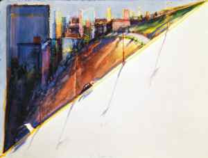
Back in college, I had the amazing opportunity to take a couple art studio classes taught by the artist Wayne Thiebaud. Before his class, I had never heard of him. Afterward, I haven't been able to get enough of his art. Best known for his "pop art" work  involving bubble gum machines, display cases full of cakes and pies, and assorted other food stuffs, he then branched out into cityscapes of San Francisco and aerial views of the Sacramento river valley. Now 89, he is still producing art, this time- beach scenes.

He's got a retrospective on now at the San Jose Museum of Art, and this exhibit is making it's way around the country. If you get a chance to catch it when it comes to your town, RUN, don't walk, to go see it!
image source
So temptingly tactile, there was a sign up in the museum imploring viewers to keep their paws off the works.

His skill with layering colors, one on top of another, and juxtaposing them to create form and definition... well, it's just mind-boggling.

image source
image source

image source
Here's a great example of his use of vibrating colors, which accentuate one another, creating an almost shimmery effect. (the magnifying glass is not part of the painting) you don't see if from far away, only when you get up really close

image source
image source
image source
A little close up of one of his cityscapes from San Francisco. Notice how ribbons of color run throughout the images... And what glorious shadows- bright blues, violets, turquoises... they are as luminescent as the sections flooded in sunlight.
image source
Ah, his color palettes make me swoon.
image source
"Thiebaud says “ I work with my students to understand that there are two ways of rendering light. Halation is a pretty simple trait. (Halation refers to the aura, halo, or hazy color around the edge of a subject; or vibrations of two colors next to each other.)Test is yourself sometime. Take a strong light, or even better, go outside. Put the light fairly close to an object and stare until the two views begin to oscillate. They begin to vibrate because the eye will hold its position for a long time. But, because you are seeing two images, stereoscopically, they are never quite perfectly fused. That is how you get halos, or auras.”(source)
image source
image source
image source
image source
Searching for the perfect baby gift? I'd be delighted to receive anything by Wayne Thiebaud! (Ah, sometimes I crack myself up, seeing as how his work is hanging in most of the major museums in the country...)

Impending motherhood

With just 3 weeks to go 'til my due date, I am racing to format guest posts, tie up loose ends, and finish up the nursery. Rug is coming next week, so I should have some shots for you then.

Not necessarily color-related, but I thought you would get a chuckle out of this. We have somehow managed to acquire 5 strollers! 3 hand-me-downs, one loaner, and one gifted.
 I would say we are more than prepared for transportation.

Color Consultant versus Interior Designer

The latest ColorPodz  podcast is up, debating the differences between a color consultant, and an interior designer.

Won't you weigh in, too?

Improving the quality of education through color

I just wrapped up writing an article for my column, Full Spectrum, in Color Conversations, Sherwin Williams online magazine, Stir. (I'll let everyone know when it's published.)

Basically, the gist of the article was to talk about how functional, educated color and lighting design are essential components of a school environment, and have a powerful impact on students' productivity. So while I was researching the article, I came across all sorts of wonderful case studies and visuals. But as a for-profit corporation, SW must follow stricter rules about image usage, which means more hoops to jump through if you want to borrow photos from a site. So now, I'm swimming in cool images that I couldn't use for the article.

Along with this, I've been in a holding pattern with a elementary school client who has yet to determine the priority for fixing up their campus interiors. I was so excited to have the opportunity to improve the students' learning environments that I hit the ground running before any final decisions had been made. Just figured I would get a 'head start'. Now, the project has been shelved indefinitely, due to a reshuffling of budgetary concerns.  And since I have education on the brain, I thought sharing some photos might help me get some "closure", so to speak.

 image source
Here's an itsy bitsy before shot of a 1960's school building, a "nasty-looking teaching block" (in the architect's own words), at Longford Community School in London.
image source
Here's a shot of the building after renovation. For those of you who love technical details, the low down: for the face lift, custom-color stained Finnish softwood laminated ‘fins’ that support both the first floor structure and the roof were used. I just love the brightly colored- gradation of panels. Can you imagine how sad this might have looked in cool, gray concrete?
Internally, a library space was designed as an adaptable open plan area that could be used for different ways of teaching
 including a raised area of carpet clad cubed modules for seating

and an enclosed curved ‘arena’ space.
  images source
The architect goes further, defining his approach in terms of color design:
"We like to define spaces and volumes using different finishes or materials often creating contrasts with unexpected or subtle use of colour. The practice is particularly interested in transformable and flexible spaces that can adapt and change to suit different ways of living, working or enjoying."
Do you have a school in your area that really impressed you, colorwise? It seems to rare to find a educaitonal facility where color was seriously considered, especially inside.

Take a slice out of cultural colors

This is kinda cool. It's a chart that attempts to map color associations according to cultures. Info-graphics are so useful, don't you think?

 image source
For instance, (according to this chart) what colors are associated with Happiness?
Western culture: yellow
Hindu cultures: green
Native American: white
Asian: red


You can even download a google-based spreadsheet of the data.

The designer explains that the circular chart, while difficult to read, was an aesthetic decision he made on purpose to encourage people to dig into the information and be coaxed into exploring the data.

First thing I always ask is, "where did they get their data?". As you know, with the world wide web, you never really know if reputable, comprehensive data is being gathered, or if cut and paste mis-information is being spread. This project seems to be a little of both. Luckily, the designer was quite transparent with his sources (thank you!):  color matters, every joe, about.com,  and books by John Gage and Leatrice Eisemann. I do appreciate that the designers realize this is just the tip of the iceberg, and ask readers,
HELP We’ve painted with a pretty broad brush. So there’s likely to be local variations or glitches. So if you spot any, or have you have references and sources for other colour meanings around the world, please send them over or comment
All in all, it's a great start for trying to visualize cultural differences in color associations.